This tutorial is the tenth part of our React Native Plant App tutorial series. In the previous part, we successfully implemented the Header and the Tabs section of the Browse screen. This tutorial is the continuation of the same tutorial from where we left off in the last part. So, it is recommended to go through the previous part in order to get insight and knowledge of the overall project.
In case of wanting to learn from the beginning, all the previous parts for this tutorial series are available below:
- [React Native Plant App UI #1: Getting Started](https://dev.to/absek/react-native-plant-app-ui-1-getting-started-516i-temp-slug-4395585)
- [React Native Plant App UI #2: Implementing Custom Components](https://dev.to/absek/react-native-plant-app-ui-2-implementing-custom-components-1j63-temp-slug-9774652)
- [Building React Native Plant App UI #3: Implementing Welcome Screen](https://kriss.io/react-native-plant-app-ui-3-implementing-welcome-screen/)
- [React Native Plant App UI #4: Illustration Slider and Animated Steps](https://kriss.io/react-native-plant-app-ui-4-illustration-slider-and-animated-steps/)
- [React Native Plant App UI #5: Terms of Service Modal](https://dev.to/absek/react-native-plant-app-ui-5-terms-of-service-modal-4g5m)
- [Building React Native Plant App UI #6: Login Screen](https://dev.to/absek/react-native-plant-app-ui-6-login-screen-405h)
- [React Native Plant App UI #7: Forgot Password Screen](https://dev.to/absek/react-native-plant-app-ui-7-forgot-password-screen-3d)
- [React Native Plant App UI #8: Sign Up Screen](https://dev.to/absek/react-native-plant-app-ui-8-sign-up-screen-1m23)
- [Building React Native Plant App UI #9: Implementing Browse Screen](https://dev.to/absek/react-native-plant-app-ui-9-implementing-browse-screen-4dp7)
As mentioned in the previous parts, the inspiration for this tutorial series came from the Mobile App Templates that provide a wide variety of mobile application templates written in React Native and powered by universal features and design. These app templates allow us to implement our own apps and even start our own startups. And, this tenth part is also the continuation of coding implementations and designs from the Youtube video tutorial by React UI Kitfor the Plant App. The video tutorial delivers the coding implementation of the overall app very thoroughly. However, there is no verbal guidance for coding and implementation. Hence, this tutorial series is the implementation of the same coding style and designs in the form of the article.
Overview
In this tenth part of this tutorial series, we are going to implement the Categories section of the Browse screen. The Categories section will contain cards and badge images which will represent the collection of specific products. The idea is to start by implementing a single category and then add multiple categories. Of course, we are going to style them properly as well as integrate mock data into them.
So, let us begin!!
Implementing Categories Section
Here, we are going to start implementing the categories section. The Categories section will represent the collection of different plant products under different categories. In order to implement the categories section, let us import the necessary components first in the Browse.js file:
import { Button, Block, Text, Card, Badge} from '../components';
Now, in the render() function, we are going to implement the template for the categories section just below the Block component for the Tabs section. For that, we need to use the code from the following code snippet:
render(){
        const { profile, navigation } = this.props;
        const tabs = ['Products', 'Inspirations', 'Shop'];
        return (
        <Block>
            <Block flex={false} row center space="between" style={styles.header}>
                <Text h1 bold>Browse</Text>
                <Button>
                    <Image source={profile.avatar} style={styles.avatar}/>
                </Button>
            </Block>
            <Block flex={false} row style={styles.tabs}>
                {tabs.map(tab => this.renderTab(tab))}
            </Block>
            <ScrollView
              showsVerticalScrollIndicator={false}
              style={{paddingVertial: theme.sizes.base * 2}}
            >
              <TouchableOpacity onPress={()=> navigation.navigate('Explore', category)}>
                <Card center middle shadow>
                  <Badge>
                    <Image source={require('../assets/icons/plants.png')}/>
                  </Badge>
                  <Text>Plants</Text>
                  <Text gray caption>123 products</Text>
                </Card>
              </TouchableOpacity>
            </ScrollView>
        </Block>

    );
}
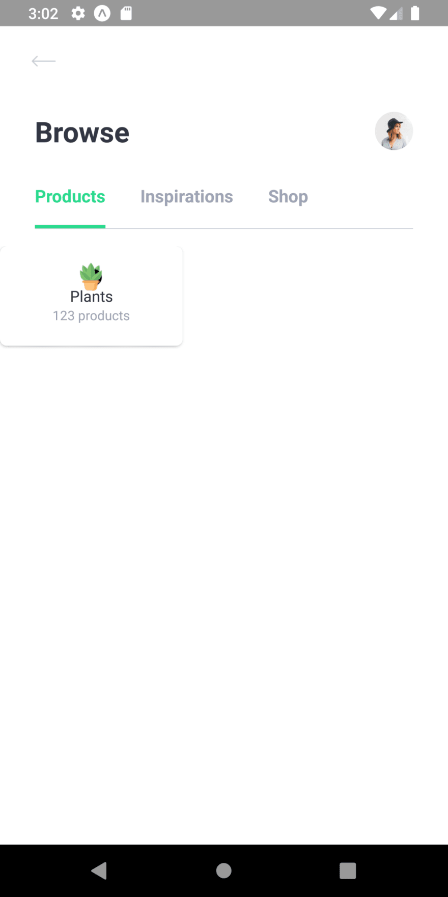
Here, we have added the ScrollView component which wraps the TouchableOpacity component. The ScrollView component has showsVerticalScrollIndicator prop set to false which will hide the verticle scroll bar on the screen. TouchableOpacity component wraps the Card component which in turn wraps a Badge component and some Text components. The TouchableOpacity component has the onPress event in which the navigation to the Explore screen is set. The Badge component wraps the Image component with the source from the assets folder.
Hence, we will get the following result in the emulator screen:  As we can see, we have got one category in the Categories section. Now, we need to style it properly as well as add multiple categories.
Adding Dimensions
Now, we are going to use the Dimensions component from the react-native package in order to get the full width of the app screen. For that, we need to import the Dimensions component into our Browse screen:
import { StyleSheet, Image, TouchableOpacity, ScrollView, Dimensions } from 'react-native';
Next, we need to define the constant called width and set it to the Dimensions component get() function with the full-width property:
const { width } = Dimensions.get('window');
Now, we are going to style the above category using this width property. For that, we need to use the code from the following code snippet:
<ScrollView
  showsVerticalScrollIndicator={false}
  style={{paddingVertial: theme.sizes.base * 2}}
>
  <TouchableOpacity onPress={()=> navigation.navigate('Explore', category)}>
    <Card center middle shadow style={styles.category}>
      <Badge>
        <Image source={require('../assets/icons/plants.png')}/>
      </Badge>
      <Text>Plants</Text>
      <Text gray caption>123 products</Text>
    </Card>
  </TouchableOpacity>
</ScrollView>
Here, we have added the style prop to the Card component which is provided in the code snippet below:
category: {
   // this should be dynamic based on screen width
   minWidth: (width - (theme.sizes.padding * 2.4) - theme.sizes.base) / 2,
   maxWidth: (width - (theme.sizes.padding * 2.4) - theme.sizes.base) / 2,
   maxHeight: (width - (theme.sizes.padding * 2.4) - theme.sizes.base) / 2,
 }
Hence, we will get the following result in the emulator screen:  As we can see, we have got the proper category card in the categories section. Now, we need to add the multiple category card in the categories section with the same style configurations.
Adding mock categories data
Here, we are going to add the mock categories data from the mock.js file of the ‘./constants/’ folder. As we have already imported the mocks data, we do not need to import it again. But we need to define new categories data as a prop, just like the profile data. For that, we need to use the code from the following code snippet:
Browse.defaultProps = {
    profile : mocks.profile,
    categories : mocks.categories
}
Here, we have set the categories data from the mocks module to the default categories prop for the Browse screen. Now, we need to define this prop inside the render() function as shown in the code snippet below:
render(){
    const { profile, navigation, categories } = this.props;
    .......................
Now, in the categories section template in the render() function, we need to add the data from the categories prop. Since categories prop is in array format, we are going to iterate through each item in the categories array using map() array function. Hence, we will get the category card for each section. For that, we need to use the code from the following code snippet:
<ScrollView
  showsVerticalScrollIndicator={false}
  style={{paddingVertial: theme.sizes.base * 2}}
>
  {categories.map(category => (
    <TouchableOpacity key={category.id} onPress={()=> navigation.navigate('Explore', category)}>
      <Card center middle shadow style={styles.category}>
        <Badge>
          <Image source={require('../assets/icons/plants.png')}/>
        </Badge>
        <Text>Plants</Text>
        <Text gray caption>123 products</Text>
      </Card>
    </TouchableOpacity>
  ))}

</ScrollView>
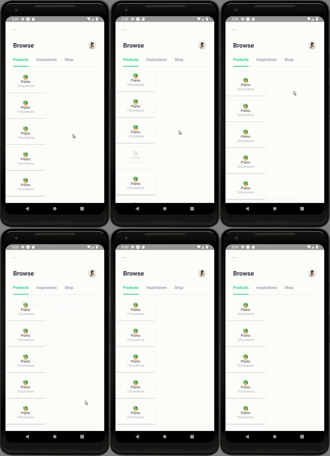
Here, we have used the categories array with the map() function just inside of the ScrollView component. Now, the TouchableOpacity component bears the key prop for each category card and identifies them uniquely.
Hence, we will get the following result in the emulator screen:  As we can see, we have got the list of category cards in the categories section. But, all appears horizontally which does not look appealing. So, we need to configure some styles to it.
Configuring Styles
Here, we are going to add some style props to our components which make up a template for the categories section. For that, we need to use the code from the following code snippet:
<ScrollView
  showsVerticalScrollIndicator={false}
  style={{paddingVertial: theme.sizes.base * 2}}
>
  <Block flex={false} row space="between" style={styles.categories}>
    {categories.map(category => (
      <TouchableOpacity
        key={category.name}
        onPress={() => navigation.navigate('Explore', { category })}
      >
        <Card center middle shadow style={styles.category}>
          <Badge margin={[0, 0, 15]} size={50} color="rgba(41,216,143,0.20)">
            <Image source={require('../assets/icons/plants.png')}/>
          </Badge>
          <Text medium height={20}>Plants</Text>
          <Text gray caption>123 products</Text>
        </Card>
      </TouchableOpacity>
    ))}
  </Block>

</ScrollView>
Here, we have added an extra Block component wrapping the categories map() array. This Block component is integrated with some style props. We have also added some style props to the inner components like Badge and Text. The required style is provided in the code snippet below:
categories: {
  flexWrap: 'wrap',
  paddingHorizontal: theme.sizes.base * 2,
  marginBottom: theme.sizes.base * 3.5,
},
Hence, we will get the following result in the emulator screen:  As we can see, we have got the category cards in the categories section side by side in the grid style. But, all the category cards appear the same with the same image and text. It is because we have not integrated the data from the
 categories array prop inside the map() function.
Configuring data from categories array
This step is pretty simple, we are just going to integrate the data from the categories array prop inside the template returned by the map() function. For that, we need to use the code from the following code snippet:
<ScrollView
  showsVerticalScrollIndicator={false}
  style={{paddingVertial: theme.sizes.base * 2}}
>
  <Block flex={false} row space="between" style={styles.categories}>
    {categories.map(category => (
      <TouchableOpacity
        key={category.name}
        onPress={() => navigation.navigate('Explore', { category })}
      >
        <Card center middle shadow style={styles.category}>
          <Badge margin={[0, 0, 15]} size={50} color="rgba(41,216,143,0.20)">
            <Image source={category.image} />
          </Badge>
          <Text medium height={20}>{category.name}</Text>
          <Text gray caption>{category.count} products</Text>
        </Card>
      </TouchableOpacity>
    ))}
  </Block>

</ScrollView>
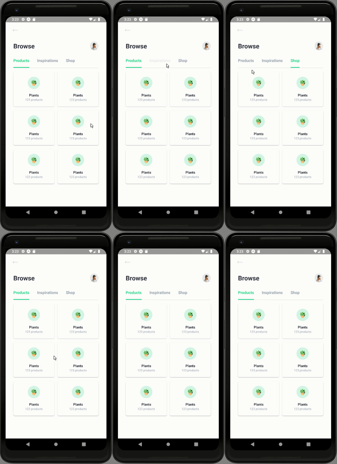
Here, we have integrated the image source and texts from for categories array prop.
Hence, we will get the following result in our emulator screen:  As we can see, we have got the category cards with different product information in the categories section.
With this, we have completed the implementation of the Categories section in our Browse screen. And, we have also come to the end of this part of the tutorial.
Finally, we have successfully completed the implementation of overall UI sections of the Browse screen in our React Native Plant UI App.
Conclusion
This tutorial is the tenth part of the React Native Plant App UI tutorial series. In this part, we continued from where we left off in the ninth part of this tutorial series. In this part of the tutorial, we learned to make use of Card and Block components from our predefined custom components in order to implement the categories section. We also learned how to make use of the Dimensions component to style the categories card and order them in grid style. Lastly, we integrated the mock data of categories into our categories section in order to complete the overall UI of the Browse screen.
In the next part of this tutorial series, we are going to start implementing the Settings screen in our React Native Plant UI App.
The post React Native Plant App UI #9 : Categories Section in Browse Screen appeared first on Kriss.
Disclosure
This post includes affiliate links; I may receive compensation if you purchase
products or services from different links provided in this article.


Top comments (0)