UPDATE 10/08/2020:
Thanks to everyone that took the time to vote and provide valuable feedback in this poll. You guys rock 🤘.
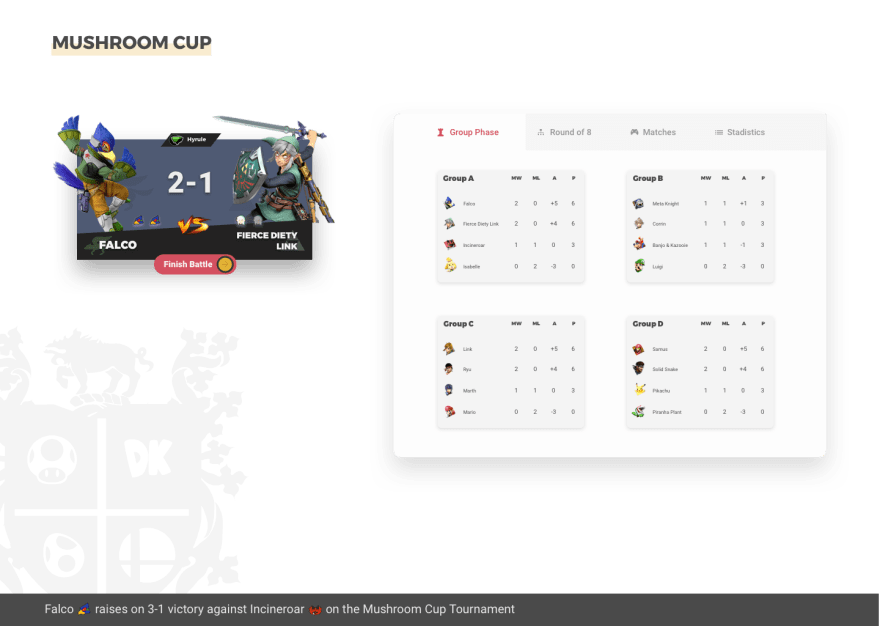
I decided to use Option A (even if B got more votes 🦄) with a few changes inspired by the feedback you gave me and considering the component surroundings:
Card A is the real deal (dark background, vibrant colors, etc., all evoke the feelings of competition, passion, aggression, etc.).
by @AnkushThakur
I added the character names, the logos in the bg similar to option B, and I added a small indicator of the stage just at the top.
I like the contrast that the card gives, it's eye-catching in all that light tournament page and clearly invites the user to check the next battle kinda feeling.
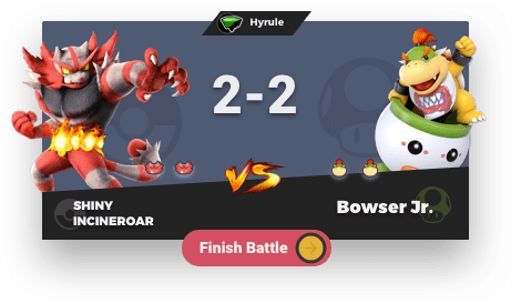
Here is another version of it
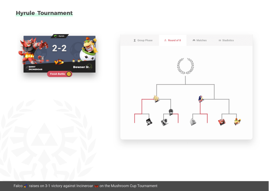
And how it looks in the same tournament page but in knockout phase:
Does that mean I threw the Option B to the trash 🗑? Not really, I actually going to use it on a page with historical of matches, because there doesn't need that much dynamism and contrast looks nice and clean.
I'm really happy with the result. and all the cool discussions happening on the comments, thanks, everyone!
Hi there 👋 . I'm a big fan of Super Smash Bros since I was a little kid.
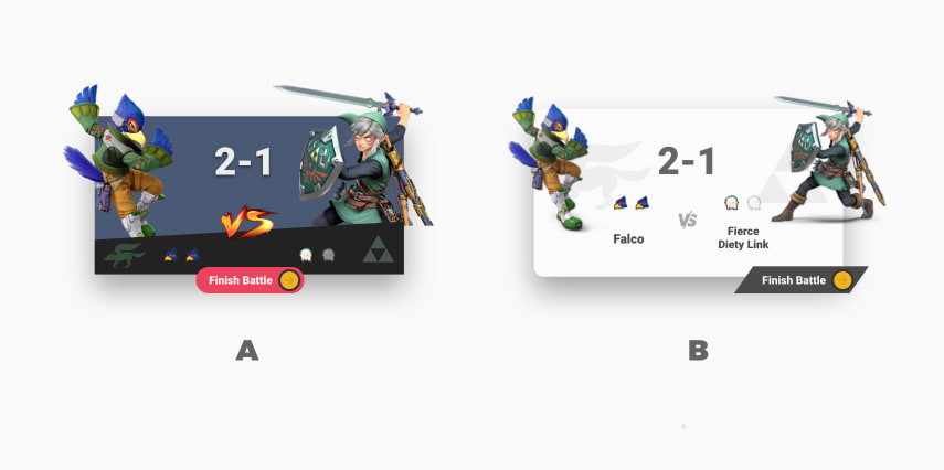
I'm doing some quick design for a tournament app in Vue and I could use your feedback, which card you like the most?.
- Option A: Vote heart ❤️
- Option B: Vote 🦄
Disclaimer: Characters and names are property of Nintendo of America.


Top comments (31)
Tough choice, they both look good! But I’ll go with option B, because the design elements more closely align with Nintendo, in my mind: clean, slanted, character logos as shadows of the characters, etc.
One suggestion: try making the “Finish Battle” text in ALL-CAPS and see how that changes the feel of it.
Thanks for the feedback, really apprieciate it.
They're both good but I prefer A. My eyes went right to that one. The colors pop and the characters look like they're more 3-D versus looking more 2-D on white.
I have the same feeling, I'm trying to step away from my overall romance with minimalistic white interfaces with something riskier
I really like both designs but I went for Option A because I find it easier to read/see things against a darker background. I'd suggest increasing the contrast of some of the icons on the bottom black banner of Option A; from an accessibility point of view, this would be a great improvement.
I also really like the shadows behind Falco and Link on Option B and I agree with Daniel that this design is more closely aligned with Nintendo.
Great job on the designs, they're both awesome!
This is hard, because like elements from each side.
I like the format of the B:
And I like from the "A":
The second one because focus more the important UI elements and has better call-to-action feelin' (e.g.: drive better the eye what to do, more intuitive).
The first one way cleaner by feeling.
Would be interesting to have both scheme for dark/light theme ;)
I like B more, but would like A if they used the same styling (ie. rounder borders, shadows, and badge)
They are both awesome! But I think that the white one looks a bit better. It's less overloaded with things (the logos behind the characters are SICK) and in general looks more clean and elegant.
Really good job!
Not a bad idea tho, thanks for replying
I prefer the second one
🦄
(but reducing the shadow just a little bit)
I'mma go with B, but not by much. They are both pretty cool :D