React-Select
When building a webpage I hate having to mess around for hours on end to get cool user friendly interfaces. It’s annoying and time consuming and seemingly unnecessary. So like many others before me I look around for useful tools to make my life easier. If I don’t find something well then if I have time I make something to make my life easier. I haven’t had much time so I don’t have many tools of my own to showcase but recently when working on a sticky selector for a webpage I’m working on I found a wonderful tool that has made my life much easier and my webpage more beautiful. The selector tool I found is a handy little API, as many are, called React-Select.
Implementing React-Select
Like all of the packages I’m aware of React-Select is easily downloaded by running the quick bash command yarn add react-select or npm install react-select depending on which package manager your react-app is running.
After installing the package you’ll have to import the selector into the files you wish to use it in like so:
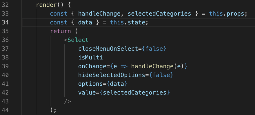
The power of React-Select comes in its ease of use and customizability. Now that you have access to react-select in your desired file you can use it like any component you’ve defined. An example from my use of the select API where I wanted a drop down with multiple options that updates when “categories” are added, allows for multiple options to be selected, and for the selected options to persist after selection is below.
It's really that easy to implement and it becomes a wonderful predesigned component to be used wherever a select is desired.
Functionality
Now that you have an idea of how powerful react-select is in this one basic use case lets dig into how to use React-select properly to allow you to implement it efficiently and error free in your next react-app.
An important place to start is highlighting the shape that Select expects its option data to be in. Unlike a classic select HTML element React-Select requires data to be structure in a {value: "collection-value", label: "collection-label"} format. Depending on how you’re storing the collection you wish to build a selector for you may have to restructure the collection before feeding it into your Select Component. Although there are more elegant ways to restructure data (namely using another api called Proptypes, react-docs here ) , in relation to the example above, I restructured my data like so:
Once you have your data restructure to display the options in a list you simply pass the collection as property of the Select component.
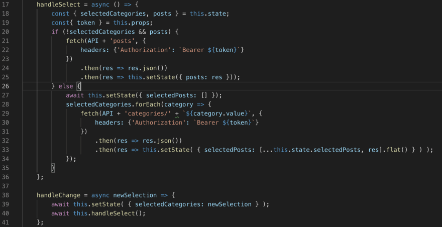
Once you have your options passed in most of the hard work is done. If you wanted a simple one item select element with a glossy finish well you basically have it. Create an onChange() property and pass in your handleChange() function (to be honest mines a little convoluted but it also does some conditional rendering and fetching -there's probably a better way-)
or define one in the function itself and voila a beautiful Select bar displayed on your page.
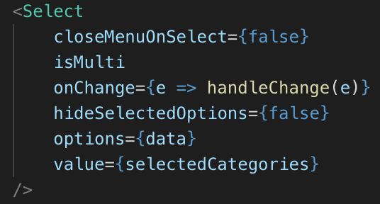
But wait there’s more. In the example above I wanted to be able to select multiple options and I wanted them to persist in the selection bar after I selected them. Well like so much else with this prepackaged component that functionality is only two Boolean statements and a collection variable away. Simply by adding a isMulti (defaults do true) prop, adding a hideOptionsOnSelect prop set to false,
and setting the value prop to a collection variable that is updated with the selected value in the handleChange() function identified above you can have the selector I so desired.
More
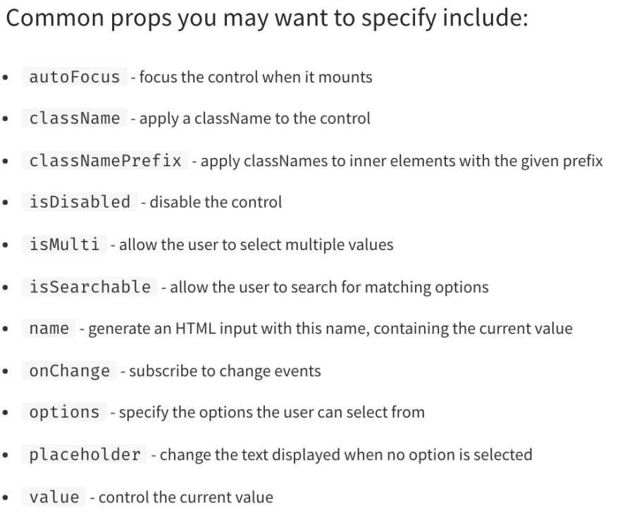
But wait there’s even More! More props that is. Some of the common props as denoted by the npm docs page are such:
I wont go to in-depth on these as I still have a lot to learn about them and all of the awesome uses this api has but Id suggest checking them out yourself!
Thanks so much for reading and I hope you keep on learning cause it’s so damn great!


Top comments (0)