I haven't updated my GitHub page for a while and decided to give it a new look. It turned out to be very simple, and it's good if you want your profile to stand out from the millions of others. Also, sometimes recruiters and HR professionals can find you on GitHub and contact you, as has happened to me several times before.
So I put in a little effort and in just one day I went from this:
To this:
Most of the time was spent on editing the text and skills. Click here to check out my GitHub profile or keep reading and edit yours.
Left Column
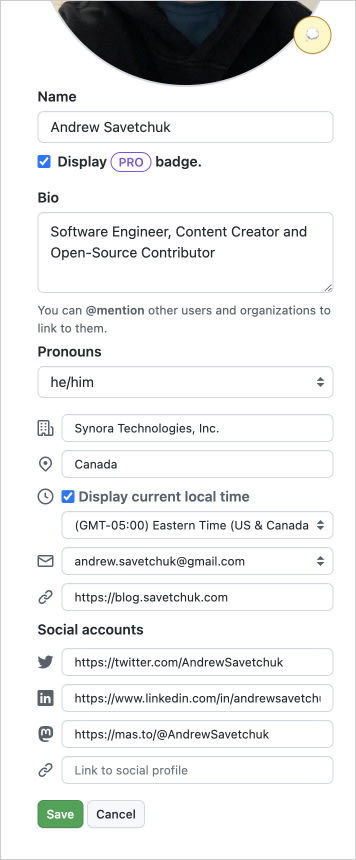
With the left column, everything is simple. Click on the "Edit profile" button and fill in all the fields. Keep in mind that GitHub often adds new features, so it's worth checking back from time to time to see if they've added anything to this column.
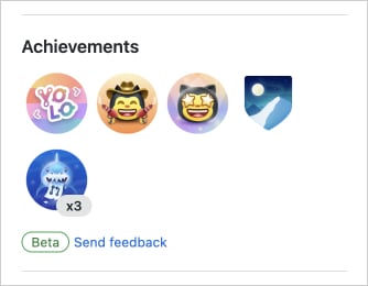
If you want to customize the left column even more, you should check out GitHub Achievements. Most of them aren't easy to unlock, but getting them is a good way to prove your skill level.
Main Area
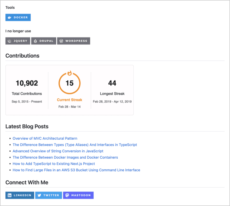
This is where things get more interesting. In addition to the pinned repositories and gists, you can create an entire page with information about yourself. To do so, just create a repository and name it the same as your GitHub username.
For example, my GitHub username is AndrewSavetchuk, so my GitHub repository for my profile page is also named AndrewSavetchuk. You are welcome to take a look or use some of my code to make changes to your profile.
In the newly created repository, you will need to edit the README.md file to make changes to your page. There you can use markdown as well as HTML.
I decided to add some text about me, a list of languages and technologies, the latest blog posts, social links and one widget that shows my GitHub contributions.
If you need more inspiration, I recommend you visit this website - https://zzetao.github.io/awesome-github-profile/. It's a collection of well-designed GitHub pages that I often use to see what widgets are used by others.
You may also like the images I used for skills and social links, you can find them here: https://github.com/alexandresanlim/Badges4-README.md-Profile
As you can see, redesigning GitHub's page is not a challenging task and now that you have learned how to do it, why not put your newfound knowledge into action? Try out the ideas discussed in this article and see how they work for you.
I hope you found this information helpful, stay tuned for more content! I also post on Twitter and Mastodon if you want more content on web development and other technologies in your feed :)


Top comments (0)