As developers, it's easy to assume that our users will intuitively understand the applications we are building. When we spend the majority of our time buried in an editor writing away, it's easy to focus on the end result of an action. Take a button that adds an item to a user's cart. Maybe it fires off a request to some API that adds the item to the user's cart in some database. It might also need to do a lot of business logic in the cloud, resulting in some amount of delay depending on network speed, device hardware, etc.
The Issue
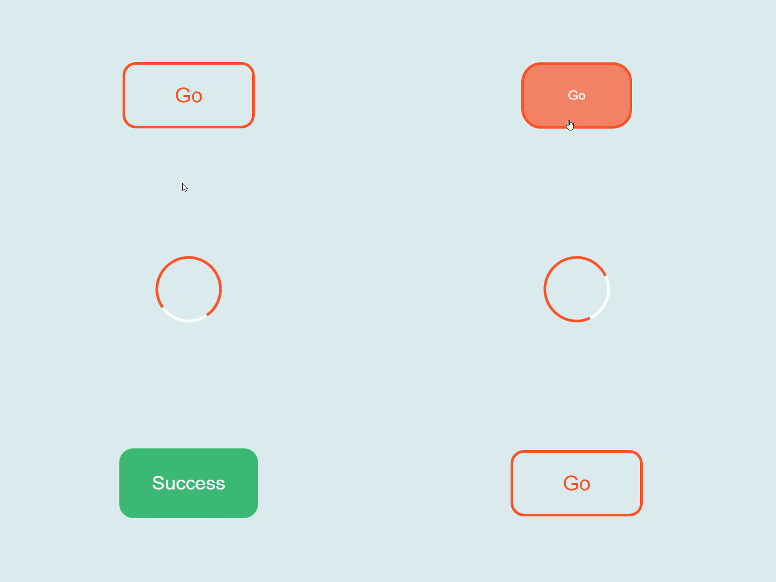
Delays can make an application feel clunky, and leave users guessing at what's going on, or worse, wondering if the action they had attempted has failed. The experience sucks. As developers, we have the power to provide insight into our apps visually. We can expose intent throughout the UI by presenting meaningful feedback to the user. Exposing intent can be as simple as a progress spinner on a button, a loading bar, or even showing skeleton placeholders until sufficient data is available to render the component or screen properly.
The Goal: Reduce a user's perception of time spent waiting
Presenting the user a brief animation allows developers to deflect attention away and make the waiting process less frustrating and more engaging. If a user has to wait ~5 seconds for a file to upload and they have no indication of current progress, they may click away or go to a competitor.
A Few Tools We Can Leverage
Skeleton Loading
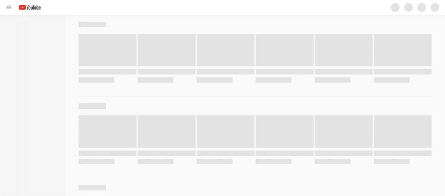
Skeleton screens are essentially blank pages that are progressively populated with content as it becomes available. The "bones" of these skeleton screens appear where the currently loading content would and provide instant feedback to the user. These placeholders are often grey or neutral-toned shapes and are usually paired with some type of animation.
When content is finally available, the skeletons disappear and the real content is presented to the user. Skeleton screens are there to fill the gap and create an illusion of an instant transition.
Progress Spinner
A progress spinner is a great choice to instantly provide feedback to the user while an action is taking place. In the earlier example with an "Add To Cart" button, a progress spinner can be a great tool to show that the action is in progress and, more often than not, the subsequent user action is blocked until the action has completed.
Conclusion
Humans are impatient. We need instant feedback because it feels good. This information helps the user determine if something has gone wrong, but it also just feels right. Your app appears more responsive when it can return instant feedback from a user's actions.


Top comments (0)