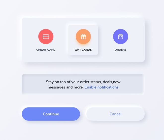
Neumorphism in 2020 was touted to be the next big trend in app/web design. Although there have been accessibility concerns , Neumorphism sure is a pretty cool design language. Infact what makes it really awesome is just how easy it is to implement it.
Today , we're going to learn how to implement Neumorphism in CSS with just two variables.
About Neumorphism 🌻
Neumorphism is a hot new take on "Skeuomorphism" which has been around for quite a while. If you've used the older versions of iOS before iOS 7, you would've have noticed that apps on the iPhone are designed to reflect their real life, physical counter-parts.
For example, the iOS Notes App was made to look like a real Notepad with a Leather cover.
Neumorphism can be easily understood as 3D over a 2D canvas. We assume that there's a light-source from any one side of the plane.
We present this illusion of a light-source using "directional" shadows. This provides a 3D Effect.
We define height and depth using shadows that fall outward a certain element and shadows inside the element (inset-shadows) respectively.
What are we building today? 🌈
A simple , Neumorphic button.
The CSS Variables
Important
A Golden rule for using Neumorphism in your web-design is to make sure that your background and your components have the same colour. Use a pale-blue or a greyish-white colour for best results.
We can implement Neumorphism using the box-shadow property in CSS. The trick is to target two sides of a Neumorphic component and add a dark shadow to one side and a light shadow to the other side.
:root {
    --nm: 6px 6px 16px 0 rgba(0, 0, 0, 0.2),
    -6px -6px 16px 0 rgba(255, 255, 255, 1);

    --nm-inset:inset 4px 4px 8px 0 rgba(0, 0, 0, 0.2),
    inset -4px -4px 8px 0 rgba(255, 255, 255, 0.8);
}
These are the two variables that I've defined for two different states of a Neumorphic component.
- Above plane (height)
- Below plane (depressed)(depth)
Let us analyse the variables in greater depth.
The nm variable
This variable is used to make a component project outwards from the surface.
On observing the nm variable , you'll see that the first part contains 6px 6px 16px 0 rgba(0,0,0,0.2)
This part is used to define the black shadow at the corners on the right side of the button.
Make sure that the transparency is set to <0.4. Dark shadows will make your button look like the buttons with the ugly drop-shadows from the early 2000s.
The second part of the box-shadow is used to add a lighter shadow. As you can see, the rgba is set to use a white color with 0.8 transparency. This is because we want the light to provide an illusion of striking the button from the left side. A higher opacity means a brighter light. This also makes your design more visible and distinct from the surface.
The nm-inset variable
This variable is used to make a component project inwards (to have depth rather than height) from the surface. This can be used to create a button-press effect.
We basically want to use the shadows we've defined in our nm variable. However , we want these shadows to be inside our button.
This is very easy to do. Just add the inset property before defining the shadow i.e
inset 4px 4px 8px 0 rgba(0, 0, 0, 0.2)
With this , you have defined two CSS variables that can now be used in any project involving Neumorphism.
Your neumorphic web-design can however be improved further by adding additional box-shadows and tweaking the numbers till you're satisfied with the end result.
Let's make a neumorphic button next.
button {
  font-size:14px;
  font-family: 'Poppins',sans-serif;
  cursor:pointer;
  padding:15px 30px;
  border:none;
  border-radius:4px;
  background-color: var(--bg-color);
  box-shadow: var(--nm);
  transition: box-shadow 0.3s ease-in-out;
}
This adds some basic styling to our Button.
Note that I've set the background-colour to the same colour as my body. I've used CSS variables for easier, modular code.
I have also added a box-shadow and set its value to the variable nm.
The transition property adds an animation when we hover over the button.
Let's add styling to our button hover state next.
button:hover {
 box-shadow:var(--nm-inset);
}
That's it!
It takes one line of CSS to add a button-press effect.
With this , you've learnt how to add Neumorphism to your web project with just two variables! 🎉
Down below , I'm linking a Design Daily Link to a Neumorphic Design and a Github Repo on exactly how I coded the design using this technique.
That's all for today.
Have a good one folks! 👨🏻💻


Top comments (1)
Awesome article! I love the look of Neumorphic sites it gives a super modern and sleek look.
However I use it very rarely as I hate writing out box shadows, these variables will be super useful.