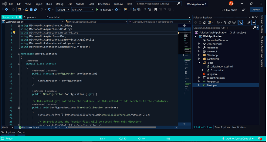
Just earlier this month, Microsoft released a new extension for theming in Visual Studio called Color Theme Designer. You read that right, Visual Studio, not VS Code! 😥😲 With the announcement I wanted to try my hand at making something I could enjoy, as there haven't exactly been many VS themes to choose from. I must admit here I never tried the old Color Theme Editor extension, though from the lack of themes and what was mentioned in the announcement, I can see why few did.
"If you were brave enough to create your own theme, you had to edit elements one by one from an unorganized list of 3,000+ vaguely named color tokens.
This summer, a group of interns has developed a newly released Color Theme Designer extension, and we’re hoping that making custom themes just got a whole lot simpler for beginner and advanced designers alike."
While there can still be moments that feel confusing, the process is bootstrapped by a "quick start", allowing you to start with a base theme then selecting primary, secondary, and accent colors.
This generates a palette of colors for you based on your selections. This got me about 90% to where I wanted to be, but there were still some glaring problems quirks.
Text and keywords had been altered in hue, but the editor background was the same. Menu backgrounds looked great, but their hover state had super low contrast. Don't get me started on my map mode scrollbar.
I developed some patience for using the color categories within "All Elements", but only after learning the hard way that I couldn't just mass update any color to a new one. Suddenly random text had an ugly background color that I couldn't get back to normal, and when highlighting text that background covered the highlight color. It was here I realized I hadn't started a git repo to track changes. Amateur hour! 🤦♂️
If you find yourself in this situation, here is the trick I used to get back on track. I made a second project using the same base theme and colors, then diffed the .vstheme file. I was able to save those changes I meant to keep, and revert the blanket changes I made. If you are doing anything more than a quick start, use version control!
In the end, I was super happy with the results. I now present to you my first ever theme, Midnight Lights.
While it still has quirks that I'm finding, It's been a fun learning opportunity. Hopefully within the next week I'll be publishing it as an extension, available within Visual Studio's new extension category of Themes! Until then feel free to download or fork it on GitHub.
 austinstanding
/
midnight-lights-vstheme
Dark theme for Visual Studio 2019
Midnight Lights Visual Studio Theme
This is my first theme and you will probably find some quirks. This is a personal project, but feel free to fork the repository!
Installation
After installing the extension from the Marketplace, the theme will be available in the dropdown under Tools -> Options -> General.
Misc
CI/CD uses Azure DevOps, following Meziantou's Blog.
I like to extend my theme with Viasfora, mostly for Rainbow Braces. I've added my Viasfora theme within the github repo as viasfora-theme.json. If you're a Viasfora user, themes can be exported/imported from Tools -> Options -> Viasfora -> Import/Export.
Versions
v1.1.5
- Modified peek background, updated theme icon
v1.1.1
- Modified Razor code highlighting to better match theme
v1.1
- Darkened editor background to match window backgrounds
- Darkened menu…
Have you tried the Color Theme Designer yet? What was your experience? What features/tweaks would you like to see?
UPDATE: The extension is now published! Install it from the Visual Studio Marketplace.


Top comments (1)
Personally I would love to see a color picker added to the UI of the color category search, just being able to click on an element and say ‘take me to this color’ would cut down on time for me.