Instagram.com ranks pretty high according to the Alexa top visited websites. This means that all the CSS from instagram.com gets downloaded to millions of devices every day. Let's have a look at the interesting parts of it their CSS analysis.
First impressions
| Filesize | 543 kB |
| Source Lines of Code | 27,992 |
| Rules | 10,314 |
| Selectors | 10,449 |
| Declarations | 16,235 |
Coming in at 543 kB, the overall CSS size is pretty substantial. It's not as bad as some other large companies, but I am almost certain it could be way less. With the amount of visitors they have, making their CSS smaller would be a nice bandwidth-saving as well.
Almost 30,000 Source Lines of Code, with declarations making up for roughly 50% of that (16,235). There are 10,449 selectors, which means that the remaining ~4000 lines of code is hidden in at-rules! That will be an interesting one to look at later on in this post.
CSS Rules
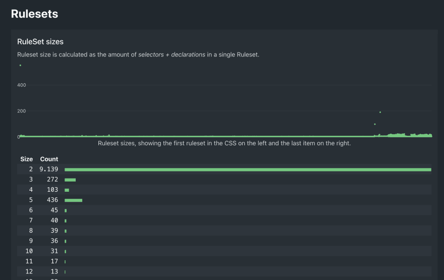
One of the first things that jumps out is a massive rule size of 550! Zooming in on that we see a rule with 2 selectors 548 declarations! This is not uncommon since the rise of CSS custom properties, because lots of sites declare most of their 'variables' on the :root selector. 548 custom properties is just... more than usual. In the graph above this ruleset is visible as the top left dot.
:root,
.__ig-light-mode {
    --fds-black: #000000;
    --fds-black-alpha-05: rgba(0, 0, 0, 0.05);
    --fds-black-alpha-10: rgba(0, 0, 0, 0.1);
    --fds-black-alpha-15: rgba(0, 0, 0, 0.15);
    --fds-black-alpha-20: rgba(0, 0, 0, 0.2);
    --fds-black-alpha-30: rgba(0, 0, 0, 0.3);
    --fds-black-alpha-40: rgba(0, 0, 0, 0.4);
    --fds-black-alpha-50: rgba(0, 0, 0, 0.5);
    --fds-black-alpha-60: rgba(0, 0, 0, 0.6);
    --fds-black-alpha-80: rgba(0, 0, 0, 0.8);
    --fds-blue-05: #ecf3ff;
    --fds-blue-30: #aac9ff;
    --fds-blue-40: #77a7ff;
    --fds-blue-60: #1877f2;
    --fds-blue-70: #2851a3;
    --fds-blue-80: #1d3c78;
    --fds-button-text: #444950;
    --fds-comment-background: #f2f3f5;
    /* hundreds more, etc. */
}
Right after that one, the dark theme:
.__ig-dark-mode {
    --fds-black: black;
    --fds-black-alpha-05: rgba(0, 0, 0, 0.05);
    --fds-black-alpha-10: rgba(0, 0, 0, 0.1);
    --fds-black-alpha-15: rgba(0, 0, 0, 0.15);
    --fds-black-alpha-20: rgba(0, 0, 0, 0.2);
    --fds-black-alpha-30: rgba(0, 0, 0, 0.3);
    --fds-black-alpha-40: rgba(0, 0, 0, 0.4);
    --fds-black-alpha-50: rgba(0, 0, 0, 0.5);
    --fds-black-alpha-60: rgba(0, 0, 0, 0.6);
    --fds-black-alpha-80: rgba(0, 0, 0, 0.8);
    --fds-blue-05: black;
    --fds-blue-30: black;
    /* hundreds more */
}
Selectors
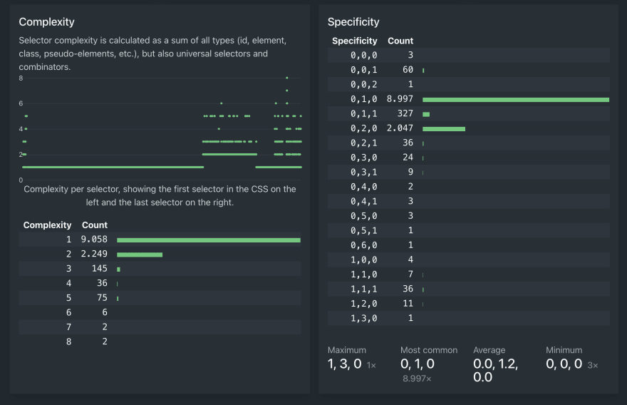
A surprisingly good score for instagram here: 11,573 selectors with 96.16% being unique. Most websites with such a vast amount of selectors suffer from a lot of duplication.
On the complexity side of things it's looking good as well: less than 200 selectors have a higher complexity than 3, which is pretty good.
The most surprising part for me was the specificity: over 10,000 selectors have specificity of either [0,1,0] or [0,2,0]. And even the maximum specificity ([1,3,0]) is way below the maximum of what many sites of this size have. Good job!
At-rules
@media
The first thing that jumps out when checking the at-rules are the @media queries. It's not just the total of 1,600+, but the fact that there's 135 unique ones. 135 unique media queries! Pretty much all of them use px as units for min-width or max-width and most of them are really, really specific numbers. I wonder if they have some kind of system for that, or that they just eyeball the page layout and apply media queries where they see fit.
| Query | Count |
|---|---|
(max-width: 767px) |
340 |
(min-width: 1025px) |
321 |
(min-width: 768px) and (max-width: 1024px) |
319 |
(max-width: 899px) |
52 |
(min-width: 900px) |
20 |
(max-width: 900px) |
14 |
(max-width: 905px) |
3 |
Excerpt from instagram.com's @media at-rules. Note the almost-but-not-quite-identical breakpoints around 900px.
@keyframes
Another interesting metric is the 140 unique @keyframes that are in Instagram's CSS, which is a lot. Usually this can be explained by the fact that many of the atrules are straight copies because of vendor prefixes in the atrule, like this:
@keyframes thing {
    from {}
    to {}
}

@-webkit-keyframes thing {
    from {}
    to {}
}
... but this is not the case on instagram.com. There are truly 140 unique @keyframes rules, most of which have a random string as a name, so I'm happy that I'm not the one having go debug that part of their CSS.
@keyframes x104yahw-B
@keyframes x1078a53-B
@keyframes x13f3g3z-B
@keyframes x148q4be-B
@keyframes x166kt1m-B
@keyframes with randomly generated names.Declarations
Only one thing worth mentioning here: there are only 167 !importants, which is really low compared to the total of 17,356 declarations. Less than 1% !important usage, that's something that not many websites at scale are able to pull off!
Properties
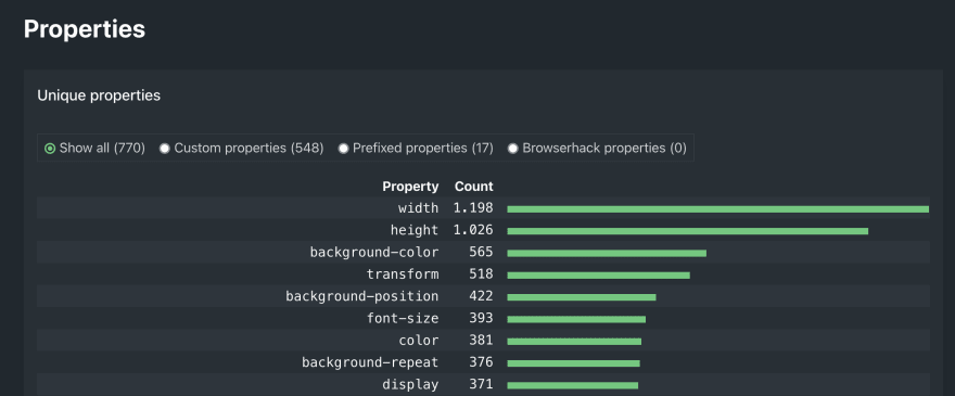
I think Instagram must have broken some kind of record here for having 548 unique custom properties. That's just bonkers. Other than that, the top usage ones are the usual suspects, with width, height, background-color and display ranking high, just like most other websites.
One thing that's cool about checking someone else's CSS is that you can learn a lot by doing it. Today I learned about -ms-scroll-rails and -ms-scroll-chaining, which are obsolete properties, but apparently still used on today's instagram.com.
Values
Colors
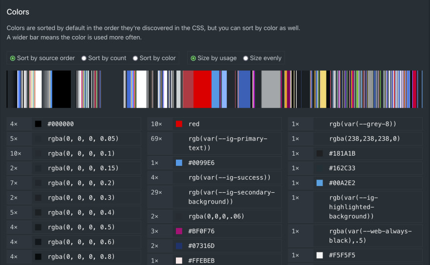
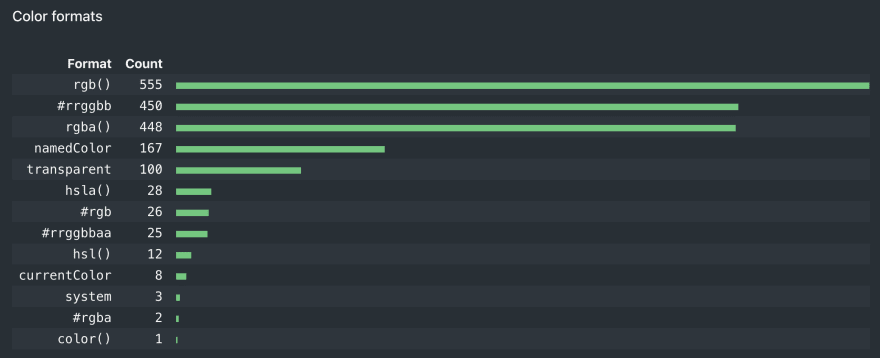
539 unique colors. That just can't be right. We've seen the vast amount of custom properties above, so I'm surprised that there's still so many unique colors. I'm afraid that there must be a part of Instagram that's old and tucked away and not updated with the same level of care as the rest of the site is.
An insteresting note about Instagram's color format usage: they seem to use more different formats than most sites I've seen so far. I'm surprised that there are so many named colors in there.
Font-families
Again, a huge list: 78 unique font-families (most sites stop at about ~20). Scrolling through that actually reveals that there's probably a good reason for this amount, because some of themhave names like 'Fix for Mac Chrome 80' and I think that font-family alone is worth a blog post on itself.
That's it for now! I won't go into more details about other things because A) this post is long enough as it is and B) most things are what you would expect from a website as big as instagram.com.
I highly encourage you to check out the report yourself and see what you can take away from these analytics. Let me know what you think of this type of post! Did you like it? Was it deep enough? Or still too superficial? Ping me at @bartveneman.
This post is the first part of a series of posts focusing on disecting the CSS of popular websites. The goal is to see how big companies structure their CSS, what mistakes they make and what we can learn from their CSS architecture.




Top comments (0)