I'm a friendly, non-dev, cisgender guy from NC who enjoys playing music/making noise, hiking, eating veggies, and hanging out with my best friend/wife + our 3 kitties + 1 greyhound.
mmmm no, not really. It's got some hoops to jump through... and a lot of the highlighting colors need to be overwritten manually w/o instruction so they're visible at all. Also VSCode will tell you it's corrupt every time it opens a new window...
you're not half wrong. its quite 'aggressive' but i find a chop/change between colour schemes is really helpful with motivation (i mean you're staring at this a fair bit)
really looking forward to a good 'forest' kinda theme but havent found one just yet. bring on the green.
vscode with rosé pine dawn
edit: font is fira code and I usually switch between dark and light mode on os level depending on my surroundings. For dark mode I'm on rosé pine moon.
Unfortunelty a bit of a mess. These should be the most relevant ones:
{"telemetry.enableTelemetry":false,"explorer.confirmDelete":false,"editor.formatOnSave":true,"editor.lineHeight":35,"workbench.colorTheme":"Rosé Pine Dawn","editor.fontLigatures":true,"workbench.editor.untitled.hint":"hidden","editor.fontSize":14,"workbench.iconTheme":"file-icons-colourless","breadcrumbs.enabled":false,"editor.padding.top":10,"editor.minimap.enabled":false,"workbench.activityBar.visible":false,"workbench.editor.showTabs":false,"vim.useSystemClipboard":true,"editor.suggestSelection":"first","vsintellicode.modify.editor.suggestSelection":"automaticallyOverrodeDefaultValue","workbench.preferredDarkColorTheme":"Rosé Pine Moon","workbench.preferredLightColorTheme":"Rosé Pine Dawn","window.autoDetectColorScheme":true,"workbench.sideBar.location":"right","editor.codeLens":false,"editor.fontFamily":"Fira Code, JetBrains Mono, Hasklig, 'Courier New', monospace","explorer.confirmDragAndDrop":false,"editor.cursorBlinking":"phase","editor.cursorSmoothCaretAnimation":true,"editor.smoothScrolling":true,"editor.tabSize":2,"vim.smartRelativeLine":true,"workbench.layoutControl.enabled":false,"editor.inlineSuggest.enabled":true}
👋 Hey there, I am Waylon Walker
I am a Husband, Father of two beautiful children, Senior Python Developer currently working in the Data Engineering platform space. I am a continuous learner, and sha
I'm a fan of Open Source and have a growing interest in serverless and edge computing. I'm not a big fan of spiders, but they're doing good work eating bugs. I also stream on Twitch.
👋 Hey there, I am Waylon Walker
I am a Husband, Father of two beautiful children, Senior Python Developer currently working in the Data Engineering platform space. I am a continuous learner, and sha
I've been a professional C, Perl, PHP and Python developer.
I'm an ex-sysadmin from the late 20th century.
These days I do more Javascript and CSS and whatnot, and promote UX and accessibility.
I really want to like FairyFloss but I found I was having to tweak too many things to make it fit my eyes. It looks great in certain screenshots but as soon as I edit something different it becomes a splodge!
Software Engineer | Full Stack Web Developer | SEO | Data Analytics | Embedded System Design with Arduino Programming | Hardware and Software Troubleshooting | PWA
👋 Hey there, I am Waylon Walker
I am a Husband, Father of two beautiful children, Senior Python Developer currently working in the Data Engineering platform space. I am a continuous learner, and sha
I have my custom theme called Moon Purple. The unique feature I like about my theme is that it has seamless colours, which is a problem when you try pulling up the terminal.
I've got Synthwave '84 but unfortunately the glow seems to not work on Mac or something to do with a VS Code update (workarounds didn't fix it for me), so I may end up switching to one of the other Synthwave themes and using custom CSS.
I used to get comments from other devs that the colours and glow are too harsh on the eyes, but I love it. I can't do light themes at all; I have Irlen Syndrome and for me, reading off white backgrounds is definitely NOT fun!
I am passionate about creation, be it code or written. I believe that knowledge should be sharee. If we all gave a little bit of our time to helping the each other, the world would be a better place.
Using Dark Pie that made by me. Not a rich one. but has satisfaction 😎. So long thinking about some updates on syntax highlighter , some minor corrections, etc ✨.
Would love to have feedbacks from you guys. Let's give it a try!😅
I learned how to code at university, so I've been at it since 2014. I've dabbled in open source contributions but would like to get into it more. Other than 1's and 0's, I love to travel.
👋 Hey there, I am Waylon Walker
I am a Husband, Father of two beautiful children, Senior Python Developer currently working in the Data Engineering platform space. I am a continuous learner, and sha
I'm working on a synthwave theme derived from the Night Rider VSCode theme. Since it's not maintained anymore and some languages had not a good color/contrast balance, I wanted to give a shot and improve things. Still a work in progress though.
Here's its dark version. It's our own IDE, integrated into Magic
You can switch modes with the slider in the bottom left corner. The IDE is kind of specialised for Magic and Hyperlambda. Not sure I'd recommend it if you only do C# or JavaScript or something, but it's not really its purpose either, since its purpose is to allow for "some manual editing" of whatever the core generates automatically for you using Low-Code and automation constructs ...
👋 Hey there, I am Waylon Walker
I am a Husband, Father of two beautiful children, Senior Python Developer currently working in the Data Engineering platform space. I am a continuous learner, and sha
👋 Hey there, I am Waylon Walker
I am a Husband, Father of two beautiful children, Senior Python Developer currently working in the Data Engineering platform space. I am a continuous learner, and sha
I am passionate about creation, be it code or written. I believe that knowledge should be sharee. If we all gave a little bit of our time to helping the each other, the world would be a better place.
5+ years in frontend Web development. Expert in UI/UX, Cypress, and performance optimization, cutting load times by 60% and enhancing accessibility,SEO and frontend architecture for live applications.
Can't beat synthwave x fluoromachine for VSCode
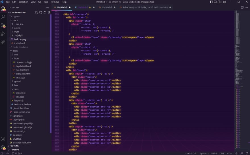
😈
Trtrerrr
Wow! I'm totally getting synthwave vibes from these colors — awesome. 🙌 That's an aptly named editor theme right there.
This is 🔥
Oh nice! I'm a Sublime girl myself, but this is pretty and the colors make my heart happy. I wonder if there's something similar for Sublime?
ive been using synthwave but not that background. gonna sort that right out! thanks for bettering my life.
nice but too distracting, i prefer material theme ocean
Is it simple to set up? Isn't it too harsh for the eyes?
mmmm no, not really. It's got some hoops to jump through... and a lot of the highlighting colors need to be overwritten manually w/o instruction so they're visible at all. Also VSCode will tell you it's corrupt every time it opens a new window...
But it looks great!
Well... So the set up is still the same after the few years I took a look at it. So bad ^^
But it does look great!
you're not half wrong. its quite 'aggressive' but i find a chop/change between colour schemes is really helpful with motivation (i mean you're staring at this a fair bit)
really looking forward to a good 'forest' kinda theme but havent found one just yet. bring on the green.
bookmarked this comment
Synthwave + Stardew Valley icons
Whaaaaaat, Stardew icons? That's awesome!
marketplace.visualstudio.com/items...
Has a winter and autumn mode too! Totally forgot about that, so now I'm running autumn for pumpkins and sunflowers!
Awesome, I love that video game ! Thanks for sharing.
Awesome theme, I use coder coder theme. Please how do you get your code to look so neat and organized?
vscode with rosé pine dawn
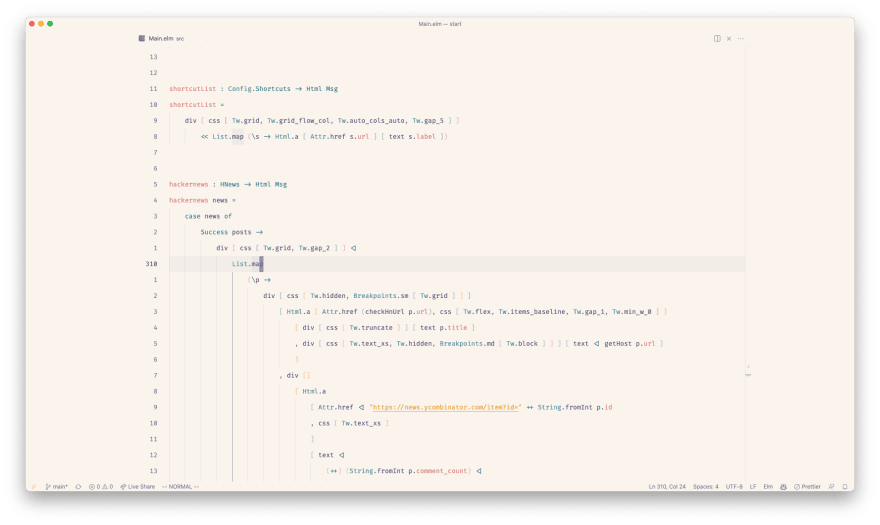
edit: font is fira code and I usually switch between dark and light mode on os level depending on my surroundings. For dark mode I'm on rosé pine moon.
Whoa
So clean, I love it
Awesome, can you share your editor settings?
Unfortunelty a bit of a mess. These should be the most relevant ones:
Cool, I'll check it out and see how it looks in my vscode.
Thanks!!!
no way xD
I generally switch back and forth between these two (four?) themes whenever I get bored of the one I'm looking at.
Arcadia (Dark)
Arcadia (Light)
Papercolor (Dark)
Papercolor (Light)
These screenshots are sooo crisp. really making vim look good here!
The light ones would look better on my linux mint setup because there the window borders actually change when I switch themes:
The other ones were quickly taken on my work PC during lunch break, where I haven't really wasted that much time making everything just perfect :D
Please share some editorial, how did you do customize vim. Looks very beautiful and eye catchy.
I actually didn't add all that much, it's really just standard neovim with some colour themes in a terminal with some padding.
That Papercolor Dark looks nice!
I love your super minimalistic vim
I put it in zen mode for the screenshots; most of the time it actually looks like this:
Lately I've been using Catpuccin on just about everything the have a plugin for and love it so much!
How nice theme i got! (solarized dark)
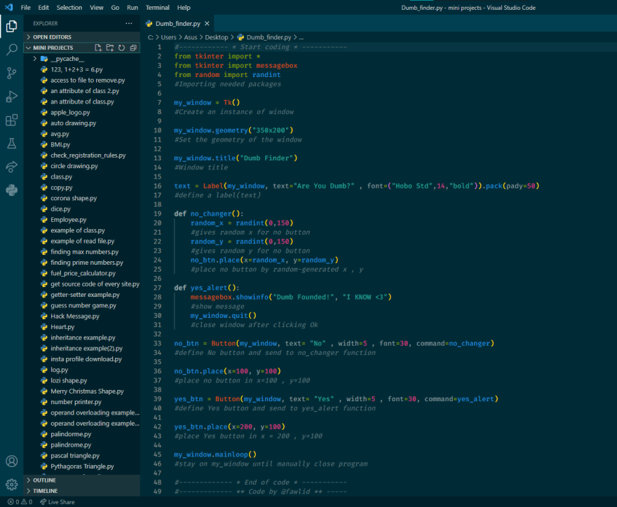
How do you like the low-ish contrast personally?
I tried many themes but for 2 weeks I use my VSCode on this theme! I dont know why I like it 🤷🏼♂️
I was considering that too!
Please how do you make your code look so neat and organized?
Is there an extension you use?
i just write my codes clean, there isnt any extension
in every line i wrote, i put a comment for that and it makes my code more beautiful
Link to larger image
I'm using the Fortnite theme with the Dank Mono font.
Me too! I love this theme 😄
Love that dark purple!
FairyFloss on VSCode, Dank Mono font ✨
I really want to like FairyFloss but I found I was having to tweak too many things to make it fit my eyes. It looks great in certain screenshots but as soon as I edit something different it becomes a splodge!
That's very fair - the most important thing is for your eyes to like it 😄 Maybe it depends what kind of files you're in most often.
I use Tokyo Night + Cascadia Code Font and I'm loving it 🤍
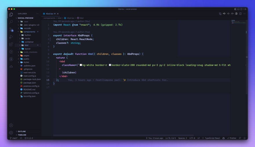
Ayu Mirage PowerUp (VS Code)
I go with Merko for VSCode.
That's a vibe
Deprecated hero xD
I used synthwave in vscode
I recently started using One Dark Theme by Mark Skelton. Loving it so far.
Font: Jetbrains Mono
Shell prompt: Starship.rs
Icon theme: Seti
I also run one dark, oddly I never used atom, but have used one-dark for years.
I have my custom theme called Moon Purple. The unique feature I like about my theme is that it has seamless colours, which is a problem when you try pulling up the terminal.
With the best icon pack: Material Icon
I also use the recursive font (not visible in the screenshot as its old)
Meanwhile me ...
Nothing beats the default Vim theme for me.
I've got Synthwave '84 but unfortunately the glow seems to not work on Mac or something to do with a VS Code update (workarounds didn't fix it for me), so I may end up switching to one of the other Synthwave themes and using custom CSS.
I used to get comments from other devs that the colours and glow are too harsh on the eyes, but I love it. I can't do light themes at all; I have Irlen Syndrome and for me, reading off white backgrounds is definitely NOT fun!
While Aurora X is my home
Halcyon is one I found recently and really like
Currently using Orbi on VSCode, and it is made by me :D
Bearded Theme Arc Reversed x Cascadia Code
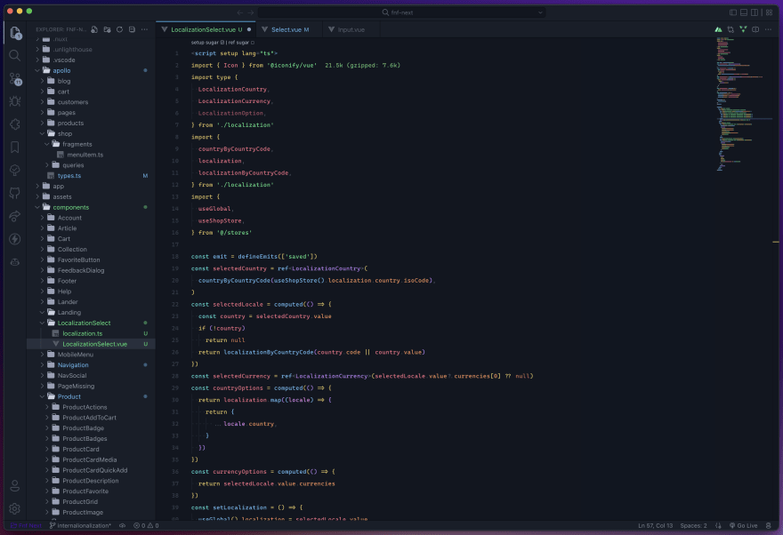
Tweaks with Customize UI and Monkey Patch:
"editor.fontSize": 16,

"editor.fontFamily": "'CPMono_v07', Space Mono, Consolas, 'Courier New', monospace",

"customizeUI.font.regular": "WW Digital",

"customizeUI.fontSizeMap": {

    "13px": "20px",

    "monospace": "12px",

    "tab-title": "12px",

    "menu": "20px",

    "window-title": "40px",

},

"workbench.colorCustomizations": {

    "editor.background": "#000211",

    "editor.foreground": "#ffffff",

    "editor.selectionBackground": "#0000ff",

    "editorCursor.background": "#d3d3da",

    "editorCursor.foreground": "#B19EFF",

    "editorLineNumber.foreground": "#42ff00",

    "editorIndentGuide.background": "#224400",

    "editorIndentGuide.activeBackground": "#aaff00",

    "editor.lineHighlightBackground": "#000012",

    "editor.lineHighlightBorder": "#6666cc",

    "editor.findMatchHighlightBorder": "#ffaa55",

    "editor.findMatchHighlightBackground": "#000000",

    "editor.findMatchBorder": "#ffffff",

    "editor.findMatchBackground": "#0000ff",

    "editor.selectionHighlightBorder": "#0000ff",

    "editor.selectionHighlightBackground": "#000000",

    "activityBar.background": "#6953F5",

    "activityBar.foreground": "#eeeeff",

    "editorOverviewRuler.background": "#6953F5",

    "terminal.background": "#000534",

    "terminal.foreground": "#ffffff",

    "minimap.background": "#3b0677",

    "minimapSlider.background": "#0000ff",

    "sideBar.background": "#002633",

    "sideBar.foreground": "#00f9ff",

},

"editor.tokenColorCustomizations": {

    "comments": "#00ff00",

    "functions": "#ffaacc",

    "keywords": "#bbff00",

    "numbers": "#6666ff",

    "strings": "#ccccff",

    "textMateRules": [],

    "types": "#FFff00",

    "variables": "#00ffff",

},
I like it minimal.
Theme : Night owl
Icon: Material icon
Product: El minimalist
github.com/AndiKod/racoon.vim
Transparent Catppuccin Mocha in WezTerm and a minimal VimSetup for WebDev :) Life can be simple to enjoy.
Using Dark Pie that made by me. Not a rich one. but has satisfaction 😎. So long thinking about some updates on syntax highlighter , some minor corrections, etc ✨.
Would love to have feedbacks from you guys. Let's give it a try!😅
I don't know. I just randomly scrolled through some previews of themes and chose my favorite color. Military Green.
I love me a good light theme, but after many hours, eye drops and glasses, I fell into the pretty Codel theme.

Let me flex my setup real quick
Theme => Gruvbox

Font => Fantasque Sans
One I made myself Rasengan Glacier
Theme: Night Owl
Theme: SynthWave
Terminal Emulator: cool-retro-term
Font: FixedSys Excelsior
MacOS Modern Theme - Big Sur Xcode
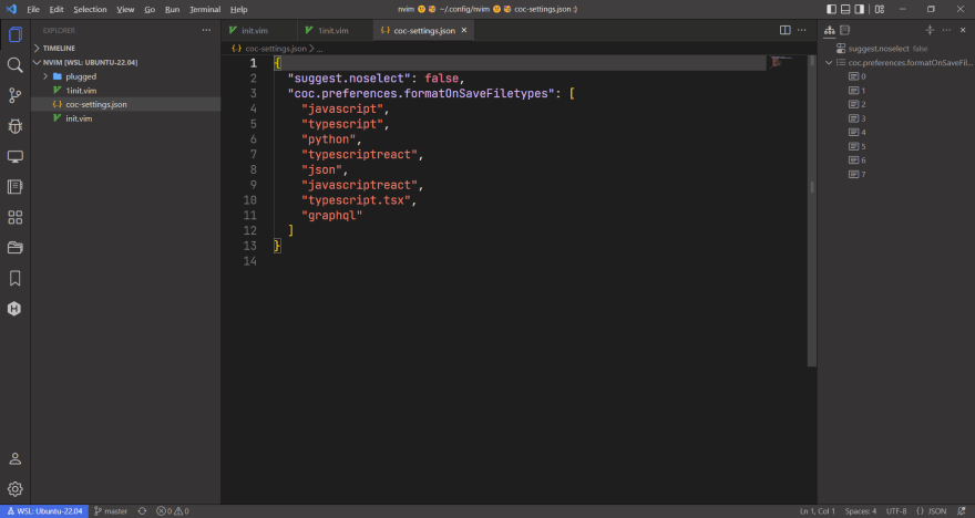
One Dark Pro for code highlight palette, and DIY for the whole UI
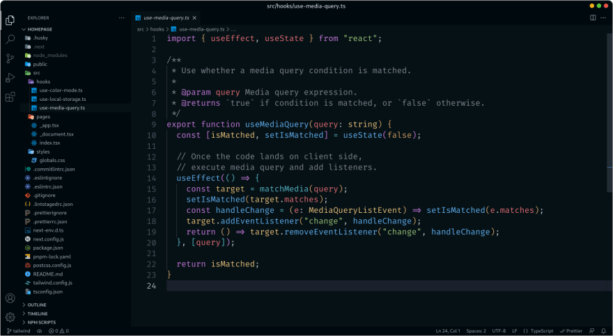
i like this one! can you pastebin your config pls
Pasted my theme config here
Just a default Darcula theme on PyCharm. Looks delightful to me :)
Theme: GitHub Theme
Accent: Peacock
Beat my theme!🚀

theme: CodeSandbox Black
icon: Material Icon
font: MonoLisa
I use lichen for vim. It's based on Nord but substitute blue for green.
Do I smell the only image of an editor other than vscode here?
SynthWave '84
Link: marketplace.visualstudio.com/items...
I've been running Night Owl with Material Icon Theme and Indent Rainbow. I use Peacock add a pop of color so I know which repo I'm in at a glance.
I'm working on a synthwave theme derived from the Night Rider VSCode theme. Since it's not maintained anymore and some languages had not a good color/contrast balance, I wanted to give a shot and improve things. Still a work in progress though.
Hyper IDE of course ^_^
Never heard of this — as far as theme goes I like the cream/white, but not sure I could go light mode.
How is Hyper IDE in general? And how much thought do you put into theme?
Here's its dark version. It's our own IDE, integrated into Magic
You can switch modes with the slider in the bottom left corner. The IDE is kind of specialised for Magic and Hyperlambda. Not sure I'd recommend it if you only do C# or JavaScript or something, but it's not really its purpose either, since its purpose is to allow for "some manual editing" of whatever the core generates automatically for you using Low-Code and automation constructs ...
Something super simple, but it works for me! GlassIT-VS extension for background. Dark Theme from VS defaults.
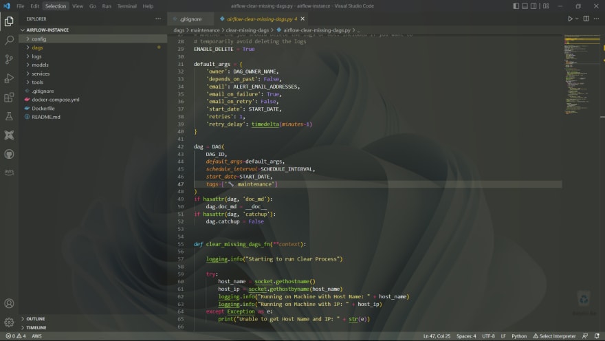
Thanks for information
Rubymine dark theme for the win.
Soul Reaper Theme for vscode - Inspired in Bleach anime/manga series
Default light+ theme with some tweaks to increase font sizes for accessibility (my eyesight is quite bad).
editor
GitHub Dark
Tokyo Night 😍
this looks pretty 💅
Monokai MidNight
That popup with the transparancy looks soo good!
Made By Me with :love :)
Greeney. - a dark greenish blue theme for VSCode
Dowload Now !! or Use this link to preview
Font Used: Cartograph CF
Just a regular old neovim
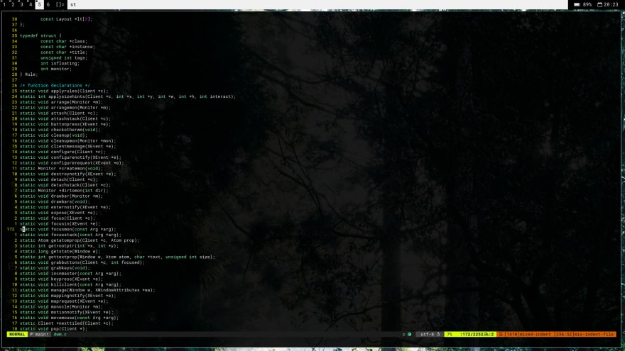
here is mine
🐟🐠🐳
UwU

One Dark Darker
Roboto Mono Font
size 18
This is what I've been looking for! Thank you!
Legendary Dark

I keep coming back to Aurora X
VS Code
from those who "oh i never stop using my terminal" guys?
Github dark (JetBrains Mono , IRANSans )
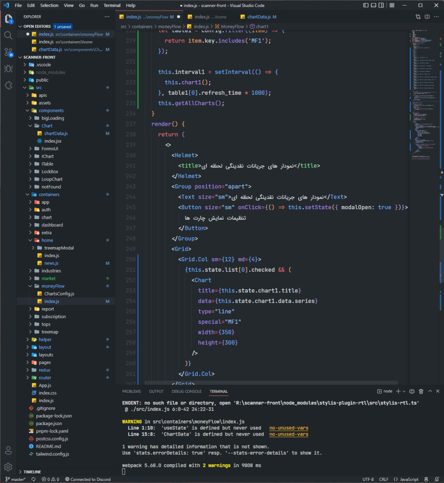
Xcode Dark High Contrast in Neovim + Tmux
Which font?
Rubymine dark theme for the win.

My custom Aurora-X
Repo: github.com/menuRivera/Aurora-X
One Dark Vivid + Menlo for Powerline (font)
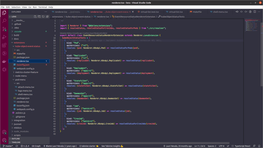
Theme: Simple light
Font: JetBrains mono
Icons: VSCode icons
Github Dark Default, Meterial Icon theme, and Fluent Icons with fira code font. Perfect!
GitHub Dark is very good for eyes.
Laser Wave & Fira Code
There's no better than (Night Owl) theme for vscode
Dracula 🧛🏻♂️

Just Monokai Dimmed for me :)

Synthwave '84
VIM with my own colorscheme and Cascadia Code.

marketplace.visualstudio.com/items...
One Dark Proless

One Dark Pro++
Monkai Midnight
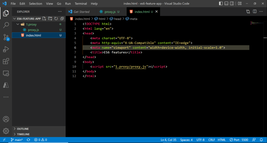
Nice theme
Vibrancy, Palenight theme and Victor Mono font

I like the feel of Tokyo Night for Neovim, also I'm using the JetBrains Mono Nerd Font.
Nothing too fancy. Simple, pleasant and elegant