State not found
Often as developers, we know how our application functions and moves. My grandmother won't know why "her phone is broken" without some help. Design it for her.
Most users aren't as technical as you.
Design shouldn't need an explanation, it should be simple. If the app doesn't give users feedback, it isn't working.
What's the difference between a search with no results and an error? How will your user know the difference?
A "perceived bug" is a bug, it's just a design bug.
Examples of blank states
- User searches for something that doesn't exist.
- User has an empty table without content.
- Placeholders or labels aren't clear or they are hidden while input is focused.
These are all frustrating points for a user.
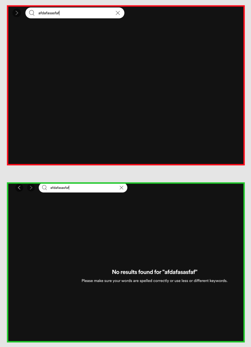
Visual blank state example
Spotify:
Imagine searching for a song and Spotify gives you a blank screen with no feedback on what happened.

Always give users feedback
Additional Resources
I highly recommend Refactoring UI. I'm not the best designer, but this book has helped me a lot in how I think about UI/UX.
Refactoring UI: https://refactoringui.com/
Here's an article describing more about blank states: https://www.innertrends.com/blog/blank-state-examples
Closing
Go and make better blank states!
My snack pack reads are intended for a quick read without any fluff, BS, or needless clickbait.
What is your favorite blank state?
- Facebook's animated cards while loading
- Twitter's "What's happening?" text area for blank tweets
- Is there a really good one I'm missing?


Top comments (0)