As someone whose role at Browser has mostly leaned towards the UI side of the UX sphere, I’ve found benefit in becoming increasingly involved in the research and discovery phase of the work we do. Becoming familiar with the process has helped eliminate some of the habitual head-scratching and customary creative blocks that previously seemed an inevitable part of user interface design.
We start every project with a discovery phase to establish things such as objectives, priorities and deliverables. UI explorations are integral to this process: they can reveal further questions to ask, or uncover areas of investigation not previously considered.
Research can be gathered from numerous sources. I’ll summarise just a few of those here, demonstrating how each has helped shape our UI designs. We’ll cover the broader subject of user research later in a separate post.
1. The customer is always right
Okay, the customer may not always be right, but the insights and knowledge of our clients are absolutely invaluable, particularly at the very start of carrying out research. The best clients will be able to communicate a wealth of knowledge and expertise, not only to help identify user types and their needs but also to provide detail on strategic business interests, company values and project parameters.
How client research has informed our UI design
During a recent discovery for a web application that publishes global risk insights, it soon transpired that as part of the client’s wider business development, the company were keen to cross-pollinate their other products and services as part of a suite.
In our early UI designs, we explored different ways to reinforce and promote the client’s full range of services. We developed solutions in two ways: one contextual(?) and one visual. Firstly, we proposed that other products and services were referenced and written into the published content where relevant. Additionally, we designed a UI component to be included in the application’s global interface, linking to each of the other tools in the suite.
2. Know the enemy
Where possible, we analyse competitor applications to see how others have overcome similar challenges to those we expect to face. We always seek an opportunity to stand out from the crowd: only by knowing the competition are we able to guarantee that our solution can achieve this.
How competitor research has informed our UI design
Whilst analysing the UI of a competitor platform, we were drawn to the use of icons in the sidebar navigation to help quickly identify each different area of the platform.
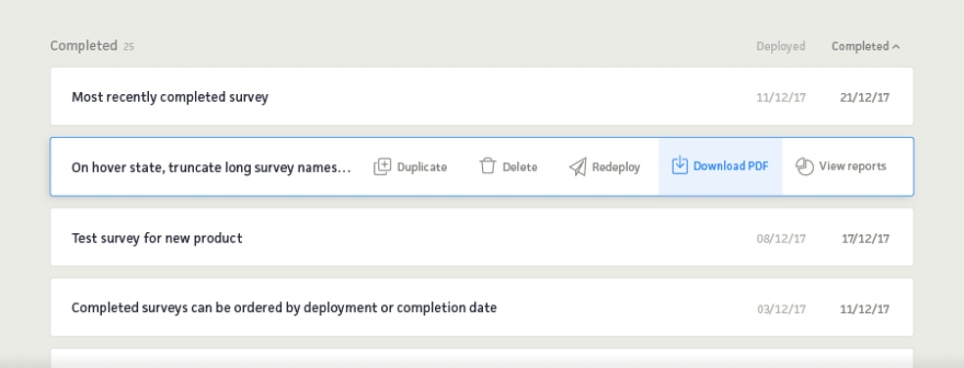
In our UI design concepts, we went a step further than simply using icons as a wayfinding tool. By introducing icons on hover state, we could hide and reveal the actions available to listed items on the user dashboard. This simultaneously added multiple, easy to discern CTAs, whilst minimising UI clutter and repeated elements.
3. Study the lay of the land
We constantly scour the web to seek inspiration from other applications and sites across a wide range of sectors and industries. We try to establish early on in the discovery phase some of the key UI components we’ll need to produce, and collect relevant examples as we progress.
How visual research has informed our UI design
A recent project required a search tool with as many as nine filters to refine searches for support programmes, containing long lists of selectable items. Our redesign had to explore ways to streamline the user experience of the existing site – particularly on mobile.
We partly solved the issue by breaking the journey down into two steps; an initial default view of just the four most important filters, then an optional expanded view of the whole range. But we still needed a way to present that full range when accessed on mobile. Only after sifting through some example UI components from other platforms, did we arrive at a neat solution that worked perfectly for our requirement.
4. Work with what you’ve got
Clients will usually share a set of existing brand guidelines, whether an all-singing-all-dancing brand toolkit or a simple document referencing colour palette and fonts. Either way, these assets always help when styling up early wireframes rapidly into more developed prototypes.
How brand research has informed our UI design
The client required the design of the application to have a visual identity of its own whilst aligning with the applications of their other services and the brand image as a whole.
In our UI designs, we suggested introducing a new primary colour, unique to the application. A prerequisite of the application was to use specific colours to indicate five different risk levels, so any new colour had to be distinctive from this predefined palette, yet visually harmonious. Considering the possibility that users would be navigating in and out of different applications, we opted to otherwise maintain uniformity of the visual language (fonts; element style such as buttons, navigation, etc) across the client’s suite of products.
In summary
A thorough discovery stage can make for a more efficient design process and a more effective UI design. Armed with a wealth of relevant information, a designer can create a rational user interface, confident that each design decision is backed up with data or visual research. A streamlined design process, free from the need for multiple concepts (and rounds of design iterations, review and feedback) makes it easier to focus on getting the design details right, and ultimately delivering a more effective and accomplished design solution.
The post How research and discovery shape our UI thinking appeared first on Browser London.


Top comments (0)