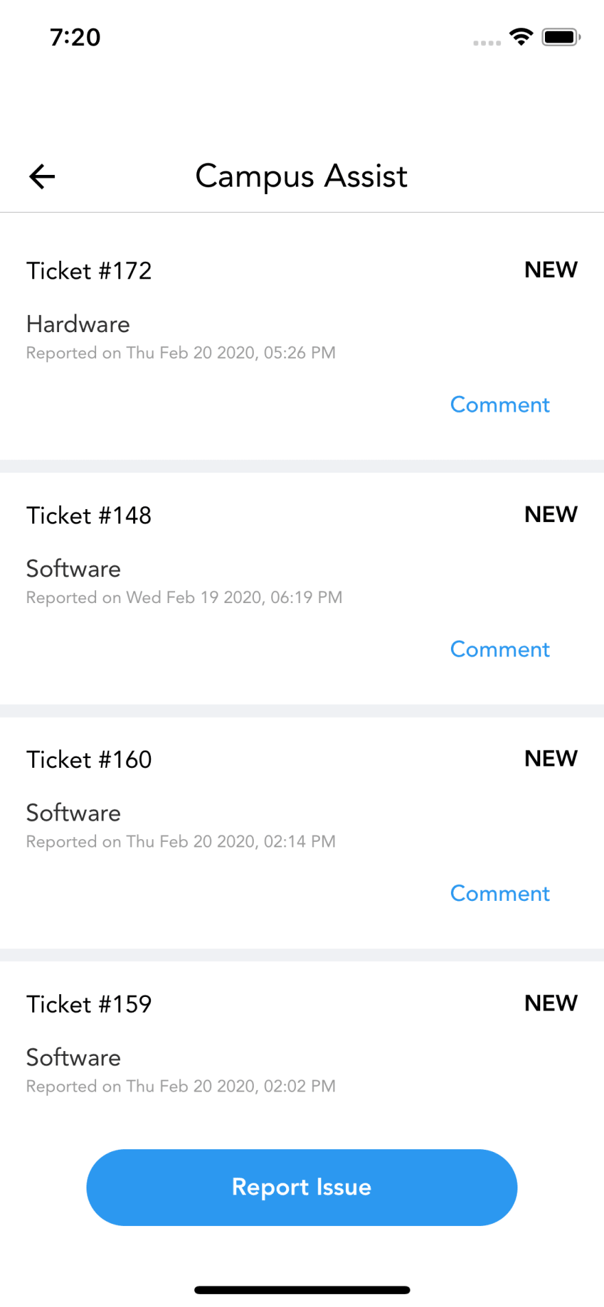
Have you ever faced large header height for iphones??
Like this one
Well then you can fix this easily with one line of code
In your navigator's default navigation options add this
headerForceInset: { top: "never", bottom: "never" }
So It will be something like
const awesomeNavigator = createStackNavigator({
    // all screens
}, {
    defaultNavigationOptions: {
        headerForceInset: { top: "never", bottom: "never" }
    }
})
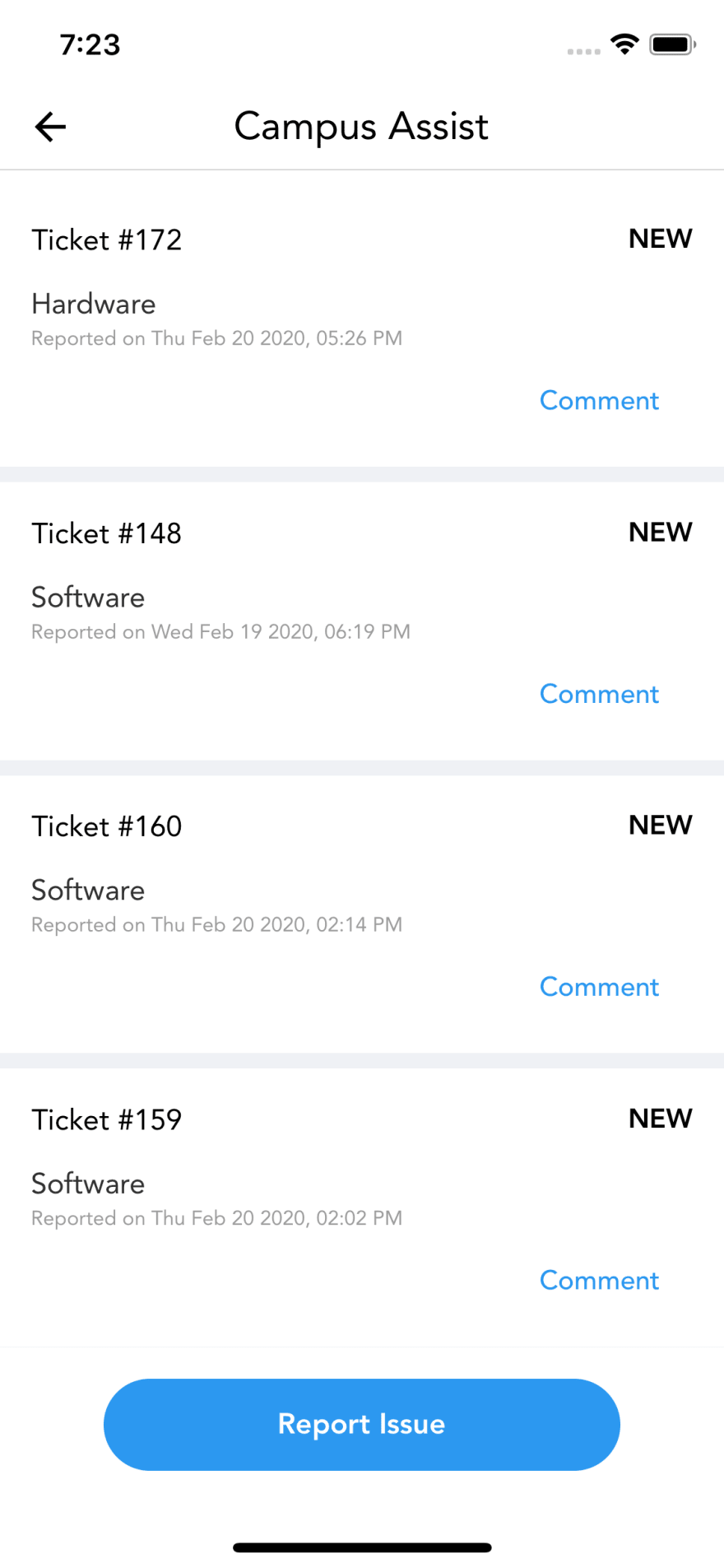
Now it changes to


Top comments (2)
This usually happen because of embedding SafeArea in top of the navigation container, which results in double padding, although what you mentioned is a fix, may be the better one will be to make sure you don't have double SafeAreas
I agree whatever you said is a better solution, but I am too #lazy or didn't want to refactor my #workplace app when I wrote this article, so 🤷🏻♂️
Thanks for pointing it out