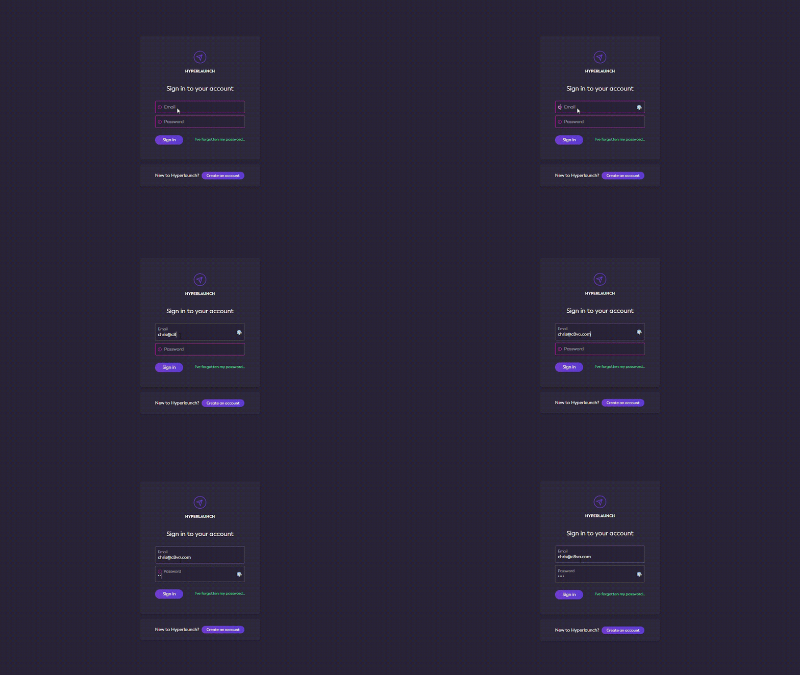
I've been working on the sign in page for Hyperlaunch this week, and wanted to add some nice touches (because first impressions count!).
One of these was to do a nice, "floating label" input - like you see in Material UI etc. It's a really nice pattern for functionality like user sign in, as it's a very streamlined presentation which gives a nice minimal feel.
You might think that this approach is just making use of the placeholder attribute - but unfortunately, that can cause a bit of an accessibility issue. The way around this is to use an absolutely positioned label instead - so screen readers can still interpret the form correctly. This approach has the added benefit of being able to add a subtle transition, to really up the UX game.
I implemented my floating label inputs with React and Tailwind CSS - using a state hook to toggle the class names based on user actions.
The result's a nice, succinct component:
function FloatingLabelInput({ type, name, children }) {
  const [active, setActive] = React.useState(false);

  function handleActivation(e) {
    setActive(!!e.target.value);
  }

  return (
    <div className="relative border rounded mb-2 bg-gray-600 text-white border-white border-opacity-25">
      <input
        className={[
          "outline-none w-full rounded bg-transparent text-sm transition-all duration-200 ease-in-out p-2",
          active ? "pt-6" : ""
        ].join(" ")}
        id={name}
        name={name}
        type={type}
        onChange={handleActivation}
      />
      <label
        className={[
          "absolute top-0 left-0 flex items-center text-white text-opacity-50 p-2 transition-all duration-200 ease-in-out",
          active ? "text-xs" : "text-sm"
        ].join(" ")}
        htmlFor={name}
      >
        {children}
      </label>
    </div>
  );
}
which is as easy to use as: <FloatingLabelInput name="username" type="text">Username</FloatingLabelInput>
You can see it in action on my Codepen


Top comments (0)