Fake it until you make it and help share your vision
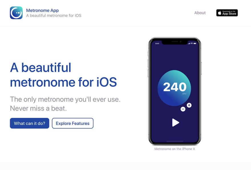
Staring at a blank piece of paper, waiting for ideas that may never come, can be daunting. When an idea presents itself, seize it. Explore the idea. It is common practice to gather your thoughts and form a plan to bring your idea to fruition. Only forming an idea of what a product could be is only part of the process. An important step is to imagine what the product could finally look and feel like. It may not look identical when it’s done but creating and presenting a few high fidelity mock-ups give something to strive for. It sets the mood and unifies people around a common goal.
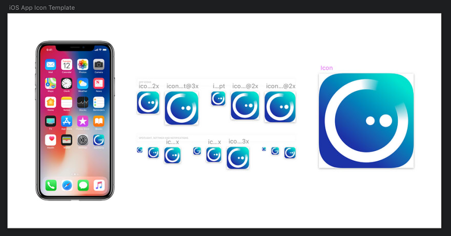
Metronome is a small side project I came up with last year to experiment with iOS development. It started as a very rough prototype but once it worked and I knew users were interested, I built a high fidelity mock-up to act as my goal. I then worked my way to attempt to bridge the gap between reality and ideal. Here is the process I took to try and bridge this gap.
Prototyping
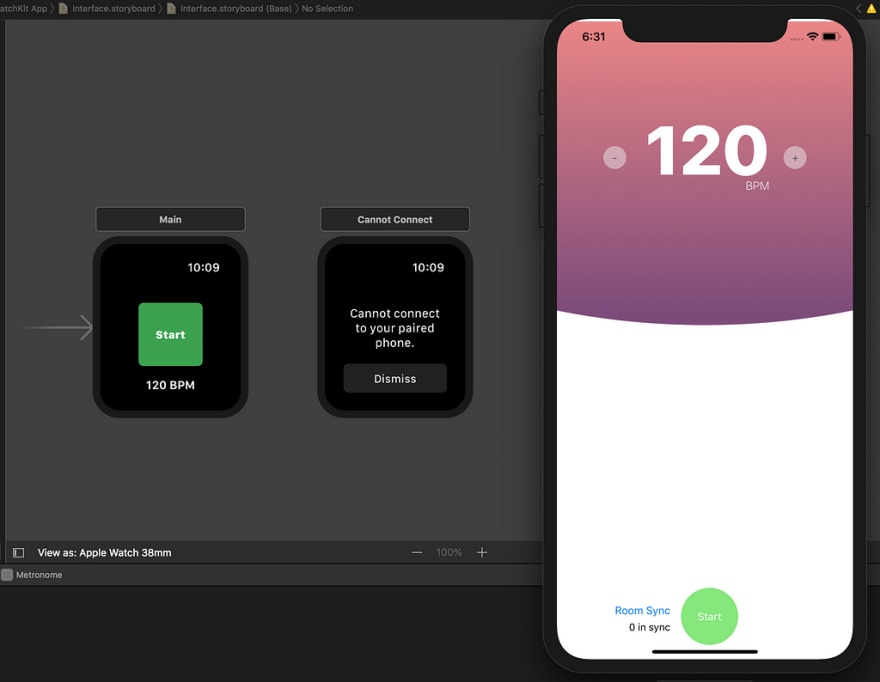
Prototyping is an essential tool for identifying issues before you spend too much time in the thick of it. It is easy to start with scarce requirements, a rough idea but it’s just as easy to lose sight of what you’re building. Before you know it, you’ve over-engineered a feature. You’ve created something that’s destined to be cut when someone (possibly yourself) figures out that it isn’t needed.
There are varying levels of prototypes which you can build, it’s not one size fits all.
Low Fidelity
A low fidelity prototype is the fastest easiest way to test a feature with zero investment. It can be a pen, paper and some creative imagination.
High Fidelity
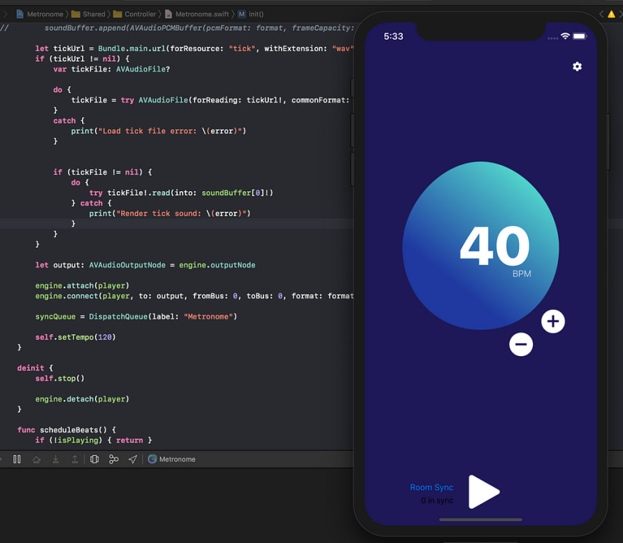
A high fidelity prototype is more complex and takes more time but is useful for communicating in a more vivid manner. This could be presented to real users. It could be an entire user journey highlighting the core features of your product, just don’t go peek behind the curtain as it may come crashing down.
The original idea was to create a metronome for watchOS, I thought it would be cool to have a metronome that was on your Apple Watch. The first prototype was a complete failure. I discovered it wouldn’t be possible in the way I had imagined. The idea died due to restrictions around playing sound without the watch being active. Although I spent time trying to create a working prototype and failed, this failure was essential. It forced me to rethink the idea and pivot to an implementation that would work. I moved the main metronome functionality to iPhone and relegated the watch to a new role as a remote controller. With my new prototype done, it was time to create some mock-ups to get a feel for the final product.
Mock-ups
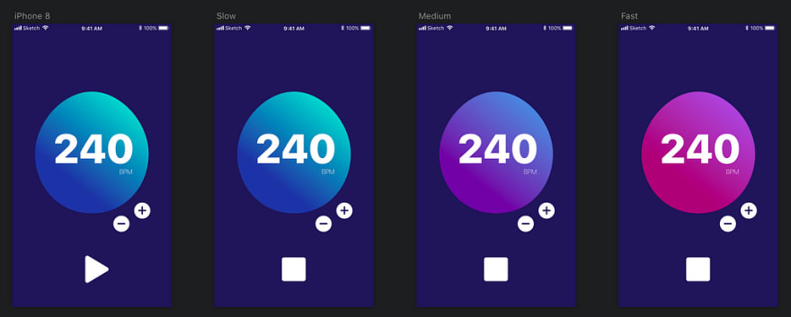
A rough mock-up can help identify possible issues in user experience and cut out unnecessary work when it comes to building a new feature. A high fidelity prototype can push the user interface beyond the ordinary to deliver a visually cohesive experience. It can be useful for getting everyone on the same page on where the bar is set. It may inspire more excitement around what you’re building.
The goal of creating the mock-ups for metronome was to try and sell the idea to myself and the users I’d shown it to. It also helped surface questions and concerns about some of the functionality of the app. The design went through a few iterations but it gave me a place to start building. High fidelity mock-ups were also instrumental in selling the idea to others. I gained useful insight from users when showing the mock-ups. They told me what their expectations were and what they wanted to see, without me having to create a working prototype at all. Once the blueprint was in place, it made building the UI much easier.
I haven’t progressed this project any further due to time and viability but I still believe in this process of bridging the gap. It has helped me craft experiences I am proud of making, I hope it will help me craft many more.
- Test what you’re unsure of to minimize risk and fail fast with by prototyping
- Inspire by creating something to strive toward with mock-ups
- Bridge the gap between your minimum viable product and your idealized target
If you’d like to know more about my process, you have questions or would like to know about some other projects I’ve worked on, let me know.
You will likely never see this app on the App Store but I hope that showing the process I took, will inspire you to imagine, create, and bridge the gap.


Top comments (0)