Hey,
we constantly get feedback that we incorporate into the product. Based on your feedback, we changed some aspects on our UX and we will do some more in the coming days. Here is a first glance...
Suggestions Page
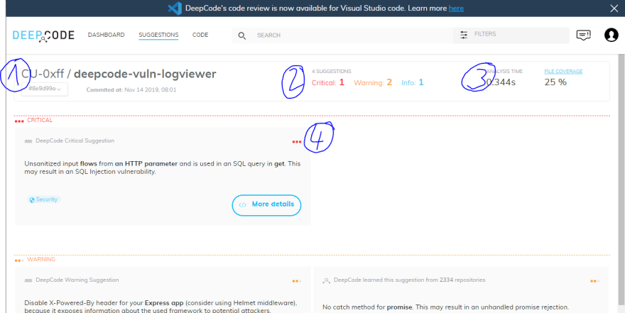
This is the new layout of the Suggestion page. On the top left (Number 1), you see the current repo and you can select which branch to work on using the drop down. Mid top (Number 2), you find how many different suggestions and their category were found. Top right (Number 3), you can find how long it took DeepCode to scan and what amount of files were covered. By clicking on File Coverage, you can drill down on what file types were scanned or not. Lastly (Number 4), we have the typical Suggestion tiles.
Suggestion Detail Page
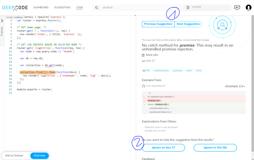
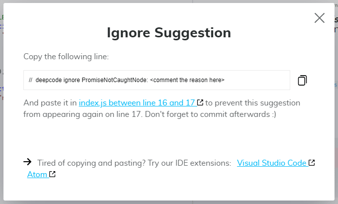
Also a few changes in Suggestion Details. We implemented the option to flick through the suggestions quickly (top right, Number 1) to get an overview. Also, we included help to add the ignore comments (lower right, Number 2). As you might know, you can switch off suggestions made by DeepCode by using comments. We provide these comments that would switch off the suggestion.
We hope you find these changes helpful. Also, check out the Visual Studio Code Extension and our Atom Package. But - for sure - check us out at deepcode.ai.


Top comments (0)