I've had the idea to rebrand my SaaS ploi.io for a long while now, but the biggest problem was that I am a core backend developer and not good at designing.
Luckily for me I have a designer friend who helped me setup a whole new brand for ploi: and boy was it a challenge 💙
We used to have the green color, but I always liked blue more over green. Which makes me feel its a whole more complete product now.
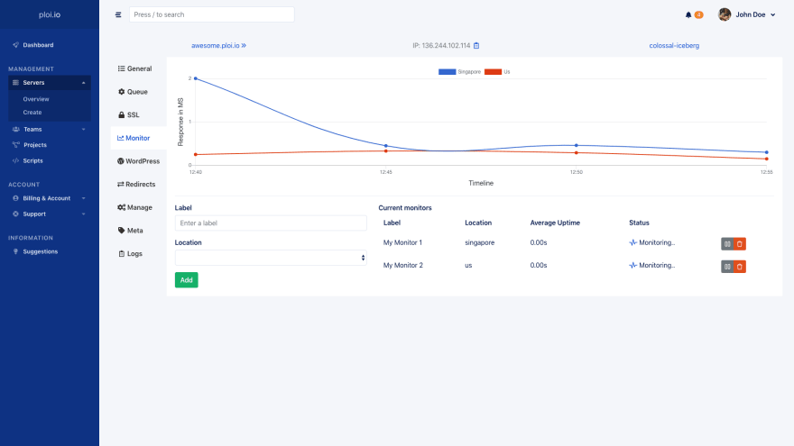
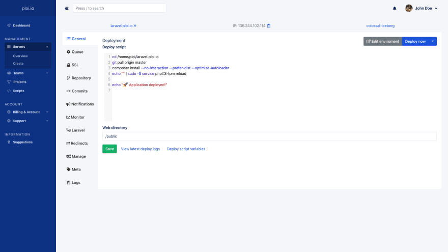
With the frontend redesigned and rebranded - we couldn't leave the panel behind (which is the most important part of the complete application).
So we overhauled that too! (Image in header and below this post some more screenshots)
Oh, and we are on product hunt too!
To sum up the changes;
- Ditched our logo (all text now)
- Changed branding color from #62A6A6 to #1853DB
- Completely redesigned frontend website
- Completely hauled over the panel design
- Changed login, register & password forget page
- Code editor highlighting added
- Exported sites & servers to 1 general search bar
- A lot of new features added to API (server creation is still in progress & changelog page is coming to https://developers.ploi.io)
- Ability to export personal user data to see what we save
- Speed improvements panel
- Bug fixes panel
I am really curious to hear what you think of the rebranding and new design, let me know!


Top comments (1)
Looked at your site. How is this different than just using the server creation consoles in Linode or Digital Ocean?