CSS Grid Layout is used to divide a page into major parts.
Like tables, grid layout make an author to align elements into columns and rows. However, by the use of CSS grid we can easily make attractive looked webpages. By using it we can easily make responsive website with pixcl perfection.
Example:
HTML:
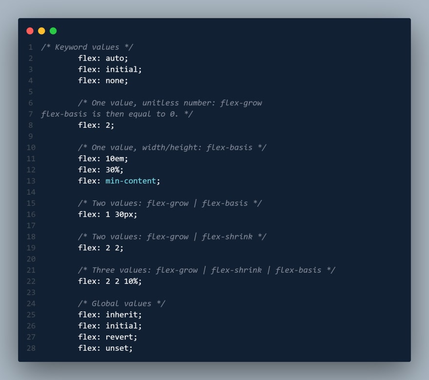
The flex CSS shorthand property is the combination of flex-grow, flex-shrink, and flex-basis property. It is used to set the length of flexible items. The flex property is much responsive and mobile-friendly. It is easy to position child elements and the main container. The margin doesn’t collapse with the content margins. The order of any element can be easily changed without editing the HTML section.
Syntax:


Top comments (0)