Here at Asurion, I’ve found the design team to be some of the most fun and interesting coworkers around. Somehow as a software engineer, I’ve infiltrated the ranks and have been invited to their happy hours, lunches, and even bowling events.

Engineering and Design are two of the three main components of a Product Team. Asurion uses what we call a Product Team which is made up of 1 Product manager, 1-2 Designers, 1 Engineering lead, and multiple engineers.
Product teams use data and metrics to measure whether they are achieving this outcome and iterate accordingly. Product teams follow agile software development best practices and focus on functional features, not projects.
Product designers often are responsible for the whole user experience, not just the visual components. They try to create typically digital experiences that solve customer and business problems, through design research, testing, and collaboration with engineering and product.
What's The Problem?
An issue I've seen too many times is where some review happens after code is pushed and merged into main, now deployed on QA/Dev, or even worse on Prod, and the designer is surprised to see something different than the designs! They could be small issues like font boldness, incorrect copy, spelling errors, spacing, or even bigger problems like incorrect icons or images.
Let’s face it, it's frustrating to miss the mark after you think you’ve finished developing something. Having to make small changes can be annoying, we all know that. To hear “looks great, but that’s the wrong font size, the alignment is weird here, etc.." can seem trivial, but good design and its execution is in the details. Sometimes these changes stem from a failure to communicate a design update or even that a design itself is unfeasible. Did the designer not clearly convey the goal? Or perhaps it was just an oversight on the engineer’s part.
It’s understandable, as engineers we are often focused on getting the app to function properly and prioritize that above getting the UI to be pixel perfect. For example, I often aim to get the elements roughly laid out and then start hooking things up for the feature function properly. By the end, I have become so focused on the functionality that I’ve forgotten to re-reference the design closely to make sure everything is correct. This could be an honest mistake early on. Hopefully this reputation is fading, but engineers are sometimes known for being grumpy or reluctant to admit they missed certain marks regarding the UI, or sometimes argue even the importance of the target.
However, our design friends worked hard on that design. We owe it to them and the rest of the team to make sure things are precise before we think we are “done.”
"The Solution"
I originally wanted to write this article and reveal that I had discovered the “solution” to this problem and present it in a very actionable, pragmatic way. “If we only did this!” Hoping “this” would be some technical solution or framework we could apply to ourselves. But as it often turns out, the answer is a lot more human than computer underneath it all.

For this article, I took a similar approach as I did with my last article and decided to meet with a few people from Design here at Asurion at different leadership and contributor levels to get their opinions and insight. Overwhelmingly the "answer" I was looking for was communication and context! Sometimes just saying "we need to communicate better" can get you a pat on the back in some meeting, but let's explore what this can look like.
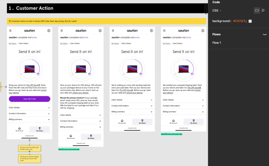
Say you are a typical individual contributor engineer and you have received a Figma file (or similar UI/UX design tool) with something like this. Ideally you've had some communication and have been involved on the conversations leading up to receiving this file, maybe even had some input on the feasibility of the design from an engineering perspective.

Angie Li, Senior Manger Design, and myself discussed the attitude that engineers can be too satisfied with simply receiving the assets and design and being told what to build. There can even be reluctance on participating in the overall design conversation. I've personally heard the words, "I don't care what the design is; just tell me what to build." The more collaboration and communication before a hand-off, the easier it is for everyone to do their job well.
Coran Lapierre, Senior Principal- DesignOps, took time with me to look over some of the various ceremonies designers and the product team do/are encouraged to do as they begin building a large scale feature. Many of the processes focus on trying to clearly understanding the business problem and iterating over it the larger product team with ceremonies like Kickoffs and Background Briefs. Some of these ceremonies happen at the beginning of a new initiative, but some can happen ad-hoc such as a design review where the designer shares with the rest of product team any updates or development on the design. If you have the opportunity to attend these larger cross-functional meetings do so. Try to go out of your way to understand the whole product lifecycle and the steps that lead to you actually receiving the designs that you are working from. It can really illuminate the designs and enable you to more effectively from them.
Clear Line of Communication
You've done your due diligence in understanding the product and the features and now you actually have the design. Both Josh Sullivan and Ann Bomar, Senior Product Designers, encouraged engineers to establish an open line of communication while you're working on a new feature. "Don't ever feel like you're bugging", Josh said. If you have questions are unsure about something, don't assume too much. Your approach can be as simple as a Slack message saying "Hey, can I show you this?" Sometimes you might need some quick feedback, but other times you may need to show the designer that there might be some UX considerations not accounted for. Ann mentioned a an instance where she was unaware that a transition from one screen to the next required an API call and would need some sort of transitional state to be reflected in the UI while the data loaded. Stay connected and updated with your designer as your building things out!
Understand the Tooling 🛠️
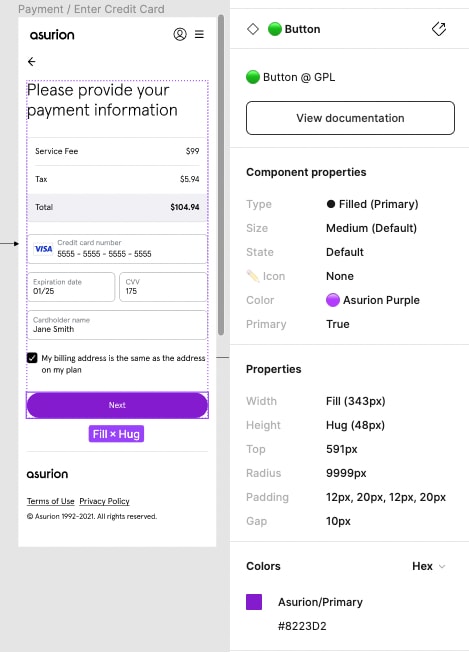
If your team is using Figma, learn how to use the tool from a developer perspective. Most design tools including Figma will have an inspect mode where you can observe and copy property values for UI components. Here is an article specific to Figma. If your team is using a different tool, take time to understand the inspection features. Additionally, ask your designer for any tips or tricks on navigating the files; as we know, keyboard shortcuts can go a long way in terms of efficiency!
Does it look black? It’s probably not.
"You might think it's #000000 but it could be #111111" says Ann, somewhat facetiously. In all seriousness, things may not always be as they seem. Look closely at the inspect tool!
Common pitfalls in building out designs are made from lack of attention to detail and making assumptions. Double check the details against the design and make sure you are using the correct font weights, alignment, spacing, etc...
Never Build A Button From Scratch, Or More Than Once
At Asurion, we have a great UI library called AsurionUI that maps to the Asurion Design System. You'll notice in the above picture that in the Inspect panel has a section labeled "Component Properties" and above it "Button". The 🟢 next to Button shows that this component is ready to use and implemented in the AsurionUI library. The component properties correspond with React props that you pass to the component. Ideally and in most cases, that's the bulk of what you need to get the button to match the design! If you are an Asurion software engineer working on the web, you are likely familiar with this component library. However there might be a case where a newer engineer might not be that aware of how the system works and might develop begin to develop a component that already exists. Take time to show each other the ins and outs of a system like this and how it is integrated on Figma and through the code. If your organization doesn't have something like this, consider developing it! (Easier said than done :))
One Last Thing
Lastly, no one likes making small content changes in the code! Changing the wording from "Continue" to "Next" on a button is not my favorite or most productive code change to raise a PR for. But sometimes, we code the wrong copy in, or the copy itself needs to be changed. Many teams at Asurion are using Contentful to manage their content: everything from images, icons, copy, and even localizations. If you take time to implement Contentful into your product, it can see both yourself, Design, and Product some headaches in updating or correcting your projects copy and make everyone happier!
Conclusion
The takeaways that I learned from talking to the Design team are take time to understand the context of what you are developing, communicate early, often, and effectively when it comes to building out the designs, and learn to use the tooling effectively. Respecting the designer perspective and having empathy for the different functions of your team can go a long way in creating a strong, productive, and successful team! Mistake will still happen, but I can assure you there will be less if you consider these tips!


Top comments (0)