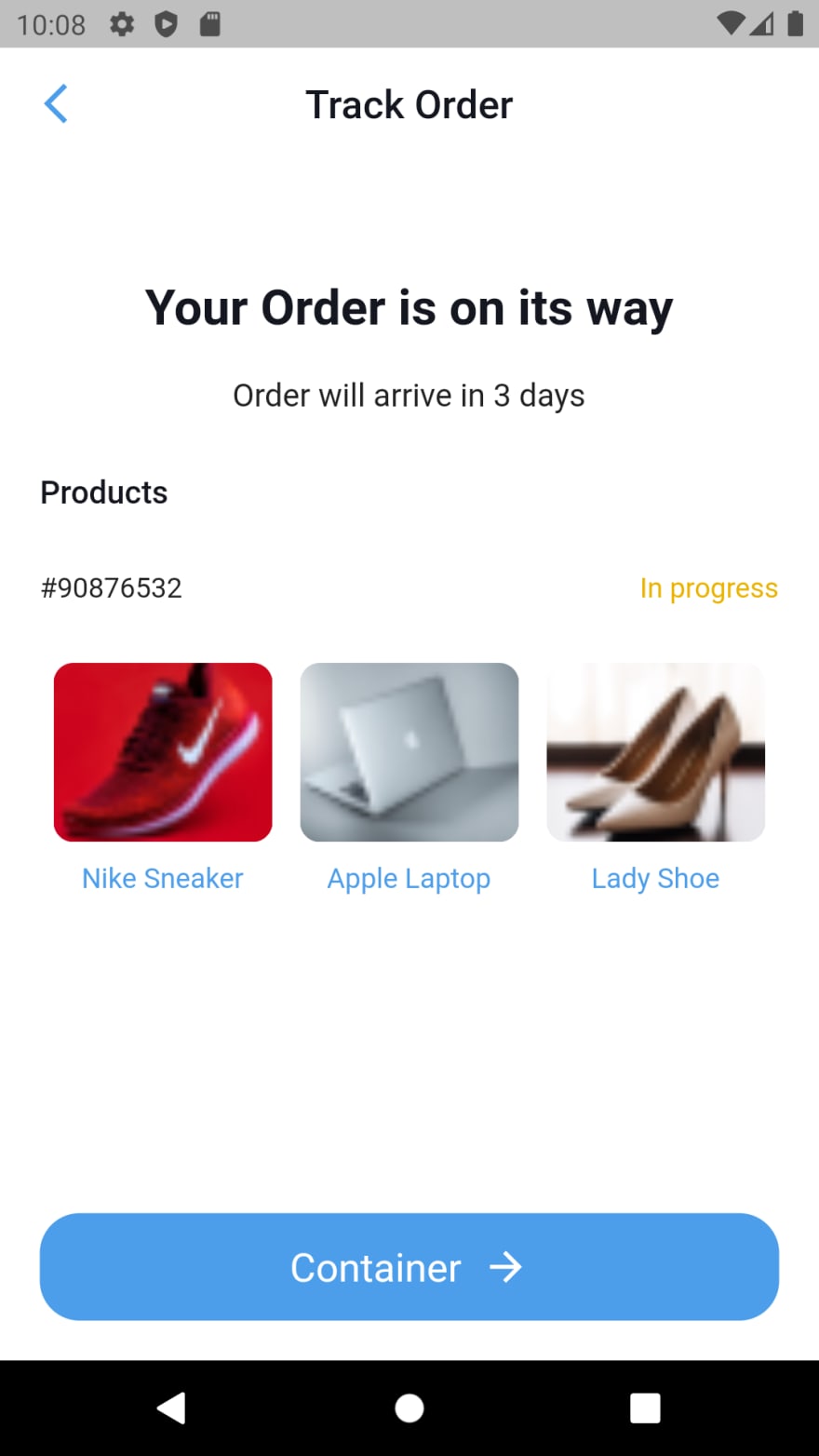
In this episode we shall be coding another simple UI. Our aim is to help every beginner understand how to analyze and code any UI, both simple and complex.
This is the second screen in this series. You can check the first episode if you want to. Everything is on github.
The project has two folders and two separate files. The folders are screens (contains all the screens or pages) and widget (contains reusable widgets), colors file and main file. All the colors used across the app are in the colors file, the app is ran in the main file
Lets analyze the screen
We have the first row which is the app bar
The app bar has a leading icon and a centered text widget
      AppBar(
        backgroundColor: AppColors.backgroundColor,
        centerTitle: true,
        leading: const Icon(
          Icons.arrow_back_ios_new,
          color: AppColors.lightBlue,
        ),
        foregroundColor: AppColors.darkText,
        elevation: 0,
        title: const Text(
          'Track Order',
          style: TextStyle(color: AppColors.darkText),
        ),
        // leading: Icon(),
      ),
We wrapped the body with a container in order to apply padding to the whole screen.
If you check the content of the screen properly, you will notice that the widgets are vertically aligned. This makes the general content a column widget. Like we defined, Column widgets has children that are vertically aligned.
Lets quickly analyze the content of the body before we look at the code
The first child widget of the column widget is a column. This column has two child text widgets that are aligned to the center.
We created a container widget with a text widget as a child. We created a container so that we can give it full width and align the text to the left. Diagram is below
Next to that is a Row widget of two text widgets. We used main axis alignment to horizontally separate them. Diagram below
Then we have an image with a text at the bottom. For this we created a reusable widget. Diagram below
Lastly is the button. For this, we created a container with a Row of text and icon widgets as children.
That is the general structure of the app. The code is below;
First is the code for the colors file
import 'package:flutter/material.dart';

class AppColors {
  static const Color backgroundColor = Color(0xFFFFFFFF);
  static const Color lightBlue = Color(0xFF4C9EEB);
  static const Color darkText = Color(0xFF14171F);
  static const Color myCartBackgroundColor = Color(0xFfE5E5E5);
  static const Color inProgressColor = Color(0xFFEBB300);
}
Then the code for the button
import 'package:flutter/material.dart';
import 'package:mobile_ui_screen_series/colors.dart';

class ImageAndText extends StatelessWidget {
  ImageAndText({Key? key, required this.image, required this.text})
      : super(key: key);
  String image;
  String text;

  @override
  Widget build(BuildContext context) {
    return Column(
      children: [
        Container(
            width: 110,
            height: 90,
            decoration: BoxDecoration(
                borderRadius: BorderRadius.circular(10.0),
                image: DecorationImage(
                    fit: BoxFit.cover, image: AssetImage(image)))),
        const SizedBox(
          height: 10,
        ),
        Text(
          text,
          style: const TextStyle(color: AppColors.lightBlue),
        )
      ],
    );
  }
}
We also have the track order screen
import 'package:flutter/material.dart';
import 'package:mobile_ui_screen_series/colors.dart';
import 'package:mobile_ui_screen_series/widgets/image_and_text_container.dart';

class TrackOrderScreen extends StatelessWidget {
  const TrackOrderScreen({Key? key}) : super(key: key);

  @override
  Widget build(BuildContext context) {
    return Scaffold(
      backgroundColor: AppColors.backgroundColor,
      appBar: AppBar(
        backgroundColor: AppColors.backgroundColor,
        centerTitle: true,
        leading: const Icon(
          Icons.arrow_back_ios_new,
          color: AppColors.lightBlue,
        ),
        foregroundColor: AppColors.darkText,
        elevation: 0,
        title: const Text(
          'Track Order',
          style: TextStyle(color: AppColors.darkText),
        ),
        // leading: Icon(),
      ),
      body: Container(
        padding: EdgeInsets.all(20),
        width: double.maxFinite,
        child: Column(
          mainAxisAlignment: MainAxisAlignment.spaceBetween,
          children: [
// column of text and images
            Column(
              children: [
                // Column of text
               const  SizedBox(
                  height: 40,
                ),
                Column(
                  crossAxisAlignment: CrossAxisAlignment.center,
                  children: const [
                    Text(
                      'Your Order is on its way',
                      style: TextStyle(
                          color: AppColors.darkText,
                          fontWeight: FontWeight.bold,
                          fontSize: 25),
                    ),
                    SizedBox(
                      height: 20,
                    ),
                    Text('Order will arrive in 3 days',
                        style: TextStyle(
                          fontSize: 16,
                        )),
                  ],
                ),
               const SizedBox(
                  height: 30,
                ),
                // Container Text
                Container(
                  width: double.infinity,
                  child: const Text(
                    'Products',
                    textAlign: TextAlign.left,
                    style: TextStyle(
                        fontSize: 16,
                        color: AppColors.darkText,
                        fontWeight: FontWeight.w500),
                  ),
                ),
                const SizedBox(
                  height: 30,
                ),

                // Row of text
                Row(
                  mainAxisAlignment: MainAxisAlignment.spaceBetween,
                  children: const [
                    Text(
                      '#90876532',
                      style: TextStyle(
                          // fontSize: 16,
                          color: AppColors.darkText,
                          fontWeight: FontWeight.w500),
                    ),
                    Text(
                      'In progress',
                      style: TextStyle(color: AppColors.inProgressColor),
                    ),
                  ],
                ),
                const SizedBox(
                  height: 30,
                ),
                // Row
                Row(
                  mainAxisAlignment: MainAxisAlignment.spaceAround,
                  children: [
                    // column of image and text
                    ImageAndText(
                        image: 'assets/images/snicker.png',
                        text: 'Nike Sneaker'),
                    ImageAndText(
                        image: 'assets/images/apple.png', text: 'Apple Laptop'),
                    ImageAndText(
                        image: 'assets/images/lady.png', text: 'Lady Shoe')
                  ],
                ),
              ],
            ),

            // container button
            Container(
              width: double.infinity,
              padding: EdgeInsets.symmetric(horizontal: 10, vertical: 15),
              decoration: BoxDecoration(
                  borderRadius: BorderRadius.circular(20),
                  color: AppColors.lightBlue),
              child: Row(
                mainAxisAlignment: MainAxisAlignment.center,
                children: const [
                  Text(
                    'Container',
                    textAlign: TextAlign.center,
                    style: TextStyle(
                        color: AppColors.backgroundColor, fontSize: 20),
                  ),
                  SizedBox(
                    width: 10,
                  ),
                  Icon(
                    Icons.arrow_forward,
                    color: AppColors.backgroundColor,
                  )
                ],
              ),
            )
          ],
        ),
      ),
    );
  }
}
Lastly is the main file
import 'package:flutter/material.dart';
import 'package:mobile_ui_screen_series/screens/track_order_screen.dart';

void main() {
  runApp(const MyApp());
}

class MyApp extends StatelessWidget {
  const MyApp({Key? key}) : super(key: key);

  // This widget is the root of your application.
  @override
  Widget build(BuildContext context) {
    return const MaterialApp(
        debugShowCheckedModeBanner: false,
        title: 'Flutter Demo',
        home: TrackOrderScreen());
  }
}
Thanks for reading. Its my pleasure to make sure you understand. You can drop your questions, and if you have any difficult UI mockup, I can guide you on how to go about it.
Github link here


Top comments (2)
Hey. thanks!!
Ooh thanks alot. I will look at it