ASP.NET Core is a cross-platform, high-performance, open-source framework for building modern web, cloud and internet based applications. We can also develop Web APIs, mobile apps and client site single page applications using our favorite development tools on Windows, macOS and Linux. Microsoft introduced many new features in ASP.NET Core 1.0 to 3.1 releases such as Razor Pages, Blazor etc. In this article I will teach you about one of the newly introduced feature of ASP.NET Core called View Components. I will explain the difference between View Components and Partial Views. I will also explain how can we implement reusable view components which can also be parameterized to customized to generate different response in different parts of the web application. We will be creating a weather widget view component which will display the current weather information of the city we will pass as a parameter to the view component.
What are View Components
View Component are powerful, self-contained, reusable UI components which can consistently generate reusable HTML from a razor view. They can generate both static and dynamic contents which can be customized further using parameters. View Components can also be used to connect backend databases or services to fetch data. Here are the important points to remember when implementing View Components
- View Components are suitable for rendering a chunk rather than a whole response. This makes them ideal for rending UI elements, widgets, dynamic menus, shopping cart, login page, sidebars etc.
- View Components don’t support features like View Data or Data Binding and only depend on the data provided to them at runtime as parameters
- View Components support separation of concern and testability benefits in a sense that they always generate consistent output no matter where they are used.
- View components can be parameterized to customize the output, and they can also have their own business logic.
View Components vs Partial Views
They are designed to do everything that a Partial View was doing in previous versions of ASP.NET and more. When we use partial view, we still have dependency on controller, and we can access View Data and controller contents while in View Component we don’t even need a controller. View Components have their own separate class which can run some business logic and generate response using razor view. We can think View Components as mini controllers with less overhead than a full MVC Controller.
Creating a View Component
A View Component consists of following two parts
- A class typically derived from a Microsoft.AspNetCore.Mvc.ViewComponent object
- A view to render the response generated by the View Component
There are many ways you can create your own View Component class. You can derive your class from ViewComponent as mentioned above
public class Navbar : ViewComponent
{

}
You can decorate your class with a ViewComponent attribute
[ViewComponent]
public class Navbar
{

}
You can also follow the naming conventions and simply create a class with the suffix ViewComponent
public class NavbarViewComponent
{

}
Let me walk you through a simple ASP.NET Core 3.1 demo application in which we can learn how to create and use our own View Components. For this tutorial, I am going to use Microsoft Visual Studio 2019 but you can also create ASP.NET Core 3.1 web application using command line tools e.g. dotnet if you want.
First, let’s create a new ASP.NET Core Web Application project in Visual Studio 2019. For this tutorial, I have chosen ViewComponentsDemoApp as the project name. Once your project is open in Visual Studio, press F5 to make sure your project is building and running without any error. If everything is fine, you should be able to see the following output in your browser.
Before we create our custom view component or its associated view file please note that the runtime searches for the view in the following paths:
- /Views/{Controller Name}/Components/{View Component Name}/{View Name}
- /Views/Shared/Components/{View Component Name}/{View Name}
- /Pages/Shared/Components/{View Component Name}/{View Name}
Off course, just like everything else in ASP.NET Core, we can customize the view search path and guide the runtime to look for the views somewhere else but for simplicity I have decided to use one of the default view path.
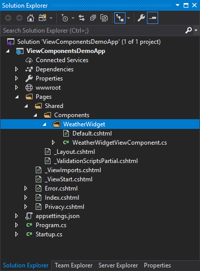
Create a Components folder in Shared folder and inside Components folder create a folder called WeatherWidget. This folder will contain both the class and the view file of our custom view component.
Inside WeatherWidget folder, create a class named WeatherWidgetViewComponent and a view named Default.cshtml. The reason I created the view with the name Default.cshtml is because in ASP.NET Core default view name for a view component is Default. We can give our view a different name but then we have to specify the new name in order to use it. I will recommend that you name your views Default.cshtml so that runtime can find them automatically at Views/Shared/Components/{View Component Name}/{View Name} path without any special configuration.
To keep things simple in the start, I implemented a simple view component below that simply passes a single parameter cityName when invoked.
public class WeatherWidgetViewComponent : ViewComponent
{
    public IViewComponentResult Invoke(string cityName)
    {
        return View("Default", cityName);
    }
}
Keep following points in mind when you are implementing view components methods
- You can define your logic in synchronous Invoke method that returns IViewComponentResult as shown in above example or you can define your logic in InvokeAsync method that returns Task. We will see the example of this method in action later in this tutorial.
- Most of the time, you will initialize your model in Invoke or InvokeAsync methods and will pass the model to a view by calling ViewComponent View method.
- Inside Invoke or InvokeAsync methods, there is no model binding and you don’t handle HTTP request. You should use the parameters passed to the method instead of any data available in HTTP context.
Inside our Default.cshtml view file I added just two lines. The first line says that the model type passed in is just a string, and the second line renders that string wrapped in an h2.
@model string

<h2>@Model</h2>
Invoking a View Component
It is now time to invoke our simple view component from a razor view or layout page. To use the view component, we need to call InvokeAsync method of Component class inside a view, and we can also pass parameters as shown below.
@await Component.InvokeAsync("WeatherWidget", new { cityName = "London" })
Press F5 to run the project and you will see the parameter value displayed on the page as h1 heading.

If you are using ASP.NET Core 1.1 and higher, you can also invoke a view component as a Tag Helper. The syntax to invoke view components as Tag Helpers is following
<vc:[view-component-name]
  parameter1="parameter1 value"
  parameter2="parameter2 value">
</vc:[view-component-name]>
so if we want to invoke our WeatherWidget component we can use following code
<vc:weather-widget city-name="London"></vc:weather-widget>
Please note that to use a view component as a Tag Helper, you need to register the assembly containing the view component using the @addTagHelper directive to the _ViewImports.cshtml file. For the purpose of this tutorial, I added following line in _ViewImports.cshtml file
@addTagHelper *, ViewComponentsDemoApp
So far our view component hasn’t provided us any special value as it is only rendering h1 element which we could easily render without even using view components. Let’s add some logic and data into our view component to make it more reusable and useful component.
For a variation, replace the Invoke method with InvokeAsync method and call a method GetWeatherInfo that returns hard coded weather information for London, New York and Paris based on the cityName parameter passed to it. In real world application, you can call a weather web service here to fetch the real data for your applications.
public class WeatherWidgetViewComponent: ViewComponent {

  public async Task < IViewComponentResult > InvokeAsync(string cityName) {
    var response = await GetWeatherInfo(cityName);
    return View("Default", response);
  }

  private async Task < WeatherInfo > GetWeatherInfo(string cityName) {

    var obj = new WeatherInfo();
    obj.City = cityName;
    obj.Date = DateTime.Now.ToString("dddd h:mm tt");

    if (cityName == "London") {
      obj.Icon = "cloudy.png";
      obj.Condition = "Cloudy";
      obj.Precipitation = "7%";
      obj.Humidity = "70%";
      obj.Wind = "6 km/h";
    }
    else if (cityName == "New York") {
      obj.Icon = "partly_cloudy.png";
      obj.Condition = "Partly Cloudy";
      obj.Precipitation = "17%";
      obj.Humidity = "80%";
      obj.Wind = "16 km/h";
    }
    else if (cityName == "Paris") {
      obj.Icon = "rain.png";
      obj.Condition = "Rain";
      obj.Precipitation = "67%";
      obj.Humidity = "20%";
      obj.Wind = "9 km/h";
    }

    return obj;
  }
}
I have used following WeatherInfo model class in above example so you can also create this class inside Models folder created at your project root level
namespace ViewComponentsDemoApp.Models
{
    public class WeatherInfo
    {
        public string City { get; set; }
        public string Date { get; set; }
        public string Icon { get; set; }
        public string Condition { get; set; }
        public string Precipitation { get; set; }
        public string Humidity { get; set; }
        public string Wind { get; set; }
    }
}
o render more professional UI element instead of a simple h1 element, I added bootstrap card markup inside our Default.cshtml view as follows. Note that the WeatherInfo object is now used as a model.
<div class="card">
    <div class="card-body" style="width:200px;">
        <h5 class="card-title">@Model.City</h5>
        <p class="card-text">
            <span class="text-muted">@Model.Date</span>
        </p>
        <img src="@("/images/" + Model.Icon)" class="card-img-top" style="margin:auto; width: 65px;">
        <h6 class="text-muted">@Model.Condition</h6>
        <br />
        <div>Precipitation: <span>@Model.Precipitation</span></div>
        <div>Humidity: <span>@Model.Humidity</span></div>
        <div>Wind: <span>@Model.Wind</span></div>
    </div>
</div>
Finally, I invoked WeatherWidget view component three times and passed different city name as a parameter.
<div class="text-center">
    <h2>World Weather</h2>
    <br />
    <center>
        <div class="container">
            <div class="row">
                <div class="card-group" style="margin:auto;">

                    <vc:weather-widget city-name="London"></vc:weather-widget>

                    <vc:weather-widget city-name="New York"></vc:weather-widget>

                    <vc:weather-widget city-name="Paris"></vc:weather-widget>

                </div>
            </div>
        </div>
    </center>
</div>
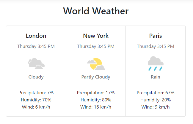
Press F5 to run the example and you will see that our WeatherWidget view component has generated the weather information of all three cities passed as parameter.
Summary
In this tutorial, I talked about one of the cool feature of ASP.NET Core view components and how they can help you in extending your views and provide more reusable functionality for the users. Keep visiting my website to read more articles on other areas of ASP.NET Core and related technologies.


Top comments (2)
Nice 🤠
✨PERFECT✨