In the early days of the internet, the World Wide Web was a collection of static webpages. Updating these pages required a meticulous process of manually uploading each change to the server as a separate file. Given this long procedure and the sluggish download speeds associated with dial-up modems at the time, it was in everyone’s best interest to deliver information as plainly and efficiently as possible. One couldn’t run the risk of making the user wait a lot of time just to load a webpage full of garbage.
Then came the technological improvements that led to the internet as we know it today. ADSL and fiber allowed for a thousand-fold increase in speed. Scripting technologies like Javascript and AJAX allowed webpages to seamlessly fetch items from the server helped build complex sites like Google Maps. The problem with the internet of today is that these tools that were built to make navigating the internet faster and easier, have had the precise opposite effect. Driven by counterintuitive design trends and legislation, Javascript has been used extensively to display intrusive pop-ups and to override native scroll behavior. The overhead in data rates has been used to deliver annoying autoplay videos. The agressive expansion big corporations has led to a high proportion of ads silencing what’s important.
This has impacted people differently depending on revenue and location. On average, bandwidths in urban areas are twice as high as in rural areas. In developing regions such as Africa and the CIS, average internet bandwidth is at less than a third of that of developed regions such as Europe. This means that internet-heavy technologies such as autoplaying web video have an even worse impact on users in rural and developing regions.
The aim of this article is to explore issues in information delivery and to figure out how what we can do to make the internet a better place for everyone.
Accessibility
A common design trend on websites has been to use new CSS specifications to drastically change how the website is displayed on the web. The more drastic ones go as far as implementing custom scrollbars (or worse, not displaying any scrollbars at all!) and scrolling interactions, also known as scroll hijacking.
Most users are familiar with the way their operating system handles common interactions such as scrolling, and they may have customised the settings to their liking. Another problem is that OS implementations are much likelier to accommodate for accessibility, whereas custom implementations often overlook accessibility.

A customised scrollbar on css-tricks.com
These recent design trends are part of a bigger problem: the trade for design over function. A good-looking website isn’t necessarily the best website: Regardless of it’s content, a website shouldn’t make users feel disoriented, or even worse, unable to navigate the website.
I personally looked into ten websites featured on Awwwards, a company that makes “Website Awards that recognize and promote the talent and effort of the best developers, designers and web agencies in the world”. Of the ten websites I visited on desktop,
- 7 implement scroll jacking i.e. the scrolling speed and inertia is different from my OS settings
- 2 use a custom cursor i.e. the pointer is not the default one provided by my OS
- 1 website uses a custom scrollbar
- 1 website displays no scrollbar at all.
Say what you want, but if ~70% of the “talent and effort of the best developers” results in unfamiliar scroll behavior, this is telling of a deeper issue in the web design world.
Best practices
Here are a few best practices that can be taken into consideration to reduce potential accessibility issues.
Use native implementations when possible. For many website interactions, browsers expose OS elements and functionality. Because they are directly provided by the OS, they handle accessibility … such as tabular navigation better. They can often be accessed through a CSS class. For example, scrollbars, cursors, hyperlinks.
Respect contrast recommendations. Make sure the foreground and background colors respect WCAG guidelines on color contrast (here’s a tool to check the contrast between colors). Bad contrast will disproportionately impact users with color blindness.
Don’t display irrelevant or unexpected content. Many users will click to your site as a result of a search. If they’ve clicked on that link, it’s because they expect the webpage and its content to match what they were looking for.
For example, if a page is a programming tutorial in the form of an article, they will likely visit it if they’re looking for a written tutorial. In this case, displaying a large, autoplaying video would be irrelevant, and most likely be more annoying than useful. They won’t be likely to be expecting pages and pages of backstory on the history of the tutorial or of the language.
The a11y project has developed a web accessibility checklist with best practices regarding content, layout and visual design. While it may be difficult to tick everything off the list, and I certainly don’t claim to have done so, it’s a good indicator to know where you are at regarding accessibility.
Search engines
Much of the online content we come across today is with the help of search engines. To be able to display the content efficiently, search engines need to index websites beforehand. This is done with the help of robots, called crawlers, that navigate webpages and search for keywords that would be relevant to the page. With the development of crawlers, techniques to optimise webpages for them were developed, appropriately dubbed Search Engine Optimisation.
The issue is that crawlers have trouble replicating the ways humans navigate, and often fall for techniques aimed to improve search rank, i.e. the position of a webpage in a search result. Crawlers tend to appreciate verbose pages with a diverse range of keywords, while humans often prefer straight to the point content from which they can glean information as efficiently as possible. Think of someone searching for a recipe: they have the exact meal they want in mind, and their goal is to know the ingredients and preparation steps. More often than not, results will contain a lengthy backstory on the history of the recipe, the author’s grandma etc. before getting to the actual recipe. This isn’t relevant to the user’s search, but the crawlers latch onto the numerous recipe-related keywords in the backstory which is the reason the recipe ranked so high up in the users search.
Over time, websites have become less and less targeted towards humans, and more towards search engines. This paradoxical, since the end consumer remains the same whether the website has been found directly or through a search engine: the human reader. The situation is that since search engines control people’s access to a website, websites optimised for humans are less likely to be visited than websites optimised for search engines. Websites less visited earn less revenue, so website creators have no choice but to favor crawlers over humans, and to have an inefficient delivery of information.

A robot feeding websites to a human. [AI-generated]
The need for human input
The main factor that has led to this dystopian trend is the complete removal of human input from the process of crawling websites. As long as robots are unable to replicate human behavior, we need to add humans to the feedback loop so that content relevant to humans is favored. This could be done in the form of a upvote/downvote button at the bottom of search results.
Ads
A large amount of the content we come across on the internet is sponsored. It is estimated that a whopping 21.2% of posts shown to users on Facebook and 20.6% on Instagram are advertisements. Revenue from advertisements make up over 80% of Google’s annual revenue in 2022. This is a conflict of interest as the company which controls the way 91% of people search earns more by manually overriding its algorithm.
Let’s look at the some of the main types of ads:
Pop-up and prestitial ads. These ads open a modal in front of content, often as soon as the page loads. On video content, they appear before the video. They provide a frustrating experience to the user as they provide an obstacle before the user is able to access content.
Sticky ads. These ads appear when scrolling down and stick to the viewport for some time as the user scrolls, lengthening the amount of time the ad is displayed.
Inserted ads. These ads appear in content such as social media posts or emails, and are crafted to look visually similar to the rest of the page. This is frustrating for the user as they have trouble distinguishing ads from what’s important.
Inserted ads in Gmail and Twitter respectively
Most users are frustrated by countdown ads which they can’t click or scroll away from, as well as ads that take up a high proportion of the screen (over 30%). It is clear that ads impact mobile and desktop devices differently: the same ad size takes up a higher proportion of the screen on mobile than on desktop.
Over the years, as online companies seek to increase year-on-year revenue, they have traded usability for profitability by making their ad strategy increasingly agressive in an attempt to squeeze the most money out of their services. Ad density has increased, and they are harder to distinguish from non-sponsored content. Youtube tried showing as many as 10 unskippable ads in 2022, Gmail experimented embedding ads in the middle of content in 2023, and I long for the sweet old times when Instagram didn’t show ads.
This has resulted in a game of cat and mouse – as platforms increase the proportion of ads, users become frustrated. This increases their chances of using an ad blocker, which in turn causes websites to use ad block detectors to as an incentive to turn them off. The situation has gotten so bad that I’ve found found that disabling Javascript on some websites makes the whole navigation experience more friendly: there’s much less ads and this even removes paywalls on some websites.

Cat and mouse: Websites detecting ad blockers and displaying pop-ups

Youtube ad blocker detection, which rolled out in Q4 2023
Now don’t get me wrong, I’m not saying we should remove all ads, as they help offset operating costs of platforms and keep them free, however the agressive growth tactics of large corporations has led to an excessive amount of ads on the web. I believe we need to rethink the way we present ads in order to put the end user back into the frame.
The coalition for better ads is an organisation formed by a group of large corporations in order to improve the standards of ads online. They provide guidelines and best practices for different types of ads. While this is on the right track, it isn’t enough: for example, despite Google being a board member of the organisation, and having pledged to block ads that are deemed below certain standards regarding user experience on Chrome, still extensively uses mid-roll ads on its video platform without blocking them.

Google Chrome’s pre-installed ad limiter
A note on cookies
With the introduction of GDPR in the EU in 2018, almost all websites display cookie pop-ups when you first load a page. While it may not be that annoying on websites you frequently visit, such as Google, since it’s only displayed once, it becomes quite frustrating on websites one rarely visits, especially on mobile, when clicking on an article link on Twitter for example.
While it was a good idea to introduce legislation around the usage of cookies, the current implementation is catastrophic. Cookie pop-ups provide a frustrating experience, an obstacle to the website which is precisely why Javascript was developed in the first place. Worst of all, the process of giving one’s cookie consent hasn’t been standardized: there is a variety of Javascript-based extensions that have varying ways of displaying information to the user, meaning that one can’t rely on muscle memory, as well as causing accessibility issues.
The legislation also lacks clarity – some websites use the cookie pop-up as an ultimatum: Accept cookies or pay a subscription to access the site. It is uncertain whether this is allowed, as the Article 5(3) of the ePrivacy Directive, also known as the ‘Cookie Law’, “the storing of information, or the gaining of access to information already stored, in the terminal equipment of a subscriber or user is only allowed on condition that the subscriber or user concerned has given his or her consent, having been provided with clear and comprehensive information.“
It is hard for average users to discern whether websites enforce cookie choices or not, as most websites store at least one cookie whether or not the user has consented.
In this catch-22 situation, a variety of browser extensions have been developed to accept cookies automatically.
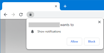
A solution would be to put the burden of cookie consent on browses, the same way that website notification requests are handled: deciding to refuse cookies on a particular website would effectively prevent it from storing any cookies, removing the question of enforcement on the websites’ side. It would also allow for setting a global policy: one could choose a default behavior so that one doesn’t have to choose every time.

A request to display notifications in Google Chrome
One could even define a standard for sending cookie choices in HTTP headers, which would allow the browser to notify the website whether the user has chosen to allow only essential, or all cookies.
Further reading
Maggie Appleton has written an insightful article on the adverse effects of large-language models on the internet.
Don't hesitate to hit me up on Twitter if you have any comments!
This article was retrieved from felixrunquist.com.


Top comments (0)