The problem is there are no simple “right” answers for most Web design questions (at least not for the important ones). What works is good, integrated design that fills a need—carefully thought out, well-executed, and tested. - Steve Krug
One of the difficult things in UX Design is that there are very few hard and fast rules designers can follow to make any specific design useful or easy to use. What is the correct task flow? What controls will our users need? Can they efficiently operate them? How should we layout our screens so users can be efficient? How can we make sure we can find all the functions and features they need? While this feels like a standard list of questions designers ask before starting to get creative, there is no definitive answer for any of these questions. For every project and screen, we need to find solutions specific to the context of the project, the users, and their tasks.
However, designers can all follow many laws, rules, and principles that can help us avoid some mistakes. One handy list of principles was compiled more than two decades ago by Jacob Nielsen. He described ten heuristics for interaction design that every UX designer should probably know. Wikipedia describes them as “... strategies derived from previous experiences with similar problems”. So, Heuristics are loosely defined guidelines for problem-solving and are not guaranteed to be optimal, perfect, or work in every situation. Nevertheless, Nielsen heuristics are general rules of thumb we use to guide our design decisions.
Here is an example of how we applied Nielsen’s “Match Between System and the Real World” principle when creating the Linx Designer.
Match Between System and the Real World
The Linx Designer is a visual backend, integration, and automation programming environment and low-code IDE. So, when we started designing it, one of the first questions we asked ourselves was what a “match between the system and the real world” actually means in the context of Linx.
The competition seems to widely agree that backend applications, data processing, and automation should be represented with views that look like workflows. Here users develop their applications by connecting various blocks on a free-form canvas. The data flows along with the diagram and is processed in each block.
However, while a workflow diagram does an excellent job at representing simple process flows for marketing materials, real-world applications can quickly become extensive and very complex. We were concerned that workflow diagrams would become too messy and not scale well enough for serious applications. We wanted to make sure our users could keep the overview even in very involved applications.
The target users for Linx range from professional developers to business people with some programming experience and knowledge of coding concepts. We expect that such people have used IDE’s to code applications before and possibly know one or two of them reasonably well. So making them develop applications in a workflow designer did not feel right. Instead, we wanted to design something more familiar and make them feel like they were still programming an application. We also wanted them to organize applications they developed in Linx in the same way they would think about and arrange them in a coding environment.
So, we decided that a match between Linx and the real world means that Linx should look and feel like an IDE rather than a workflow designer. A low-code application development environment is also an IDE, and we decided that Linx should have more similarities with IDE’s. This design approach should help to bridge the gap between developing by writing code and developing using low-code. In Linx, they could feel that they were programming applications, just on a higher level and without writing any code.
So, the concepts we created in the Linx Designer and the terms we use to describe the concepts developers use when coding applications. The terms we use to describe these concepts are terms used in programming.
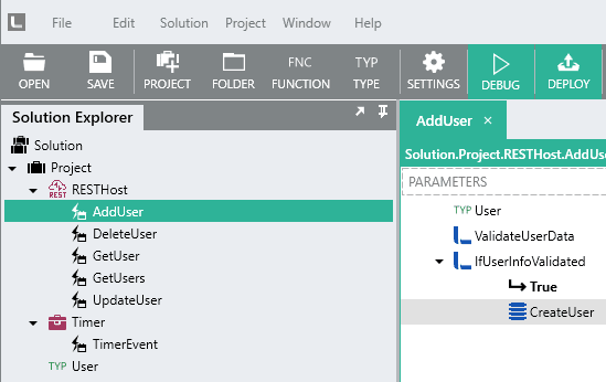
In Linx, users create custom functions with inputs, called parameters, and outputs called results. Functions are used to encapsulate functionality, as they are in code. Functions can also be nested and call each other to create functional hierarchies and simplify developing very complex applications.
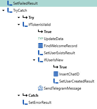
Each user-created function opens in a tab in the center of the IDE. Users program a function by dragging and dropping other functions into sequences. The sequences users create look like high-level code. The logic is built from the top down. We use indentations to denote function scope, just like many programming languages and code editors do.
To make development quicker, Linx comes with a large number of pre-written functions. Some of these functions are very generic, like CallRESTHost, which can be used to call any REST endpoint. Others are specific to an API, like all the Amazon S3 or Google Drive functions that enable users to quickly use the specific endpoints by these services.
These functions are contained in sets we call “Plugins.” Plugins are NuGet packages and include libraries with pre-written functions. When writing this article, we had released almost 40 plugins, each catering to a different technology, resource, or API. Plugins are picked from a list and added to a solution. Adding plugins to a solution in the Linx Designer is like referencing namespaces or importing classes in other languages, like import in java and python or using in C#. Once added, the premade functionality therein can be used in the application.
We also created a typing system, strings, integers, dates, and so on that are used to store in-program data. Users can combine these simple types to create complex ones. Individual plugins can also have types. Internally, Linx handles all data in JSON already anyway, making it easy to work with REST services like the types they expect can just be dragged into a function and populated with data.
Finally, we created services that listen to events and initiate the execution of the functionality. The most straightforward service is our Timer. It has one event called TimerEvent that the service fires at specific times or intervals, as configured by the user. Users define the logic they want to execute when the event fires in the TimerEvent. Another popular service is called RESTHost. It contains various endpoints that contain the logic to process incoming calls.
The upshot
Modeling Linx after IDE’s rather than workflow designers was an excellent strategy to choose. Staying close to the programming world allows our target users to get familiar with the concepts in the IDE quickly and helps to flatten the learning curve considerably. In addition, the design will enable users to follow sound programming principles, like the single responsibility principle, DRY (Don’t Repeat Yourself), or the separation of concerns principle, and enables Linx applications to scale well even when applications become large and complex.
References
10 Usability Heuristics for User Interface Design
https://www.nngroup.com/articles/ten-usability-heuristics/


Top comments (0)