Let's create a simple xylophone with some CSS and Pug. The xylophone sounds I will be using in this blog can be found here. The resulting codepen can be found here.
What will it look like?
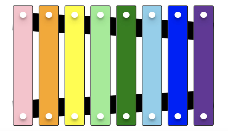
We will use an unordered list of buttons to represent the xylophone. The finished product will look like the image below:
Creating the Xylophone
To get up and running quickly with Pug you can open up a codepen. In your HTML settings, click Pug as your HTML preprocessor.
Writing our Pug
Let's create an unordered list of buttons using an array of xylophone notes.
- const notes = ['c', 'd', 'e', 'f', 'g', 'a', 'b', 'c2'];

main
  ul.xylophone(role="list")
    each note, index in notes
      li
        button #{note}
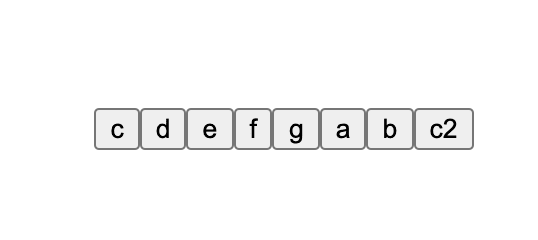
This produces the following HTML:
<main>
  <ul class="xylophone" role="list">
    <li>
      <button>c</button>
    </li>
    <li>
      <button>d</button>
    </li>
    <li>
      <button>e</button>
    </li>
    // ..... the rest
  </ul>
</main>
I added role="list" to the ul to overcome a semantics issue in voiceover and safari.
Let's style our xylophone with CSS.
First, let's reset box-sizing and position the content to the center of the page.
Alternatively, you can just import a CSS reset. I recommend the modern CSS reset by Andy Bell but it's not necessary for this project.
*,
*:before,
*:after {
  box-sizing: border-box;
}

body {
  min-height: 100vh;
  margin: 0;
  display: grid;
  place-items: center;
}
We can style our ul to be a flex container. Using the attribute selector here just to open our CSS to other types of lists.
[role="list"] {
  list-style: none;
  display: flex;
  justify-content: space-between;
  padding: 0;
}
This gives us:
Now we can add some responsive sizing to our xylophone.
We will apply the vmin relative length unit using CSS custom properties.
:root {
  --desired-size: 60;
  --coefficient: 1vmin;
  --size: calc(var(--desired-size) * var(--coefficient));
}
Let's update our list with the new sizing.
[role="list"] {
  list-style: none;
  display: flex;
  justify-content: space-between;
  padding: 0;
  height: calc(1.5 * var(--size));
  width: calc(2.5 * var(--size));
}

li {
  width: 10%;
}

button {
  width: 100%;
  height: 100%;
}
Let's apply the backboards of the xylophone. We will be absolutely positioning these against our xylophone. To do this, we must first set position: relative; in our [role="list"] CSS.
.xylophone:before,
.xylophone:after {
  content: "";
  position: absolute;
  z-index: -1; // hide these to the back, allow our buttons to appear in front
  background: black;
  height: 15%; // 15% of the overall xylophone height
  width: 100%;
}

.xylophone:before {
  top: 10%;
  transform: rotate(3deg);
}

.xylophone:after {
  bottom: 10%;
  transform: rotate(-3deg);
}
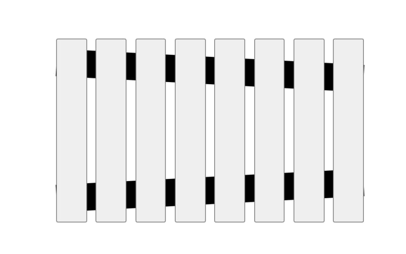
This gives us the following:
Hooking up our audio
Before we continue to style our xylophone, let's add some audio to it.
main
  ul.xylophone(role="list")
    each note, index in notes
      li
        button(onclick=`playNote('${note}')`)
          audio(
            data-key=`${note}`,
            src=`https://s3-us-west-2.amazonaws.com/s.cdpn.io/1312918/${note}.wav`
          )
We have added a hidden audio element to be a child of the button. We can hook into this to play each note sound. I have added a src attribute to point to the different wav files. The data-key attribute will be used within our querySelector to help us find an audio element for each individual note. In this example, I have stored them on my codepen s3 bucket. Next, I will need to add some JavaScript to handle the on click logic.
At the bottom of your pug file, add the following script.
script.
  function playNote(note) {
    const audioElement = document.querySelector(`audio[data-key="${note}"]`);
    audioElement.currentTime = 0;
    audioElement.play();
  }
Cleaning up our xylophone
Let's add some color to our buttons:
li:nth-child(1) button {
  background-color: pink;
}
li:nth-child(2) button  {
  background-color: orange;
}
li:nth-child(3) button {
  background-color: yellow;
}
li:nth-child(4) button {
  background-color: lightgreen;
}
li:nth-child(5) button {
  background-color: green;
}
li:nth-child(6) button{
  background-color: skyblue;
}
li:nth-child(7) button{
  background-color: blue;
}
li:nth-child(8) button{
  background-color: rebeccapurple;
}
Next, let's add the knobs for each button:
button {
  width: 100%;
  height: 100%;
  position: relative;
  border-radius: 5px;
}

button::before,
button::after {
  content: '';
  position: absolute;
  left: 50%;
  transform: translateX(-50%);
  height: 5%;
  width: 35%;
  border-radius: 50%;
  background-color: white;
  box-shadow: 0 10px 20px rgba(0,0,0,0.19), 0 6px 6px rgba(0,0,0,0.23);
}

button::before {
  top: 5%;
}

button::after {
  bottom: 5%;
}
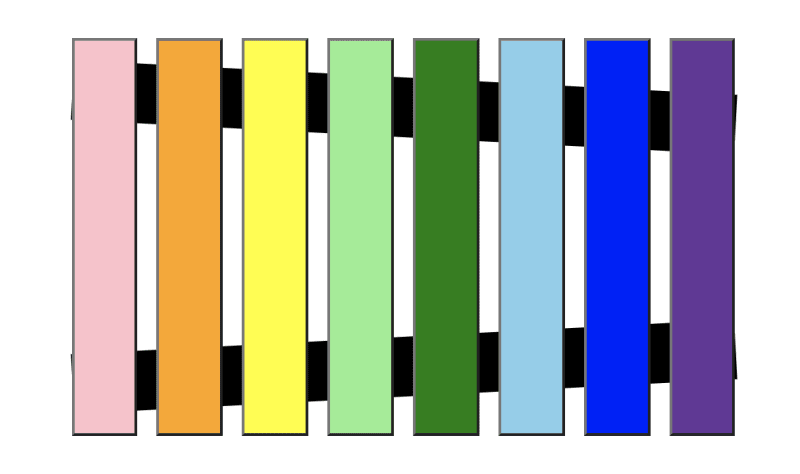
Now we have a working xylophone. Here is a working version:
Cleaning up our Xylophone
There is a number of things we can do to tidy up our component.
When we click a button, we can apply a class to show the sound is playing.
For the same button, we can also add an event listener to remove the class
when the transitionend event is fired.
For this, we will remove the class when the box-shadow transition has ended.
Let's add a transition to our button and a nice box-shadow when the button is playing.
button {
  //..other styles
  transition: all 1s ease; //we can listen for the box shadow end
}

button.playing {
  border-color: #ffc600;
  box-shadow: 0px -10px 1rem #FFC600;
}
Add the data-key attribute with the value of the note to our button.
button(onclick=`playNote('${note}')`, data-key=`${note}`)
Then apply the .playing class when we click the button.
script.
  function playNote(note) {
    const audioElement = document.querySelector(`audio[data-key="${note}"]`);
    const buttonElement = document.querySelector(`button[data-key="${note}"]`);
    buttonElement.classList.add('playing');
    audioElement.currentTime = 0;
    audioElement.play();
  }
Add our transitionend event listener:
script.
  function removeStyles(e) {
    if (e.propertyName !== 'box-shadow') return;
    e.target.classList.remove('playing');
  }

  function playNote(note) {
    const audioElement = document.querySelector(`audio[data-key="${note}"]`);
    const buttonElement = document.querySelector(`button[data-key="${note}"]`);
    buttonElement.classList.add('playing');
    buttonElement.addEventListener('transitionend', removeStyles);
    audioElement.currentTime = 0;
    audioElement.play();
  }
Now we have a nice transition on our xylophone:
We can do a lot more with Pug. I created another example to show how we can pass values from pug into our CSS to use as custom properties.
I randomly generate the hue for our background color each time, and I can pass the index which I use to make each button smaller in height and create a nice horizontal rhythm. In the pen below, you can also see how I used the kbd element instead of the button element to listen for keyboard events.


Top comments (6)
Pure magic, thanks! 🧙♂️
Thanks Joel 👍
I really like the look of pug! Reminds me of Slim! Thanks for showing it!
Sure! No problem. Thanks for checking out the post. Codepen makes it really easy to get up and running with Pug. It's really cool.
Whoa just whoa....Thank you for this
No problem. Thank you for checking out the post 👍