Proceeding with the appointments with the PnP React controls today I want to talk about the DragDropFiles control.
You can find the code of this sample here on GitHub.
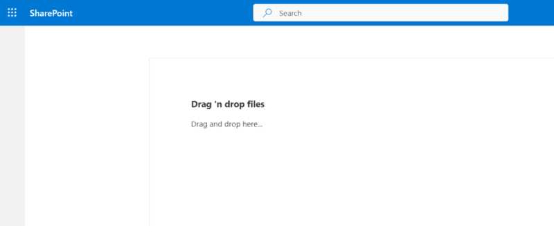
The DragDropFiles control is a very helpful one which enables the user to drag and drop files into a specific area of the page, in the sample I’ve created a simple control:
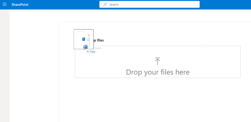
This control allows, thanks to the DragDropFiles control, to drag and drop files:
Once the files are dropped a list will be populated allowing the user to, for a sample purpose, download the single file or to remove it from the list:
Show me the code
To use the PnP React controls first you need to install the package:
npm install @pnp/spfx-controls-react --save --save-exact
After the installation of the package you can proceed with the following instructions for the DragDropFiles control.
You can import the control as following:
import { DragDropFiles } from "@pnp/spfx-controls-react/lib/DragDropFiles";
The DragDropFiles control can be instantiated as following:
<DragDropFiles
 dropEffect="copy"
 enable={true}
 onDrop={(files: File[]) => {
  // Add the file to the state
  this.setState({
   files: this.state.files.concat(files[i])
  });
 }}
 iconName="Upload"
 labelMessage={strings.DropMessage}
 >
 {strings.DropLabel}
</DragDropFiles>
The main property of this control is the onDrop property which returns the dropped files and enable the handling for those files, in the sample the files will be added to the state to be shown in the list of files.
If needed it’s possible to retrieve the content of each file using the async method arrayBuffer , in the sample I used the method to enable the download of the selected file from the list of files but it can also be used to parse the dropped files and upload those, for example, in a SharePoint list.
Apart the onDrop method there are some available customization to the control, such as:
- the icon shown in the drop area through the iconName property, this value is the name of the icon from the Fluent UI icon set.
- the message text shown when dragging the files is the value set to the labelMessage property.
- the label shown in the sample for the control is the string set as content of the control, it can also contains other controls or HTML elements, in that case the drop area will be all the component/s inside of the control.
The dropEffect property accept values of the data transfer drop effect, those values define the feedback given to the user during a drag and drop operation, if you’re wondering what are the possible values you can find them here.
Conclusions
The DragDropFiles control is a quick and easy way to create a drag and drop area in your application, it may be not fully customizable but it surely is an easy and convenient way to allow users to drag and drop files.
Hope this helps!


Top comments (0)