Proceeding with the appointments with the PnP React controls today I want to talk about the Map control.
You can find the code of this sample here on GitHub.
The Map control is a very useful visual control to enable the visualization of a point on a map, I prepared a sample solution to show various possible configurations and the corresponding visual results.
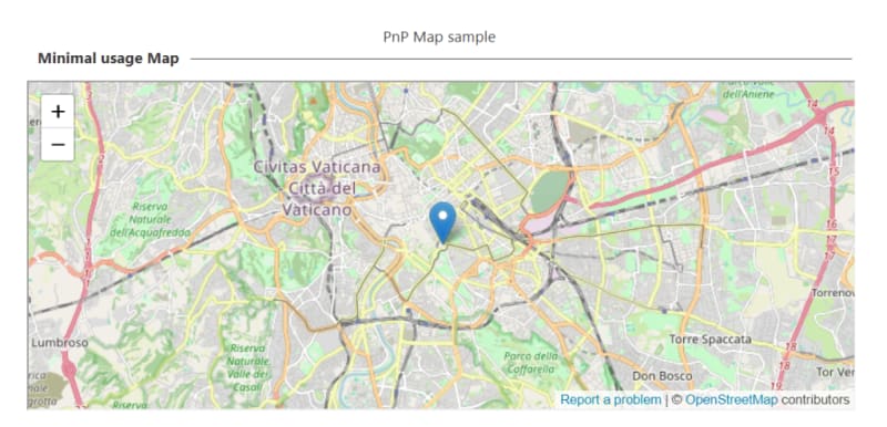
Starting with the minimal usage the appearance will be like the following:
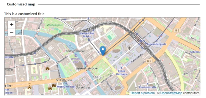
Next I customized the loading label and the display name of the map:
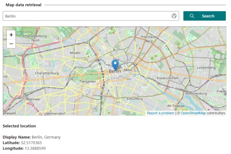
Another option that can be enabled is the possibility for the user to search for a specific place on the map:
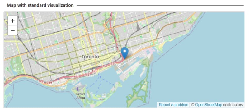
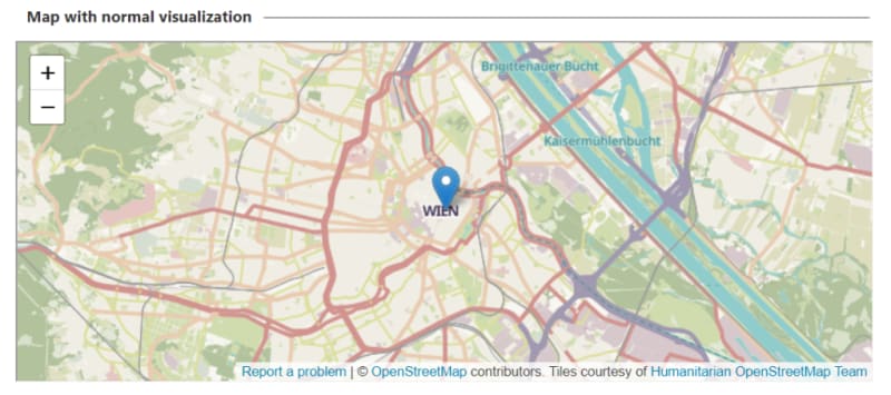
The control support multiple visualization types which are:
- standard : is the default visualization.
- normal : shows the map with an emphasis on places.
- cycle : shows the available cycling routes.
- transit : displays the available public transportations.
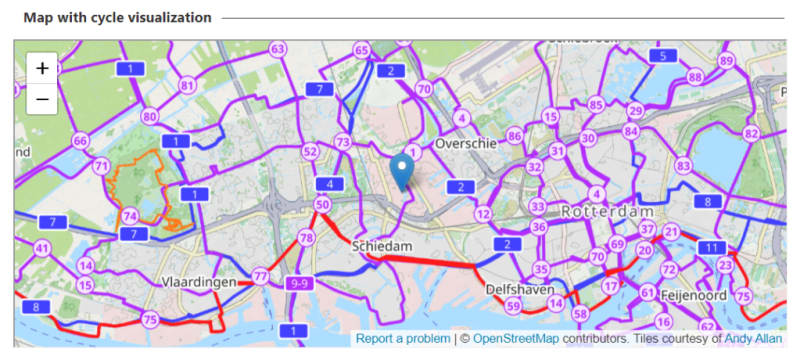
Following there are screenshots for each map type:
All the other instances of the map expand to use all the width available and an height of the default value (300px), the following instance shows that is possible to customize the size of the control:
Following here is an example that shows the possibility to intercept the search query and to display the result:
Show me the code
Ok, I heard that! Let’s see how to achieve the aforementioned control instances. First it’s needed to install the PnP package containing the Map control:
npm install @pnp/spfx-controls-react --save --save-exact
After installed the package we need the import statement in the web part component:
import { Map, MapType } from "@pnp/spfx-controls-react/lib/Map";
Now it’s possible to instantiate the control, keep in mind that the minimal configuration of the control needs the property coordinates to have a value set. For example the minimal configuration instance has the following code:
<Map
  coordinates={{
    displayName: "Colosseum, Rome, Italy",
    latitude: 41.890251,
    longitude: 12.492373
  }}
/>
In the customized instance you can see how to customize the map title using the titleText , the loading message can be customized too using the loadingMessage and also the zoom is customizable (with a value from 1 to 15) using the zoom property.
<Map
  coordinates={{
    displayName: "Berlin, Germany",
    latitude: 52.520008,
    longitude: 13.404954
  }}
  titleText={strings.CustomMapTitle}
  loadingMessage={strings.LoadingMessage}
  zoom={15}
/>
A useful feature of the control is the ability to search for a user-specified location in input and that’s easily achieved using the enableSearch property:
<Map
  coordinates={{
    displayName: "Copenhagen, Denmark",
    latitude: 55.6712398,
    longitude: 12.5114238
  }}
  enableSearch={true}
/>
As said before there are four different type of map visualization:
- standard
- normal
- cycle
- transit
To use those you can directly specify the string or use the enum type MapType , for example here you can see the cycle one:
<Map
  coordinates={{
    displayName: "Rotterdam, Netherlands",
    latitude: 51.9279573,
    longitude: 4.4084277
  }}
  mapType={MapType.cycle}
/>
Visualization can be customized through either the width or height property. The width property accept a string representing a percentage where the 100% is the default value. The height property accept a number as a value and represent the height value in pixels, the default value is 300. In the sample the custom width is set to 50% and the height to 150:
<Map
  coordinates={{
    displayName: "Porto, Portugal",
    latitude: 41.1579438,
    longitude: -8.6291053
  }}
  width={"50%"}
  height={150}
/>
In the end I want to show how to intercept the change of the searched value, to achieve this you can use the onUpdateCoordinates property which receive the new selected location information, here I used the method to set a value in the state so that it can be displayed in the UI:
<Map
  coordinates={{
    displayName: "New York, USA",
    latitude: 40.712776,
    longitude: -74.005974
  }}
  enableSearch={true}
  onUpdateCoordinates={(locationInfo) => {
    this.setState({
      selectedCoordinate: locationInfo
    });
  }}
/>
The received value is of type ICoordinates which contains the following properties:
- latitude : the latitude of the searched value.
- longitude : the longitude of the searched value.
- displayName : the displayed name of the searched value, this can be null.
- address : the address of the searched value, this can be null.
Conclusions
When using SharePoint Framework the PnP reusable Map control is a cool visual addition to any form or page and can be extremely helpful in helping the user visualizing or selecting a place on the map.
Hope this helps!






Top comments (0)