If you’re here probably you’re wondering: “What’s an Application Customizer?”
An Application Customizer is a custom SharePoint Framework extension that enable the customization of two possible placeholders (top and bottom) and also to execute code when opening a SharePoint Online page, for example you can prompt the user with a privacy statement inside a dialog.
In the sample solution I’ve created I wanted to display the use of the two placeholders, this is my dev environment main page:
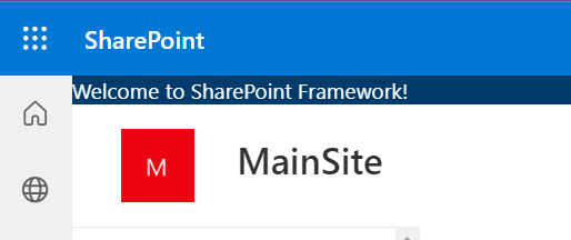
As you can see there are, at the top and in the bottom part of the screen, a couple of different controls rendered. In detail here is the top placeholder which contains only a simple text:
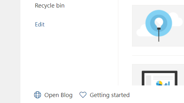
The bottom placeholder is composed by a component that contains two buttons: the first one will open the home page of my blog and the second one will open the page on the PnP site about how to get started with SPFx extensions (this is the link if you want to take a look):
Creating the Application Customizer
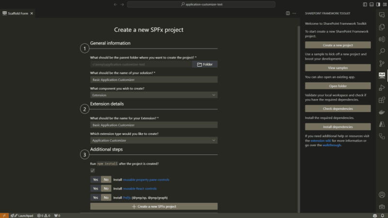
You can create the solution using the SharePoint Framework Toolkit which is a very nice and always improving VSCode extension, as you can see this is the new solution setup page:
On this page it’s possible to define:
- where the solution is located
- what’s the name of the solution
- what extension is contained within the solution
- what’s the extension name
- a couple of additional steps and configuration
If you’re interested in this extension you can find it here or on the VSCode extension marketplace searching by “SharePoint Framework Toolkit”.
Show me the code
If you’re interested in viewing the full code of this sample solution you can find it here on GitHub.
When creating the solution a new TypeScript file will be created under the path src\extensions{name of the extension} which contains the code for the application customizer and the class definition will be something like:
export default class BasicApplicationCustomizer extends BaseApplicationCustomizer<IBasicApplicationCustomizerProperties>
The BaseApplicationCustomizer is the base class from which the newly created application customizer will inherit and the main method that needs to be implemented to allow the control to work as expected is the onInit method. This method will contain all the code to manage the application customizer behavior, in the sample solution I only defined two calls to the methods that create the top and bottom placeholder controls:
protected onInit(): Promise<void> {
 Log.info(LOG_SOURCE, "Initialized BasicApplicationCustomizer");

 // Handling the top placeholder
 this._renderTopPlaceHolder();

 // Handling the bottom placeholder
 this._renderBottomPlaceHolder();

 return Promise.resolve();
}
NB: In my sample application I didn’t need any asynchronous operation but if needed you can set the onInit method as async.
Let’s take a look at the Top placeholder of the Application Customizer, the Bottom placeholder will be the same with some little changes, for example the placeholder name will be Bottom instead of Top. Since the differences regarding the Application Customizer are minimal here I will cover only the Top placeholder, if you want to check out the code for both the placeholders you can have a look to the solution on GitHub.
When creating the solution an import statement will be specified from the “@microsoft/sp-application-base” which requires the addition of the PlaceholderContent and PlaceholderName imports as follow:
import {
 BaseApplicationCustomizer,
 PlaceholderContent,
 PlaceholderName,
} from "@microsoft/sp-application-base";
Those newly imported classes and enumerator are required for a couple of things, for example the PlaceholderContent class is used to define a property, at class level, to handle the placeholder content:
private _topPlaceholder: PlaceholderContent | undefined;
To create the content of the top placeholder we will need to get the placeholder content, to do so there are a specific property (placeholderProvider) and a method (tryCreateContent) to be used from the current context, the method will need to know which type of placeholder we want to create and there’s where the enumerator PlaceholderName comes handy:
this.context.placeholderProvider.tryCreateContent(
 PlaceholderName.Top,
 { onDispose: this._handleDispose }
);
The tryCreateContent will try to create the content for the specified placeholder specified by the first argument which is a value from the PlacholderName enumerator, by now the available properties are:
-
Top Bottom
The _handleDispose method is used in case there are some operations to be performed when disposing the control, in this sample it’s a simple placeholder:
private _handleDispose(): void {
 console.log("[BasicApplicationCustomizer._onDispose] Disposed custom top and bottom placeholders.");
}
I’ve created a couple of React component to be rendered inside the Application Customizer placeholders, to insert a React component in the placeholder you can, after retrieved the placeholder content, set it:
const element = React.createElement(TopComponent, {});
ReactDom.render(element, this._topPlaceholder.domElement);
The full method for the Top placeholder will be something like the following:
private _renderTopPlaceHolder(): void {
console.log(this.context.placeholderProvider.placeholderNames);
 if (!this._topPlaceholder) {
  this._topPlaceholder = this.context.placeholderProvider.tryCreateContent(
 PlaceholderName.Top,
 { onDispose: this._handleDispose }
);

  if (!this._topPlaceholder) {
   return;
  }

  if (this._topPlaceholder.domElement) {
   const element = React.createElement(TopComponent, {});
   ReactDom.render(element, this._topPlaceholder.domElement);
  }
 }
}
The TopComponent will simply render the following:
public render(): JSX.Element {
 return (
  <div className={"ms-bgColor-themeDark ms-fontColor-white"}>
   {strings.TopMessage}
  </div>
 );
}
To test it you can update the pageUrl in the serve.json file to point at your dev SharePoint site and run the following command:
gulp serve
Conclusion
The Application Customizer is a SharePoint Framework extensibility that allows more customization of the SharePoint UI and UX, for example it can add the ability to place an informative banner at the top of the page, another example can be a breadcrumb to enable a different navigation on the site. If you’re wondering what you can achieve there are a bunch of samples in the Microsoft Sample Solution Gallery.
Hope this helps!


Top comments (0)