Introduction
Proceeding with the appointments with the MGT (Microsoft Graph Toolkit) controls today I want to talk about the ThemeToggle control.
The control is a little bit different than the other MGT controls. This one does not need a context to be set so you don’t need to prepare (almost) anything in order to use the control.
The ThemeToggle control allows you to toggle from a light to dark theme (and vice versa) for all the MGT components.
As usual, I’ve prepared a sample solution for this blog, if you’re interested in checking the code you can view it here.
Visual Appearance
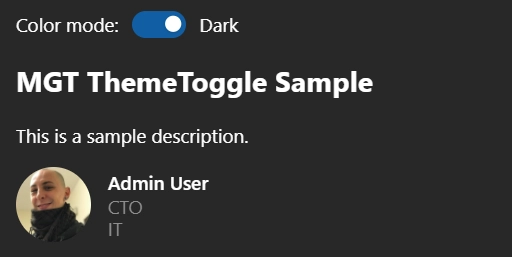
In the UI of the sample solution you can find:
- the
ThemeTogglecontrol in the upper part. - a title.
- a sample description.
- the MGT
Personcontrol. This just to prove that the toggle works without effort.
Here you can see the web part with the light theme applied:
And here the same web part with the dark theme toggled on:
Now that you have an idea of what is the visual appearance let’s cover the code.
Show me the code
Prerequisites
After creating your SPFx solution with a web part you can import the required MGT package:
npm install @microsoft/mgt-react
Once the package is added you will need to specify the import for the control:
import { ThemeToggle } from '@microsoft/mgt-react';
Usage of the control
Once the package is installed and the control is imported it’s possible to use it in your code!
To use the ThemeToggle control is enough to instantiate it as following:
<ThemeToggle />
This is enough to have the toggle inserted in the page.
After this, to support the toggling from the light and dark themes, the CSS will need to be updated accordingly.
For example, in the following snippet, I’ve set the background color and the color of the main component of the project to make use of variables:
.mgtThemeToggleSample {
  overflow: hidden;
  background-color: var(--fill-color);
  color: var(--neutral-foreground-rest);
  font-family: var(--body-font);
  padding: 20px;
}
This is all you need to do to utilize the toggle control.
Extra properties
If needed, it’s possible to utilize a couple of properties for this control. Let’s have a look at those in the following snippet:
<ThemeToggle
  darkModeActive={false}
  darkmodechanged={(e) => {
    alert(`${(e.detail === true ? 'Light' : 'Dark')} mode is now active!`)
  }}
/>
The darkModeActive property simply enables to programmatically select the currently active theme. As it is a boolean property is enough to set it to true or false:
-
true: the active theme will be the dark one. -
false: the active theme will be the light one.
The other property, the darkmodechanged one, is an event that will be triggered when the user toggle the control. The event has an argument with a detail property which will contain the value for the new active theme:
-
true: the new active theme is the light one. -
false: the new active theme is the dark one.
Conclusions
The ThemeToggle control is very convenient to handle the theme selection. Updating your code just a little bit it enables a nice UI/UX enhancement with close-to-zero effort.
If you’re interested in knowing more check out the official documentation here.
Hope this helps!


Top comments (0)