Link to the redesigned website
The Old Design
Over the years, my portfolio website has gone through many changes. I always liked my website as simple as possible, with the possibility of editing my resume without opening the code. I have always preferred using HTML/CSS & JS to make websites if possible. I will, of course, use a proper SSG if the project needs it (mostly Hugo for blogs). I am also not against using some framework like React or Vue, but I only use them in projects with a huge number of components.
Also, although I know CSS, the quality of any design I make from scratch has an inverse relation with the number of components. Thus, I prefer using premade themes as a base and then customizing them to my needs.
The older version of my website used Astral theme from HTML5UP. I had customized it to some extent (not a lot, the theme was great but I never spent enough time on it). I hosted my resume on Github Gists and embedded it on the website. After some minor CSS changes, it looked as if it was part of the website itself.
There were a number of problems in that design, and I had to eventually change it someday. Among the problems, the things that I hated the most were:
- Extremely Heavy: The design loaded a lot of resources (Font Awesome, etc) that made it extremely slow to load.
- No CMS: I never got the time to integrate the website with a CMS, and I always had to edit the code to make any change.
I was always planning to fix these two issues, as soon as some inspiration struck me for the new design.
Inspiration for the New Design
The inspiration came when Florin Pop did a live stream on Twitch where he did a developer portfolio review. Among those portfolios, I found a design that I liked a lot. The said design was of CasperTheGhost’s portfolio website.
What I liked about his website was:
- Limited Colors: It had only 3 colours, one purplish for the background and grey and a white for the text
- Repeatable design: All the sections of the website had the same base design. Adding or removing sections won’t destroy the design of the website.
- Lightweight: Very few external resources are used, and I could remove whatever I didn’t want.
Before proceeding further, you should check out the website because I am going to mention different parts of it
Planning
After deciding on the design, I spent some time deciding how to make the website work. If I did minimal changes to the source, I would have to do a lot of changes manually and keep doing them manually in the future. I knew that I was going to add a variety of stuff to the portfolio which can change frequently, so having a CMS was a must. I decided that the CMS would make store all the data in JSON files somewhere in the code and I would load the data into HTML files.
For the loading part, I had two choices. One, I could use JavaScript and its fetch() method to load the JSON data. The advantage of this method is that no building or generating is required, and the files could be used as-is. The disadvantage, of course, was the effect on performance and that the website would have almost nothing that isn’t loaded via JavaScript. I had used this method a lot in the past but wasn’t too fond of it due to its disadvantages.
On the other hand, I could use a Static Site Generator that would put the data into the HTML files during the build process. The client will only need to download the HTML file which already has all the data in it. The advantage, of course, would be the increase in performance, but I don’t like using Static Site Generators for such a simple task. Static Site Generators are usually made for generating much bigger and complicated sites (many are specially tuned for generating a blogging website from markdown files).
I finally decided on writing a Python Script that would act as my custom Static Site Generator. Jinja2 is a great Python module for generating files from templates. I had already used similar scripts in other projects of mine. This is a great way to add a common part (header, footer, navigation bar, etc) of code to a multi-paged website. I was also able to generate a multilingual web app using a similar technique.
Deciding to use a Python Script allowed me to make a lot of stuff editable from the CMS (Name, Open Graph Information, Colors, etc).
The CMS
Before starting the work on the website, I had to decide what CMS I was going to use. I have previously used both Forestry and Netlify CMS, but only for Hugo Blogs. I wanted to use Netlify CMS because I could access it from mydomain.com/admin (I forgot how to access Forestry CMS once). No matter how much I tried, I couldn’t get it to work for editing single data files. I switched to Forestry and setup the required front matter and data files.
Structure of Data
Since the whole website works on this data, I think it would be appropriate to define its structure first.
At the time of writing this, I have 5 different JSON files for various sections of the website.
- Settings.json This contained the settings for the website (colours, google analytics code, etc), Open Graph Details, and some stuff that is used in the landing section (Name, Subtitle, Social Media Links, etc)
- backpack.json, foss-contributions.json, timeline.json, projects.json Each of these contained an array of items to be used in different sections. You can see the actual structure in the code below. For the icons, I was originally using the Font Awesome class names but changed it to the path to increase performance. (More on this later)
backpack.json
    {
      "name": "Python",
      "icon": "assets/svgs/brands/python.svg"
    },
foss-contributions.json
    {
      "link": "https://github.com/processing/p5.js"
    },
timeline.json
    {
      "title": "Polybar Module",
      "time": "June 2020",
      "description": "<p><a rel=\"noopener noreferrer\" href=\"https://github.com/HackeSta/polybar-speedtest\">polybar-speedtest</a> - speedtest.net module for Polybar<br></p>"
    },
projects.json
    {
      "name": "Tweet2Pic",
      "buttons": [
        {
          "name": "Play Store",
          "link": "https://play.google.com/store/apps/details?id=org.hackesta.tweet2pic",
          "icon": "assets/svgs/brands/google-play.svg"
        }
      ],
      "description": "Tweet2Pic is a small tool, which can be used to share your Twitter Tweets in the form of an image.",
      "tags": [
        "assets/svgs/brands/android.svg",
        "assets/svgs/brands/java.svg"
      ]
    },
Data from the Internet
Apart from the data which I am entering via the CMS, there were some sections that required the script to fetch data from different sources on the internet. Most importantly, I use the Github API data for the Open Source section, which lists the number of repositories (source) I have, the numbers of stars they have, and the number of forks I have. I use the Github API for the “Projects I Contribute to” Section as well. In its data file (foss-contributions.json), I am storing only the repository name of the items. The script then uses Github API to fetch the description, number of stars and forks of each project.
def get_github_data(username,num):
    repos = []
    page = 1
    while True:
        data = requests.get(GITHUB_API_URL%(username,page)).json()
        repos.extend(data)
        if len(data) < 100:
            break
        page += 1
    source_repos_len = len(list(filter(lambda repo: repo["fork"]==False,repos)))
    stargazers = reduce(lambda a,b: a+b["stargazers_count"],repos,0)
    forks = reduce(lambda a,b: a+b["forks"],repos,0)
    most_popular = list(sorted(repos, key=lambda repo: repo['stargazers_count'],reverse=True))[:num]
    return {
        "github":{
            "repo_count": source_repos_len,
            "stargazers": stargazers,
            "forks": forks,
            "most_popular": most_popular
        }
    }
def get_foss_contributions():
    contributions = json.load(open(FOSS_CONTRIBUTIONS_DATA,"r"))["contributions"]
    contributions_data = []
    for contribution in contributions:
        api_url = contribution["link"].replace("github.com","api.github.com/repos")
        data = requests.get(api_url).json()
        contributions_data.append(data)
    return {
        "contributions": contributions_data
    }
I also configured my blog to output a JSON listing recent blog posts along with their featured/open graph image. The script fetches this JSON file, then downloads the data for four recent posts, along with the images. The images are then resized to a smaller size and stored in a folder. Downloading the images, resizing them to a smaller size and converting them to WEBP format really helped in maintaining the performance of the website.
def get_blog_posts(num):
    data = requests.get(BLOG_API_URL).json()
    os.system("rm -rf assets/img/blogs")
    os.system("mkdir assets/img/blogs")
    for post in data[:num]:
        filein = f'assets/img/blogs/{post["data"]["image"].split("/")[-1]}'
        fileout = filein.rsplit(".",1)[0] + ".webp"
        wget.download(post["data"]["image"],out=filein)
        post["data"]["image"] = fileout
        im = Image.open(filein)
        im.thumbnail(BLOG_IMAGE_SIZE,Image.ANTIALIAS)
        im.save(fileout)
Optimizations
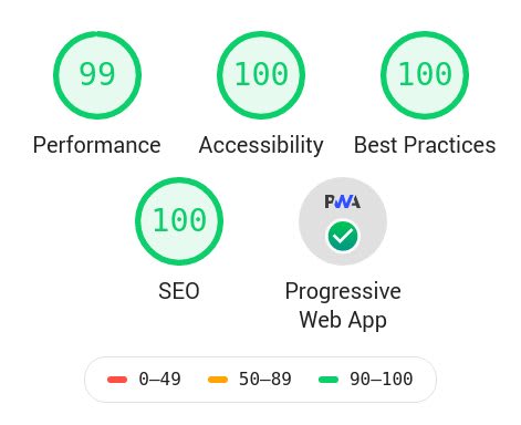
I wanted my website to be as lightweight as possible. To make sure I am doing everything right, I used the Lighthouse Test to check for errors, and get ideas for optimizations. Apart from issues that were fixable easily (missing attributes, missing icons, etc), the most important part of the optimization was to reduce the number & size of requests. As I already had minimal JS, I focused on optimizing the CSS files and reducing the number of requests.
Optimizing CSS
Two Node Packages, PurgeCSS (to delete unused CSS, although there wasn’t much to delete) and PostCSS + cssnano (to minify and bundle the CSS) were more than enough to optimize the files. I added both of them to the Travis Build Process to automate it.
Also, Netlify does provide a feature to minify and bundle resources, which should also work similarly.
Optimizing Font Awesome
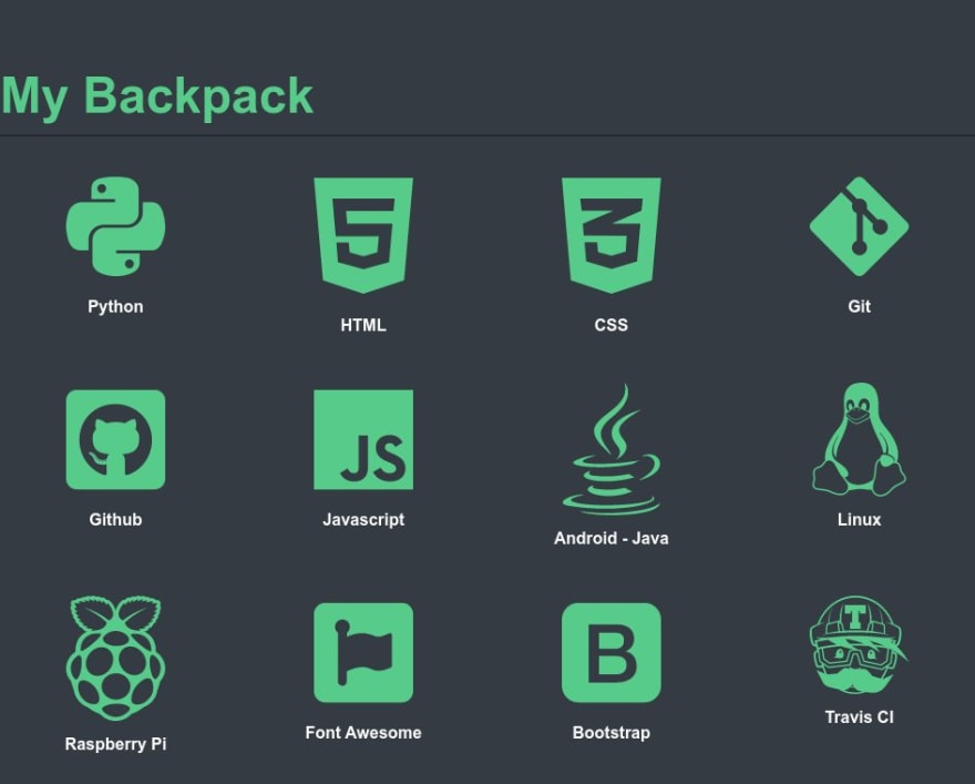
Apart from other places in the website, the “My Backpack” section heavily used Font Awesome. Font Awesome files are huge in size and each icon had a request associated to it. To overcome this, I stopped using Font Awesome the normal way (adding fa* fa-* classes to elements) and took advantage of using Jinja2 to import the SVG icons into the HTML wherever required. After generating the final page using Jinja2, all the SVGs are present as inline SVGs and are loaded as part of the HTML document. This removed the size of the helper script (approx 1.4mb) and removed a good number of requests.
Optimizing Favicons
I originally used another Python script to generate Favicons but they were being requested numerous times during the page load. After some research, I came across this favicon generator site which generated beautiful icons and reduced the number of requests to just 2 requests.


Top comments (7)
Firstly - great work! I'm glad you took optimization into consideration.
That being said, a couple of points: why are you loading trash like Google Ads and Analytics, FontAwesome is still being loaded and your profile picture is 228kb that is resized by CSS.
I think you checked the wrong website. I redesigned my portfolio (haideralipunjabi.com), not the blog. I don't have a profile pic there, nor do I load Ads. I am still loading Google Analytics because I haven't used anything else for analytics, what do you suggest?
Yeah, I checked the blog as there was no other link, apologies.
Your portfolio looks much better. Are you really using 10kB of CSS?
I personally use GoAccess to check out logs. If you really, really need analytics - I heard good things about Fathom.
Hmm, I will definitely check out Fathom.
Yeah, I should have been more explicit with the website URL. I did link to it before the planning section, but I will make an edit to make it more explicit.
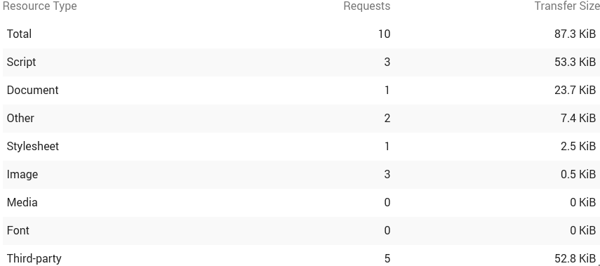
I have only one CSS file (2.5kB), and that's what it shows in the Network Panel in Chrome Dev Tools, but maybe we are measuring differently.
This is what I see:

Edit: For some reason, dev.to makes the image really small. Here: 0xff.nu/i/firefox_XV5TWKf2ul-fs8.png
I have no idea why you are seeing this, I tested using Lighthouse as well and it also shows 2.5kb
Edit: Lighthouse Budget Report
Thank you to the author for crafting such an informative article! If you're interested in exploring more about website design, I'd like to recommend an alternative article titled "how to redesign a website" It offers valuable insights and tips on the website redesign process. Don't miss the chance to enhance your knowledge further in this area!