Caleb Porzio did an amazing job with his Make VS Code Awesome course. There were a lot of good tips on being more productive with VS Code, and one thing that particularly resonated with me was what he referred to as "silencing the noise". Essentially he covered how to reduce/remove all the visual clutter in VS Code that is there by default.
It's amazing how much cleaning up your editor / IDE can really impact your productivity. As an Android Developer I spend most of my time in Android Studio, and I noticed that there was a lot of clutter. Buttons, windows, tabs, all things I don't use or information I don't need. So I decided to silence the noise, let's see what we can do.
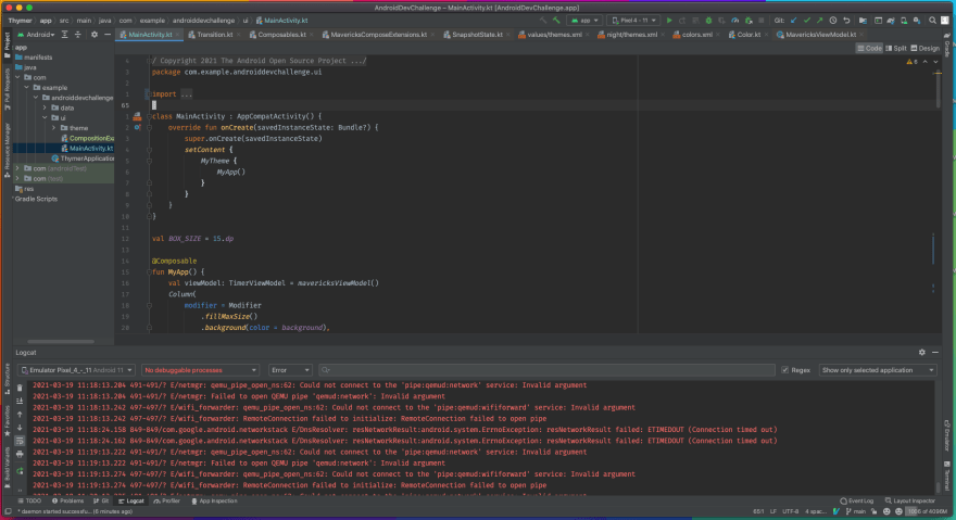
The Starting Point
This is what Android Studio looks like by default. There are so many buttons, widgets, etc that are displayed that we don't need. Let's start by getting rid of the tool window buttons on the perimeter, updating the navigation toolbar actions, and removing a bunch of the bottom status bar widgets:
Remove Tool Window bars
Preferences -> Appearance & Behavior -> Appearance
Toggle off Show tool window bars
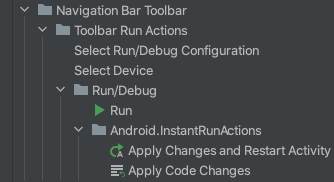
Remove actions from Navigation Toolbar
Preferences -> Appearance & Behavior -> Menus and Toolbars
Go to Navigation Bar Toolbar and delete a lot of that, this is what mine looks like now (still deciding if I need even these)
Remove widgets from Status bar
Left click on the bottom status bar and uncheck everything (I like to keep memory indicator, but feel free to remove that too).

Slightly Better
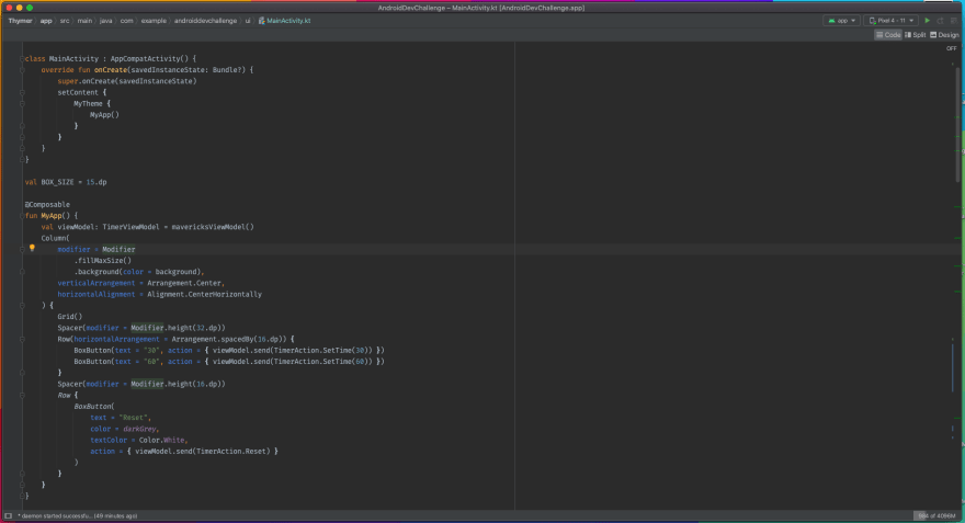
It's already looking much better! We now only have relevant information showing for the navigation toolbar and status bar. Next we can get rid of editor tabs and line numbers:
Remove Editor Tabs
Preferences -> Editor -> General -> Editor Tabs
Set Tab placement to None
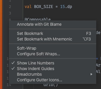
Remove Line Numbers
For Line numbers you can just left click on the line number side bar, and uncheck Show Line Numbers
Even Better
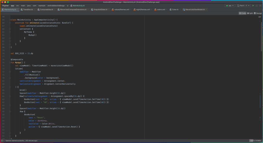
Lastly, let's update the aesthetic a little but. The stock font and Darcula theme are okay, but with a custom font and the Material Theme Plugin you can go a long way.
My preferences:
Recursive Duotone Mono
Material Theme - Github Dark
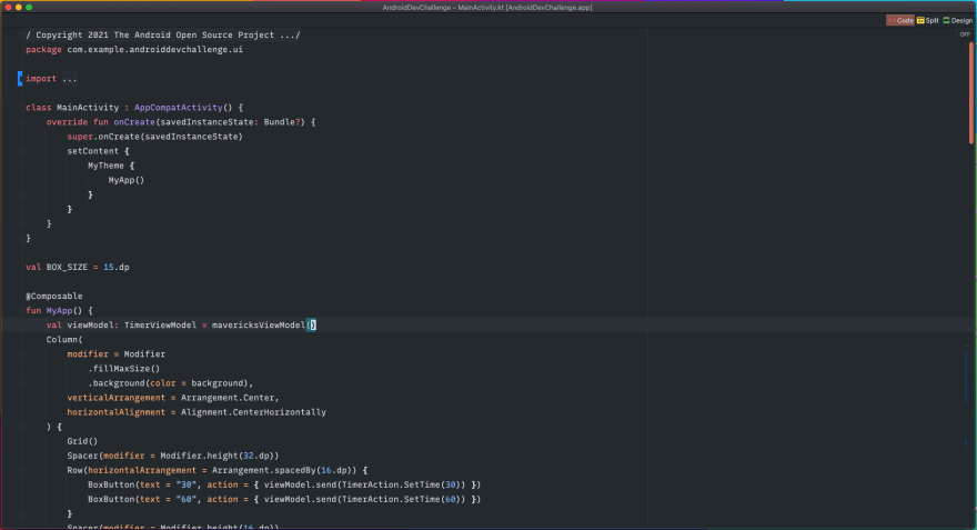
Final Product 🔥
To me the differences are night and day. Not only does it feel better working with this configuration, I am more productive and focus on what I need to (the current file I am editing). Give it a shot and let me know what you think!




Top comments (0)