49% of the downloaded are uninstalled by users within a month.
Due to poor user experience.
👉 Poor usability
👉Slow load times
👉Poor customer service
👉Lack of personalization
👉Too many bugs and glitches
👉Too many notifications and ads
There are several factors behind it but Mobile app accessibility is a prime factor that impacts user engagement and the success of the mobile app.
Ensuring proper accessibility for apps can encourage users to continually visit the app and engage with the product, tools, services, and products available.
Conversely, substandard app accessibility could lead to app abandonment, and in the worst case, the user may uninstall the app due to its ineffectiveness or poor user experience.
255 Billion Mobile Apps Downloaded in 2022!
The data itself shows why the success or failure of any business or service depends on the accessibility of mobile apps.
A study was conducted and it estimated that an average US adult will spend 4 hours and 6 minutes on mobile apps, surpassing the browser. Nearby 92.5 % of internet time is spent on mobile apps limiting browsers to 7.5%.

To leverage this booming app economy you must focus on enhancing accessibility for apps so that you can provide the best UI/UX to the users and make them use your mobile app frequently.
Proven Tips to Make Your Mobile App More Accessible:
💡Try to Make it Inclusive
💡Play Gesture Game Correctly
💡Icons: Make it Comprehensive
💡Navigation: Focus on Touch Targets
💡Size Matters: Consider Varying Screen Size
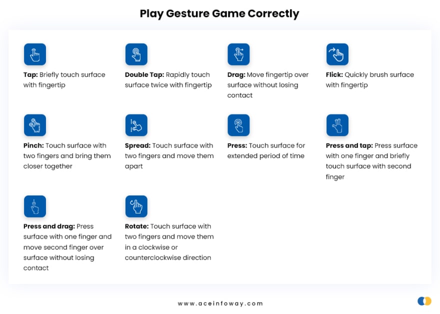
Play Gesture Game Correctly
Gestures such as single tap or click, double tap or click, swipe, pinch, and long touch is used to navigate the app having different tools, product, or services.
While providing the gestures it is advisable to keep them aligned with universal trends and also consider elderly users, physically-visibly impaired users, or users having motor or dexterity impairments.
So what are the measures we can take to make the mobile app accessible with gestures?
- Keep the gestures simple
- Easy access to go back in case of unintentional click or tap
- Keeping icon and font size reasonably big and bold
- Make sure buttons are in contrast with the screen background
- Keep the keyboard easily accessible
- Give an alternative to gesture if a user is not comfortable with it

The reason for suggesting big fonts, icons, and buttons many times users could be better with tapping and clicking or maybe having shaking hands due to their age.
📖 Read all these 5 proven tips in detail here: https://bit.ly/3GfbrPw
🚀 These proven tips have the potential to help you increase your app user engagement to a whole new level 🚀


Top comments (0)