As per Statista, an estimated 36.8 billion downloads of apps from the App Store and Play Store were made in the first quarter of 2022. With so many apps being downloaded, it’s no surprise that over 70% of users are anticipated to churn across all categories in the app stores within 90 days.
If a navigation design or any part of the app is unappealing, users will choose to install a new one instead of continuing to use the flawed app.
However, on the other hand, you’ll lose a valuable business idea!
So, avoiding some common navigation design mistakes will help businesses in creating apps with better user experience and help your business to cross the 90 days threshold efficiently.
5 Common Mobile App Navigation Design Mistakes to Avoid
1) Your Navigation Menu Has Too Many Options
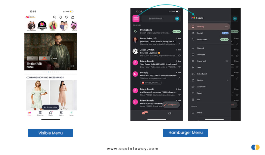
2) Hidden Navigation Menu
3) Using The Wrong Colors
4) Avoid using jargon that users don’t understand
5) Cluttering up the user interface
Let’s discuss 5 common mobile app navigation design mistakes that you should avoid and take preventative measures to enhance your app:
1) Your Navigation Menu Has Too Many Options
The primary mobile navigation menu of the app can be accessed via the navigation menu. Therefore, if the opportunities in the primary navigation menu are too many, users can get confused and quit the app without taking any action.
💡 Practical Recommendation:
It is better to keep the primary navigation menu precise and short. So, users can quickly scan the entire menu without taking too much time. The clearer your UX navigation for the menu is to the users, the better the designers have done the job.
2) Hidden Navigation Menu
like a hamburger menu has hoover through navigation components in an app like a hurricane. No trend, though, is without its critics.
💡 Practical Recommendation:
Hamburger menus or hidden navigation menus are great for all secondary navigation menus. Therefore, the common advice is to use visible navigation, where the primary navigation choices are shown in a visible navigation bar, or combination navigation, where some of the primary navigation options are visible and others are concealed under an interactive element.
3) Using The Wrong Colors
Around 300 million individuals worldwide are believed to have a color vision deficiency. 1 in 12 men and 1 in 200 women are color blind. Therefore, the majority of designers don’t face color blindness issues, so it’s easy to forget that we’re developing for this specific user group too.
💡 Practical Recommendation:
For a great user experience, app designers and developers must create fonts readable and provide excellent contrast between text and background. In addition, you will be much closer to professionally selecting colors and designing an appealing app if you use tools like Coolors, Palettr, etc. to assist you to build color combinations rather than picking colors at random.
Continue reading: https://bit.ly/3Nt7Uzn


Top comments (0)