UX services are consistently in high demand when building websites or applications. This is because of its focus on enhancing the way users experience a new product. Through interface, design, and interactions, good UX ensures the product is accessible to users. Each feature implemented also adds further value to the user. For the better user engagement, it is essential to align proper UX principles with your business goals. This is challenging and confusing to business owners especially when numerous myths and misconceptions exist about what UX is. In this article, we debunk 5 common UX misconceptions our clients have shared when seeking our UX design services.
1) UX Is Only About Users
UX designers conduct research and analysis to understand the users’ needs, pains, and goals. This is to provide them with an optimal experience by meeting their expectations and giving them a satisfying experience when interacting with the product.
Many people may not know this, but the UX design also has to meet the businesses’ goals and objectives. This includes understanding the product vision, the reason for creating the product from a business perspective, your target market, and the problems that your product aims to solve.
UX designers understand that trying to focus too narrowly on optimising the user experience may fail to achieve a company’s business goals. It is crucial to alight both the users’ needs with the business goals to create an effective user experience.
2) UX Benefits From Fewer Clicks
The 3-click rule is a popular usability standard in the world of UX. It says that if users can’t find what they’re looking for after three clicks, they’re likely to become frustrated and leave the site. This common misconception is affecting how people understand good website UX.
Getting users to the content they are looking for with as few clicks as possible is a generalisation that is impossible to apply to all websites. Recent studies have shown no correlation between the number of user clicks and their success in finding the content they are looking for.
Users are found to interact differently on various sites (e.g., compare an e-commerce site like Amazon.com to a search engine like Google). How effectively users got the information they needed on each of these sites and not how many clicks it took to get them there is a better way to measure user ease. If users get to where they want and are satisfied with their experience, we do not need to worry about how many clicks it took to get them there.
3) UX Rewards Quantity over Quality
Having a lot of choices is usually a good thing. However, this is not always the case when it comes to UX design. A common misconception people have about their website or application is that having more choices will increase product SEO and users’ satisfaction. However, as search engines become smarter, including unnecessary content and keywords may do more harm to both SEO and UX.
From the UX perspective, having numerous choices may confuse users and even trigger decision paralysis. Decision paralysis is a phenomenon where the user overthinks their decisions and ends up not interacting with the site. As a result, users may leave your website and try to find one that is more user-friendly.
UX designers should be skilled in finding the sweet spot that balances UX and SEO expectations. This is often more difficult than it looks. Hiring a full-fledged web design agency that has both SEO strategists and UX designers is the right thing to do. This will allow your website to have the best of both worlds.
4) When In Doubt Always Animate
“Add the fade-in effect here, and add the slide-in effect there…” the list goes on and on. Many people tend to think that animation will delight users and keep them engaged for longer. This is not always true. Animations can make a site stand out but only if it is done right. Overdoing it can just as easily kill the user experience and keep them from coming to your site for good.
Common mistakes include adding animations that serve no purpose and setting durations that are too long or too quick. Not using the right type of animation also could have a more damaging impact than you think. UX designers refrain from applying unnecessary animations so as to not hinder the ultimate goal of good UX.
5) UX lengthens the project timeline
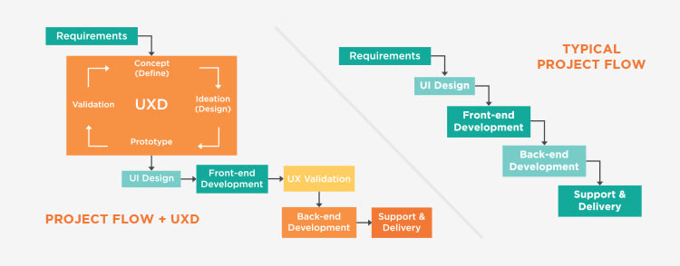
Another misconception about UX is that it lengthens your project timeline and increases the cost of creating the website. As illustrated in the image below, it is evident that the UX project flow has a longer timeline compared to a typical project flow. This gives business owners the impression that adding UX services stretches a project timeline and therefore will increase costs.
However, by following this method, UX designers can actually help web developers speed up the development process. This can be done by providing them with well-defined requirements and specific style guides.
Solutions can be created, tested, and validated immediately instead of following the usual process of building then fixing a product. Everything is documented for the developers in detail so they will be able to work faster. By investing in UX for your website, you can prevent time-consuming development rework and focus on the business instead.
On top of our custom web design services, Verz Design has a dedicated team of highly skilled and experienced UX Designers to provide research, consultation and design services that are essential to your website’s UX.
The post UX Misconceptions appeared first on Verz Design & published here with their permission.


Top comments (0)