My second contribution was for a website called "GDSC JGEC Website".
The issue was with some UI of the webpage, which had some bug, and also design that was not enough.
https://github.com/gdscjgec/gdscjgec.github.io/issues/38#issuecomment-953101856

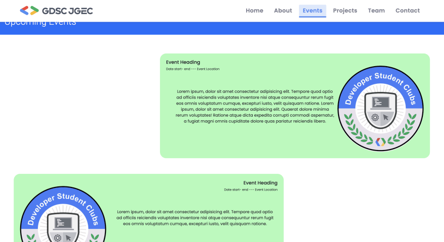
The original page looked like this. There was a bug with the banner "Upcoming Events" which was not showing properly.
I updated the margin-top from 2% to 5% to show off the whole banner properly.
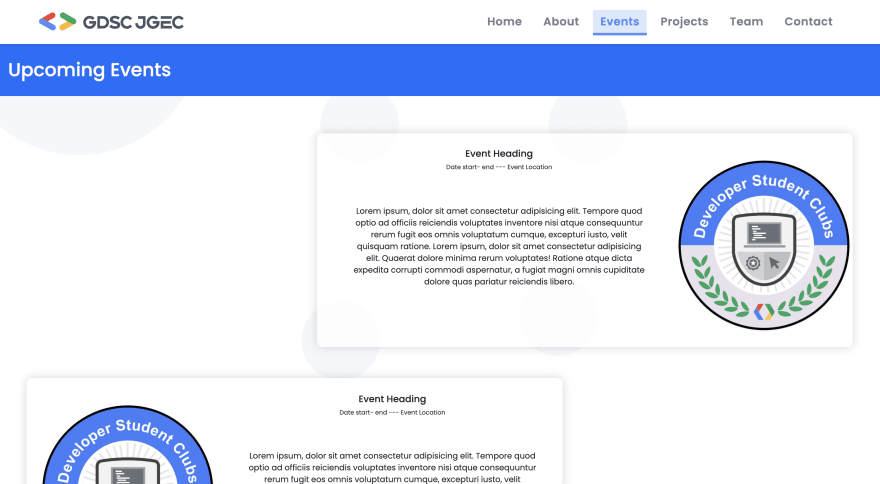
For the design of the website, I wanted to make it looks like matching with the website theme.
So I re-used the background image from another page of the application. Also the color, light green did not quite suit with the website theme. I looked at other pages to find some colors that goes with the main theme of the webpage, and re-used those colors to the event card.
Also, font and the box designs was modified to match with other pages.
After the fixes, it looks like below.
https://github.com/gdscjgec/gdscjgec.github.io/pull/40


Top comments (0)