We design and build our apps for our imagined ideal user. This is a person that uses the app everyday, that uses all the different features, that is constantly producing and consuming. There is another really important kind of user that we need to design and build our apps for. That is a new user. When a new user first signs up and starts clicking around the app, they are going to see a bunch of empty states. Even if we don't expicitly design an empty state for our users, we will have implicitly built one that they will see.
Imagine a table of things that belong to the user's account. When they first sign up, they won't have any of those things. By default, a lot of apps show an empty table with just headers. That's a choice. We could also choose to take advantage of this opportunity. We can show the user what to expect, we can orient them to the UI, and we can help them imagine the value they are going to get out of the app.
This is exactly what Freshbooks does on their dashboard when you first sign up.
There is no data or revenue or whatever to show. Not yet. Freshbooks jumps at the opportunity to orient me to their dashboard and get me excited about the money I'm going to start bringing in with their product.
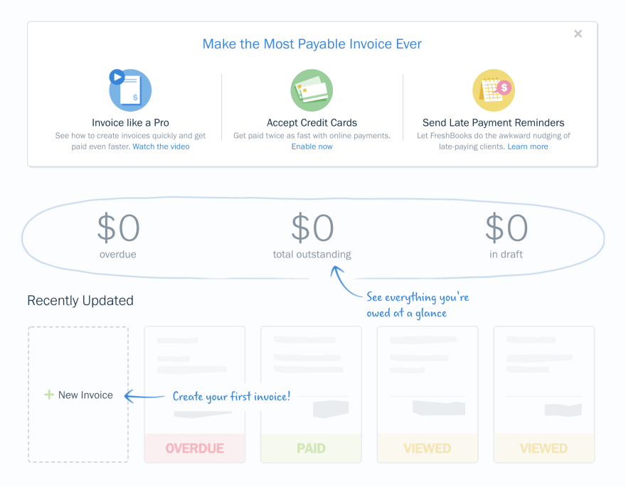
Here is what I see when I jump to their invoicing page:
They show me a couple temporary CTAs to educate me about the product, they tell me about the high-level numbers even though they are zero, and then they fill up what would be a bunch of whitespace with placeholder invoices in different states.
In terms of MVPs and business priorities, you probably ought to focus on the happy path of your ideal user, at least at first. That said, any business and app that has legs is going to constantly have new users coming in. You'd be remiss to not spend some time on that experience. The empty states across your app are a new user's first experience with your app and your business. You better make a good impression.


Top comments (0)