I decided last week that I wanted to pursue the path of frontend engineering, and in my way to being successful at this position was a topic that I had been avoiding for a long time: CSS. I had always found this topic very difficult, and actually was probably one of the reasons why I didn't want to be a frontend engineer. One analogy I remember someone using to describe CSS was that it was like trying to put a bedcover on a mattress that would barely fit, and that analogy described my actual experience. Fixing one thing would seem to break another, and I just didn't understand what was going on. Realizing that no one will want to hire someone who can only make beds without bed covers, I decided to start learning.
I realized I needed some kind of starting point. As I searched for tutorials online, there was a post on CSS tricks called "The moment CSS started making sense", which provided just that. It was an article for people just like myself who had a hard time understanding CSS at first. It offered what their breakthrough moment looked like and what central concepts they were able to hold onto to shape their understanding. Different people share different concepts that were able to help them, but I found Chris, the first person on the article, and his concepts to be very helpful. He summed up CSS into 3 basic concepts:
1) Every page element is a box
2) I can control the size and the position of those boxes
3) I can give those boxes background images
Obviously, these are simplifications of what CSS is doing, but for me this was a perfect starting point. It's really easy to get lost in the details of CSS, so having these 3 clear goals were very useful for me. This also made it clear what I was lacking in my understanding of CSS. Concepts #1 and #3 are pretty trivial, but it was really rule #2 which I was confused about. To bring back the analogy, the question of how to fit a bed sheet exactly right onto a bed mattress, was ultimately a question of how to control the sizes and position of the boxes, so that I wouldn't break the page and get a good looking result.
Today, I just want to talk about one of the display modes: flexbox. Now to appreciate just how much flexbox can do for us, I first want to talk about the only framework I had worked with, which was float.
Without getting too deep into this, because this article is about flexbox, I want to highlight a problem that there was with float. The way that float works is that elements are taken and shoved all the way the left or the right of a screen. This was mainly used so it could allow divs below them to wrap around the div that was floated. The typical example of this would be an image that is floated to the left or right with the text below it wrapping around the image. You also have a the clear method which was a way to take away the option for the next div down to be forced onto the next column as opposed to being but underneath the floated element.
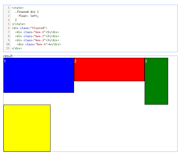
The major problem that I saw with floating elements is when you resized the screen. When you have a fixed pixel width for your divs on a floated layout, when the width of the screen becomes shorter than the combined elements inside, the elements would be forced to move down. The way that this happened was very unpredictable and made for some weird looking pages. Here's is one example of divs floated to the left reorganizing unpredictably, when the screen was resized.
Code and Full Screen
Resized Screen
The screen running out of room, causes the div that no longer fits to float to the left on another column, but once it has room for it on a closer height (the height of the 3rd div is sent to down), the last div comes back next to the 3rd div. These divs had no code calculate new width values based on the resizing of the screen. I probably already used more effort trying to write this short intro to the problems of float, but that just goes to show how difficult understanding the rules of the game with float really was. It's actually probably one of the reasons I gave up on CSS.
Flexbox
This is where flexbox comes to the rescue. Whereas the float quality was put onto the divs that needed floating themselves, the flexbox display is actually put onto the div surrounding the elements you want to adjust. You would need to put display: flex on the parent div of the elements you want to encapsulate. By default, the div around the elements resized will act as a row for the elements inside and display them in the order they appear on your HTML.
Now to look at how the problem we had before is complete fixed by the flexbox layout. When you resize the screen, the calculations for you and allows the elements inside the boxes to resize proportionally to your original layout. Here's a display of the layout change that takes place (keep in mind, these boxes are also given static widths).
Code and Full Screen
Resized Screen
Flexbox also allows you to control the layout of the elements based on a column orientation, as well as the order of the list of elements. This is taken care of with the flex direction attribute which you can give the column value to allow elements to appear in a column instead of the default row or row-reverse column-reverse to affect the order that the list appears in those orientations.
Column
Row-Reverse
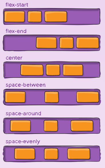
There's also ways you can adjust the spacing that is on the row of elements as a whole through the justify-content attribute. This attribute is put onto the parent div. There are many options to input for values on this attribute, and I found a useful diagram on CSS tricks that cover them.
Justify-Content
The flex-start and flex-end values that does something of a float for us, pushing all the elements either to the start or beginning of the parent div. The center value allows us to center the div. Apparently, this was extremely difficult feat to accomplish in the days of float, but now you can take care of this with just one attribute. The other ones have to do with spacing the elements evenly. The space-between value causes outermost elements to be put on either end of parent div and the spacing in between those elements is divided evenly. The space-around value gives us something of a margin which allows for equal spacing, but the space in between the elements are double the space that is between the element and parent div border. The last one, space-evenly allows for equal spacing in between elements as well as between element and border.
One last attribute I want to cover is align-items, which allows you to vertically align the elements in your row, given there are differences in height. This attribute is put onto the parent div. Here's a diagram from the same article on align-items.
Align-Items
The first flex-start flex-end function predictably, in that the flex-start brings all the way to the top, and allows their heights to display, and flex-end does the same but brings the elements to the bottom. The center value brings the elements to the center based on the div height, and baseline brings the divs to alignment based on the content inside. The stretch value gives all the divs equal value and you have to add a height to the parent div (f.e. height: 200px;), as well as getting rid of the original children's heights. If you don't want to go back and do all that, you can just create another class for the parent div and give it a property height: inherit and it will overwrite all the children's heights.
These are just the basic properties of flexbox, but having covered how to display a list of elements in a column & different order, with horizontal/vertical spacing, I think we can see how capable flex-box is for us that are deciding to pick up CSS. We really cover most of the bases of anything we'd every want to do with our content. All this, and it doesn't require much more than a couple of properties, as opposed to having to lose some hair, figuring out a float layout that doesn't pop off like a sheet that's too small for the mattress.
I definitely plan to add this display mode to my arsenal in finally doing the CSS and becoming a capable front-end engineer.
The place I got the diagrams from which is an article on css-tricks.com covers even more properties, and if you are interested you can check it out here.


Top comments (0)