Measuring Success in a startup ecosystem has its own caveats. Ever since I have gotten a little familiar with it, every day brings a new perspective. It's a jargony world of OKRs and KPIs,
This blog aims to establish the role of overlooked principles, factors, and anomalies resulting in deviation and uncertainty in such measurements. It tries to set the perspective of intuitive bias in decision-making, pre-planning, and reinforcement learning. It goes on to talk about Simpson's paradox, North Star Metrics, and much more.
This Saturday, it randomly hits you to pull up the NPS numbers for the startup you are building. You come to realize that one of your competitor’s NPS score has moved up 3 points from 73 to 76 while your NPS has reduced by a point from 75 to 74 for this quarter. The numbers don’t concern you as much as the PR around this news does. You don’t have the highest NPS score in the industry anymore. You pick coffee to tea today and decide to investigate the cause.
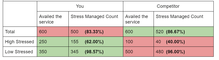
You are building a startup that promises to bring a revolution. You offer work-stress relief services to businesses for their employees. You now want to understand the reason behind this marginal dip in your NPS score. On going through the data, you realize a causal relationship. Out of 600 users who availed of your service, 500 of them reported positive results immediately while the remaining had less/no significant effect on their stress levels. On the contrary, your competitor surprisingly had the same number(600) of users for this quarter too, out of which 520 users reported immediate positive results.
On a normal day, you would accept these figures as the right metrics and solely work on improving your service but today’s a little different. It’s Elon Musk saying no to cryptocurrencies and Kunal Shah not tweeting anything for more than 3 days. You decide to stay put.
After a day of long brainstorming discussions with your team, you narrow it down to one conditional variable, “The level of stress”. Out of 600 users who availed of your service, 250 had severe levels of stress. (They acknowledged this information in the service request flow). Out of these 250 users, your product could bring down the stress levels of 155 users. On the other hand, your competitor had 100 cases of highly stressed users and it could successfully settle stress levels of 40 users.
Quite absurd it may sound, but as it turns out your service was better for low-stressed users too. Out of 350 less stressed users, 345 of them got rid of their stress using your service but out of 500 low stressed users, your competitor could successfully handle the stress of 480 users.

Look closely, while the total numbers are stating something, the individual numbers are telling a different story altogether. Yes, high stressed and low stressed are the only categories of users.
How could this be true? It indeed is, and this is called the Simpson’s paradox. Simpson’s paradox occurs when the same set of data can show opposite trends, depending on how it is aggregated. This often occurs when aggregated data hides a conditional variable, also known as the lurking variable.
In other words, the relationship observed within a population (i.e. a group of individuals), could be reversed within all subgroups that make up the population. Simpson’s paradox comes in two parts:
The fallacy of Division: What is true of the whole is not always true of the parts
The fallacy of Composition: What is true of the parts is not always true of the whole
What exactly happened in the story above was there was a significant difference between the number of highly stressed users availing both the services. The lurking variable here was “level of stress at the time of availing the service”.
This story had some insights to take. But this isn’t the only one where numbers can outplay you. Simpson’s paradox is just an example of how important it is to manage numbers that deal with key success attributes for your startup. Statistics is vital for any business. While most of it can be simply right, fair, and straightforward, there are some anomalies and paradoxes.
But wait, what did all this have to do with NPS score? NPS score is calculated based on the difference between promoters and detractors, both of which are your own users. So why did the NPS go down if both high and low stressed patients had better servicing rates than your competitor?
Are these two even related? Looks like I will have to believe in you to solve this one :)
When you are building a startup, one of the most crucial things is a clear set of objectives. Investor Sean Ellis coined the term North Star metrics to give a singular goal of growth across teams. You might even come across this conspiracy of numbers while evaluating your performance towards north star metrics. For SaaS startups, the north star metrics should be the most important metrics for measuring product success and the very notion of a conspiracy in this measurement is daunting. There should be thoughts to examine how such conspiracies can live in all dimensions of your north star metrics. From a SaaS point of view, If you define the metrics as the number of users signing up every month for a service that renews every month, you might be misdirected by the numbers. This metric shows the total users who signed up since the very start. Among this aggregated data there might be many clusters. Instead of it, you might want to keep in account the number of returning users every month which gives better objectives and saves subtle misdirection. (or does it?) This dimension is called the breadth in north star metrics. There are more dimensions to it. Frequency specifies the number of monthly purchases/subscriptions/orders per user which might/might not be a good metric instead of total orders placed this month.
The reason why I am not sure is because of something called the “Pareto Principle". You might also know it as the 80/20 rule. It asserts that 80% of outcomes (or outputs) result from 20% of all causes (or inputs) for any given event. This accounts for notions like 20% of health crops make 80% of total grains. Now when you consider the total number of orders placed in a month, this might be a case of one large purchase. You might not agree with me here, but it most certainly is about the objectives you choose. You understand what you are building better than anyone else and you might want to capture a few things as they come.
Typically, the right measure of product for a SaaS would be frequency instead of total purchases. To add to it, another dimension called “depth” which means total items per order comes into the picture.
While the above three dimensions talk about users’ interaction with the product. The fourth one, called "Efficiency" talks about your offering. For a SaaS, it might be the percent of orders delivered in time.
I think we got a little deviated here, but it was important to understand how and when the numbers can conspire. A large attribution of it goes to our own psychological biases, but we are made that way. Most of the large-scale businesses set multiple north star metrics. While it might suit/complement your business needs and goals it also can lead to confusion as to what the real objective is. However, having sub metrics over multiple north star metrics might be helpful.

To be continued...
Next up:
- Decision Factors in choosing the right metrics
- Simpson’s paradox in NPS and Production Adoption Rate
- Metamathematics and Anomalies
- The startup paradox
- The Game theory challenge to startups.


Top comments (0)