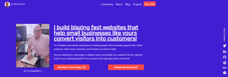
Refreshes, redesigns, and rebuilds are always fun and exciting for me. I get the sense of giving new life to something that hasn't seen it for a while. However, it wasn't an easy task to re-imagine the purpose, layout, and design of something I love as much as my own website.
It holds a special place in my developer heart. I mean it was, quite literally, the very first website I put on the live web.
It was a fun, albeit long, process that really tested my ability to mesh colors, design, and purpose but I'm very happy with the finished design and build.
My Previous Website

The previous version of my website was built with the intention of landing my first developer job. As such, it had sections and content that's relevant to that purpose.
It reads like a resume which is exactly what I wanted at the time because when the site was built I was looking for my first developer job.
Now that my focus has changed (check my tweet about going full time freelance ) from getting a full time job to going freelance, it was time my website reflected that.
To prepare, I did quite a bit of research on accessibility, color theory, and layout design so I’d have a good foundation to start from on the visual aesthetic. I asked for some input from my daughter and that’s where the initial purple color came from.
I also shifted the layout to have multiple pages instead of the landing page style that my previous website implemented.
What Made This the Right Time
It’s been nearly 3 years since I changed industries by landing my first developer job. In that time I’ve learned a ton, grown as a person and as a developer, and met some amazing people.
My ultimate goal is (and was from the beginning) to move into freelancing full time. This redesign is just one of the many steps I’ve taken in that direction.
The freedom and flexibility that freelancing affords me and my family is what initially drew me to freelancing but the love for helping people/small businesses has truly become my calling.
Being in a place financially, emotionally, and mentally stable enough to make the transition into full time freelancing made this the most opportune time for this redesign.
The Results

This refresh took much longer than I anticipated or wanted (but isn't that always the case with our own projects?) but I'm very happy with the end result.
I wanted a new design that was bright and vibrant - I think I hit the mark on that one with the purple and orange/red combination.
I use a custom but simple form for the contact portion - after all I don't need much from a potential client at this stage.
Without going too much into the technical weeds, it's built on Gatsby which means I get greater control over what's being sent to the client and it's super fast:
I also took the time to make accessibility a focus from the ground up - focusing on color contrast, element flow, and semantic HTML. I want my website to be usable by anyone that visits it.
I'm extremely happy with the way this process turned out and I feel like the results speak for themselves :D
Planned Upgrades
Like any project, it's never finished so I do have some upgrades planned for the not-so-distant-future. Here are a few ideas:
- I want to bring the blog posts into the Gatsby ecosystem via a headless CMS. I feel like this will have a much better user experience while bringing my website and blog design inline with one another.
- I'm also eying a dedicated contact page. I haven't decided on the specifics of this implementation yet
- Adding customizable banner/notification area at the top of pages for special events/promos/important messages
- Easter eggs for developers/curious visitors
I'm sure this list will grow before everything above is complete, but it's good to have a starting point :D
This was originally posted on my blog.
Since you've made it this far, why not sign up for my Newsletter?
You can do that at the top right of the main blog page. I promise I’ll never spam your inbox and your information stays with me. I like to occasionally send out interesting resources I find, interesting tweets I see, articles about web development, a list of my newest posts, etc.
Lastly, I'm available for hire! You can use the form on my portfolio or send a message to hello at jonathan sexton dot me to get in touch :)
Have an awesome day my friend and happy coding!


Top comments (0)