Layout is hard. And trying to use floats is a massive pain in the ass.
But what if we had a tried and true method for writing responsive layouts? Enter Flexbox.
What is Flexbox
Flexbox is a way of aligning content on a web page. It makes elements easy to shrink and expand, and involves a lot of unique CSS properties that make responsive design that much easier.
Now, if you're planning to have a 2 dimensional layout, Flexbox might not be right for you. The best place to use Flexbox is with a 1 dimensional layout, where you have a lot of different elements you need to organize and make responsive.
Family Matters
Flexbox relies on the parent-child relationship a LOT. You have to have a container, which you fill with all of the different elements you have in your layout.
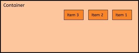
The above diagram shows a basic layout, with a container holding 3 different items. These 3 items could be anything - pictures, a sidebar, the entire main content of your website - it's literally all up to you. You just have to make sure they are contained within a container before you can start using Flexbox to it's full potential.
In this post, we're only going to cover container properties. Keep an eye out later this week for a post about item/child properties!
Flexible Containers
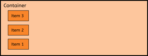
So before you do anything, you need to set the container to display:flex. This tells the computer that this is now a flexible item. Incidentally, this should set your items beside each other. So if, say, your items look like this without the display:flex:
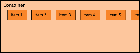
It'll end up looking like this with the display:flex:
Now, this obviously has some caveats. My images have margin added, and no set width. If you do have a set width, that'll change things. The biggest recommendation I can give is to play around with it and see what works best for you.
Container Specific Properties
Let's talk about manipulating the container. Now that it's flexible, we have different options and things we can do with it.
flex-direction
This defines the direction in which the container stacks the items. The different values you can give this property are:
-
flex-direction: row;- default option, items go horizontally left to right -
flex-direction: row-reverse;- items go horizontally right to left -
flex-direction: column;- stacks the items vertically -
flex-direction: column-reverse;- stacks vertically, but this time from bottom to top
I've tried to make it sound as simple as possible, but if your like me, that still sounds like a lot of gibberish. So I'm going back to my handy diagrams to try and visually explain it:
flex-direction: row;:
flex-direction: row-reverse;:
flex-direction: column;:
flex-direction: column-reverse;:
Hopefully you've got a basic understanding of what flex-direction does at this point. Now, let's move on to another property...
flex-wrap
This specifies whether the items should wrap or not - with nowrap, the items will stay on one line, with wrap, they will create a new line. There is also a fun thing called wrap-reverse, which makes them wrap, but all in reverse.
Let's do some diagrams:
flex-wrap: nowrap;:
flex-wrap: wrap;:
When you have it set to wrap, the spacing and items will adapt to the screen size. When it's at nowrap, the items will overflow (as seen above).
And that's flex-wrap! Simple, yet so so powerful. Now on to...
justify-content
Simply put, this property is used to align the items horizontally in the container. It contains such values as:
-
justify-content: flex-start;- default, aligns items at the start of the container -
justify-content: flex-end;- aligns items at the end of the container -
justify-content: center;- aligns items to the center of the container -
justify-content: space-around;- leaves space before, after and between the items -
justify-content: space-between;- leaves space just between the items
Did you get all that? The values are semi-self-explanatory, but I think we need diagrams anyway because I enjoy cobbling these together. (And yes, some of these might be the same as before. Sometimes they just match up well.)
justify-content: flex-start;:
justify-content: flex-end;:
justify-content: center;:
justify-content: space-around;
justify-content: space-between;
The difference between space-around and space-between is minimal, but as you can see it does still make a big difference. Always make sure you're using the property that best suits what you're trying to accomplish!
align-items
"But wait" I hear you exclaim, "didn't we just talk about aligning items with justify-content??"
Yes we most certainly did. But align-items aligns the items vertically, instead of horizontally. Super helpful, right? We're going to have to change the diagrams up a bit for this one, but let's first do an overview of the values.
-
align-items: center;- aligns the items vertically in the center of the container -
align-items: flex-start;- aligns the items at the top of the container -
align-items: flex-end;- aligns the items at the bottom of the container -
align-items: stretch;- stretches the items to the same size and fills the container -
align-items: baseline;- aligns the items to the baseline of the text inside them
This is definitely the property that confuses me the most, which is why I'm trying to break it down to it's base components. Let's do diagrams.
align-items: center;
align-items: flex-start;
align-items: flex-end;
align-items: stretch;
align-items: baseline;
As you can see, I actually added a dashed baseline in so we can all tell where the alignment is happening.
And, hopefully, I've covered that correctly.
Off we go to another similar sounding property:
align-content
This is used to align the flex lines. Yep. This is basically the same thing as the above, but instead of focusing directly on the items, we're manipulating the flex lines.
Now, I'm not going to go into detail about the values here. No diagrams this time, as all of the values are quite similar to the justify-content values.
Instead, we'll stick with a list.
-
align-content: space-between;- leaves equal space between the flex lines -
align-content: space-around;- leaves equal space all around the flex lines (not just between) -
align-content: stretch;- stretches the flex lines to fill available space -
align-content: center;- centers the flex lines in the middle of the container -
align-content: flex-start;- aligns the flex lines at the start (left side) of the container -
align-content: flex-end;- aligns the flex lines to the end (right side) of the container
And that's the general gist of it. Honestly, if you need a visual representation of this, take a peek at the diagrams under the justify-content section - it gives the same general view as this would.
Conclusion
Well, this was fun. At this point, if you made it this far, you should have a general idea of how to style a container when using Flexbox. Again, I seriously suggest opening up CodePen and just messing around with some divs and boxes to get the feel for Flexbox - I've spent way too long playing around with it myself.
I mean, hey, if you want to peek at that here's the link for it:
And again, I will write something about child properties later this week! That way we can cover all of the bases and not take up all of your time.
Until then, happy coding babes. <3


Top comments (10)
I just wanted to say I think you did a great job explaining flex, I would totally use this to introduce my junior developers to flexbox. Thanks for putting this together :)
To follow up, it would be cool to explore some more complicated flex techniques, such as having a flex-wrap on a parent container, but having the inner elements centered but justified flex-start. That's something I don't really see in most other flex overviews.
Aww thank you!
I was actually digging into the more complex techniques a bit, and considered trying to include them, but decided to stick with the basics because those are a bit over my head right now. 😂
Does that mean, this will become a series ?? I use this for react native, so that could be interesting. Good post by the way, great information.
There is a very good chance of that, but I won't say for definite because I'm always horrible at keeping up with commitments. :P
Do we need another article on flexbox? There are already a ton of good articles and cheatsheets on flexbox... nothing new here
My reasoning behind this article was to really drill the properties into my head, and have a place I could come back to when I needed a refresh or to relook at something. Writing it all out myself makes it inherently understandable to me, and a much better resource for future me.
So nope, nothing new here. Just thought I'd post it in case any other Flexbox newbies found it useful. 🙂
Please be kind to who's actually producing content, you aren't. I don't get why you are getting so salty.
There's nothing new to you, but something presented "just so" could make a concept click for somebody. If you didn't get anything out of a particular article, that doesn't mean that nobody else did, and disparaging comments like that aren't at all helpful.
I, for one, still struggle a bit with flexbox and find that the more articles I read, the more it makes sense, so ... yes. We do need another article on flexbox.
Thanks! I will use it!