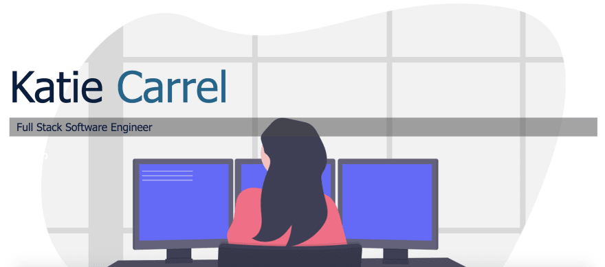
As I have been in the middle of my job hunt for the elusive first software engineer role I have been soliciting feedback from friends and mentors on my projects, resume and portfolio. With the gathered input on my portfolio site I set aside some time to refactor my portfolio website from this:

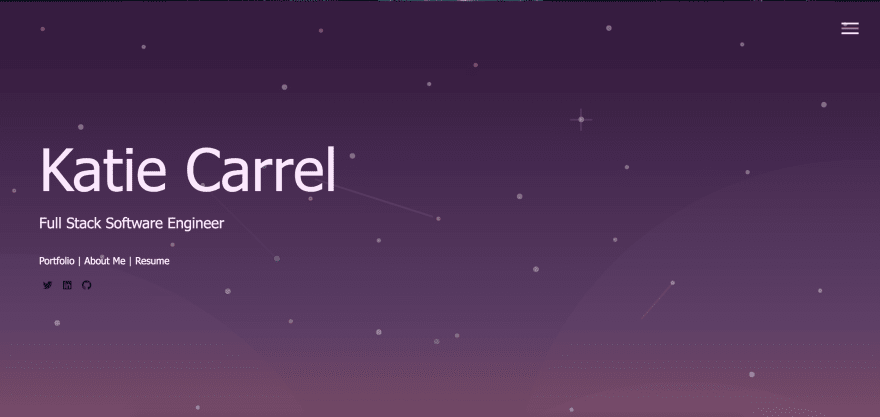
to this:

This blog post will be going over the main problems identified with my original website and the resources I used to update it.
Problem 1: Color scheme
The original color story I had utilized originally didn't provide enough contrast to be visually pleasing or in the case that a user was visually impaired it could prove more challenging to read. Utilizing the below resources I landed on a color scheme that I loved and accomplished the contrast I was looking for!
Resources used:
Problem 2: Original background image
The original image that I used for my landing page is from the wonderful open source illustration site UnDrawn. While I love UnDrawn's illustration it didn't fit what I envisioned for providing contrast to highlight the various links I wanted displayed. Thus I looked around for a vector image that suited the color scheme I was looking for and was eye-catching.
Resources used:
Problem 3: Portfolio, About Me and Resume hidden in menu
In my first iteration of my portfolio I only had links to these pages living in my hamburger menu rather than making it simple for the user by providing those links on the homepage.
Next update: Accessibility score
This first refactor left me with a portfolio site that had around 87% total compliance rating for accessibility standards and definite room for improvement. Using the below resources I got scores and suggestions for ways to improve the accessibility of my website that I am working through now. You may be asking - What is accessibility and why is it important? In that case I suggest you check out this friendly introduction.
Resources being used:
I hope this is helpful for anyone looking to update their portfolio website!


Top comments (2)
Thanks for the insights. I will be sure to check out those accessibility links to see how I can improve my blog as well! Have a great day!
Judging from the picture alone, I like the old design better, it feels more personal/less generic somehow.