Over the last three years at Crowdform we’ve designed countless digital products. Along the way we’ve picked up a few subtle and unexpected tricks which can really level up a product design. So we thought: why not collate these tips into a series of articles to help the other UI designers out there?
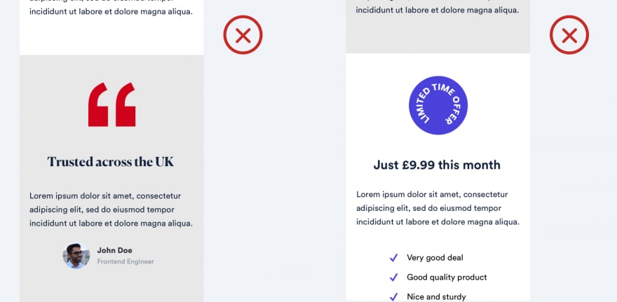
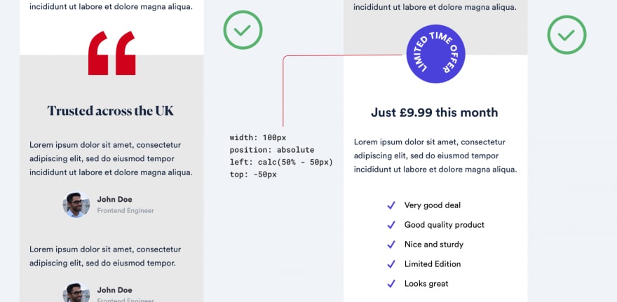
1) OVERLAY SHAPES ACROSS SECTIONS TO ADD MORE DEPTH
Sometimes a straight transition from one section to another looks, well…boring.
If you have a graphic element on your page, it’s worth experimenting by overlaying it across two sections. Your design should look more fluid and less compartmentalised.
We wrote a longer article, with 6 other examples, over on our product studio’s blog.


Top comments (0)