
Written by Elijah Asaolu✏️
HTML, at its core, is limited to a specified collection of tags, each with its own functions. However, developers regularly face situations where they need to reuse certain blocks of code (HTML tags) across different sections of an application. This recurring requirement paved the way for the development of Web Components.
Web Components is a set of standards that allow developers to expand HTML with custom tags, encapsulating code in a reusable and manageable manner. In this guide, we'll look at web components, how they work, how to create them, and their benefits and drawbacks.
We will also compare Web Components to other popular JavaScript component frameworks, exploring their different advantages and potential use cases. Ultimately, this guide should help you thoroughly assess Web Components and determine whether to use it in your next project.
What is Web Components?
Web Components is a suite of modern web standards that allow developers to create reusable, encapsulated, and interoperable custom elements.
In other words, in addition to the default HTML elements, we can create a new markup, such as a dropdown or carousel component. Then, we can add our desired functionality with JavaScript, give it a custom tag name, and render it like any other HTML element.
To achieve all these, Web Components utilizes multiple technical standards behind the scenes — namely, custom elements, shadow DOM, HTML templates, and ES modules: 
The combination of these technologies creates a comprehensive toolkit for developing complex, reusable web components:
- Custom elements help to define component behavior and interfaces
- The shadow DOM assures style and markup encapsulation
- HTML templates provide a means for describing component structure
- ES modules facilitate code organization and reuse
In subsequent sections, we'll go over these features in more detail.
Further reading:
- Create reusable components with Mitosis and Builder.io
- Building reusable web components with Stencil.js
- Credit card form web component tutorial
- Build an off-canvas menu with and web components
Why use Web Components?
Web Components offers several key advantages for web development:
- Performance: Utilizing the browser's native features makes Web Components lightweight and fast, reducing the need for additional libraries and decreasing load and runtime speeds. This efficiency is particularly beneficial for performance-critical applications
- Developer experience: Thanks to their encapsulation, web components streamline development and maintenance. They enable a modular approach, allowing for isolated development, testing, and deployment. This, in turn, simplifies codebase management and enhances code clarity and scalability
- Smaller bundle sizes: Since web components leverage native browser capabilities, using them often leads to reduced application bundle sizes. Without the need for large external libraries, applications load faster, improving the user experience
- Framework-agnostic: You can integrate web components into any web framework or application, offering great flexibility and enabling their use across various projects without compatibility concerns
While Web Components offers numerous benefits, there are also some challenges to consider:
- SEO and accessibility: Encapsulating web components with the shadow DOM can complicate SEO and accessibility, potentially hindering content visibility to search engines and assistive technologies
- Tooling ecosystem: The tooling for Web Components is evolving but may lack the maturity and convenience of established frameworks, possibly leading to a steeper learning curve
- Styling and theming: Ensuring consistent styling and theming across web components, particularly from different sources, requires a thoughtful strategy and possibly additional tools to overcome encapsulation boundaries
Nevertheless, you can manage or minimize most of these drawbacks effectively by using web components strategically.
Creating web components
To demonstrate Web Components in action, let's create a basic card component. First, we need to design the basic HTML structure for our card component, defining what it should look like:
<style>
  /* Styles for the card */
  .card {
    font-family: "Arial", sans-serif;
    background: #fff;
    width: 300px;
    box-shadow: 0 4px 8px 0 rgba(0, 0, 0, 0.2);
    margin: 16px;
    border-radius: 10px;
    overflow: hidden;
  }
  .container {
    padding: 2px 16px;
  }
</style>
<div class="card">
  <img src="path/to/image" alt="Card Image" />
  <div class="container">
    <h4><b>Card Title</b></h4>
    <p>Card Description</p>
  </div>
</div>
With the markup finalized, we can now define our component in JavaScript. This entails creating a class that extends HTMLElement and calling the customElements.define() method, as shown below:
// app.js
class CardComponent extends HTMLElement {
    constructor() {
        super();
        // Attach a shadow DOM tree to this instance of the component
        const shadow = this.attachShadow({mode: 'open'});

        // Create a clone of the template content
        const template = document.createElement('template');
        template.innerHTML = `
            <style>
                /* Styles for the card */
                .card {
                    font-family: 'Arial', sans-serif;
                    background: #fff;
                    width: 300px;
                    box-shadow: 0 4px 8px 0 rgba(0,0,0,0.2);
                    margin: 16px;
                    border-radius: 10px;
                    overflow: hidden;
                }
                .container {
                    padding: 2px 16px;
                }
            </style>
            <div class="card">
                <img src="path/to/image" alt="Card Image">
                <div class="container">
                    <h4><b>Card Title</b></h4>
                    <p>Card Description</p>
                </div>
            </div>
        `;

        // Append the template content to the shadow DOM
        shadow.appendChild(template.content.cloneNode(true));
    }
}

// Define the 'custom-card' element
customElements.define('custom-card', CardComponent);
In the code above, we've defined a class called CardComponent that extends HTMLElement. Within the constructor, we initiate a shadow DOM for encapsulation, allowing internal features of the component — like styles — to remain isolated from the rest of the document.
The template element defines our card's HTML structure and styling. This element is then cloned and appended to the shadow DOM, making it part of our custom element.
To use our newly created component, we simply need to import the JavaScript file where our component is defined into an HTML page. Then, we can use the custom tag as we would with any standard HTML element:
<!DOCTYPE html>
<html lang="en">
<head>
    <meta charset="UTF-8">
    <title>Custom Card Component</title>
    <script src="app.js"></script>
</head>
<body>
    <!-- Render the custom card component -->
    <custom-card></custom-card>
</body>
</html>
Following these steps, the custom <custom-card> element becomes recognized by the browser. When the page is loaded, the browser processes the tag, creates an instance of CardComponent, and renders it according to our definitions.
Further reading:
- Nesting web components in vanilla JavaScript
- Building web components with WebC in vanilla JavaScript
Key Web Components features to know
Web Components provides essential capabilities that allow us to create robust and easily maintainable components. Let's quickly go over some of them.
Lifecycle methods
Web Components includes many lifecycle callbacks that allow you to take specified actions at certain points in a component's lifespan. These callbacks are useful for managing resources, responding to changes, and ensuring that your components behave predictably: 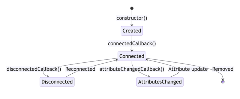
constructor
The constructor is called when an element instance is created or upgraded. It’s where you set up the initial state, default values, and event listeners:
class MyElement extends HTMLElement {
  constructor() {
    super(); // Always call super first in a constructor
    // Initialize state or bind event listeners
  }
}
It’s recommended to utilize this method solely for initial setup. Avoid including any code that modifies attributes or children, since the element may not be fully set up.
connectedCallback
connectedCallback is invoked each time the custom element is appended to a document-connected element:
connectedCallback() {
  this.render(); // For example, a method to render component's HTML
}
This callback is a good place to run setup code, such as fetching resources or rendering. Essentially, it's where you should prepare your component for display.
disconnectedCallback
The disconnectedCallback function is called when a custom element is disconnected from the document's DOM:
disconnectedCallback() {
  // Cleanup work
}
Use this callback to handle cleanup operations, such as removing event listeners or canceling any ongoing network requests.
adoptedCallback
adoptedCallback is invoked each time the custom element is moved to a new document:
adoptedCallback() {
  console.log('Component moved to new document');
}
This is a less commonly used lifecycle hook but can be useful for components that are moved between documents, such as in a multi-frame application.
attributeChangedCallback
This callback is invoked each time one of the custom element's attributes is added, removed, or changed. You must specify which attributes you want to observe using a static observedAttributes getter:
static get observedAttributes() { return ['disabled', 'label']; }

attributeChangedCallback(name, oldValue, newValue) {
  // Respond to attribute changes
  if (name === 'disabled') {
    // Handle the 'disabled' attribute change
  }
}
This method is essential for responding to changes in attributes, enabling dynamic updates to the component's state or appearance in response to attribute modifications.
Simple demo usage of lifecycle methods
Putting everything together, here's a simple example of how these methods might be combined into a custom element definition:
class MyCustomElement extends HTMLElement {
  constructor() {
    super();
    // Initial setup
  }

  connectedCallback() {
    this.innerHTML = `<p>Hello, World!</p>`;
  }

  disconnectedCallback() {
    // Cleanup
  }

  adoptedCallback() {
    // Respond to moving document
  }

  static get observedAttributes() { return ['example']; }

  attributeChangedCallback(name, oldValue, newValue) {
    // React to attribute changes
    if (name === 'example') {
      this.updateComponent(newValue);
    }
  }

  updateComponent(value) {
    // Update component based on attribute
  }
}

customElements.define('my-custom-element', MyCustomElement);
With these lifecycle methods, you can fully utilize the Custom Elements API to develop dynamic, responsive, and efficient web components.
Shadow DOM
The shadow DOM allows you to include a subtree of DOM elements in a document, but with a separate scope for CSS and JavaScript. This means that styles and scripts defined in a shadow DOM will not leak into the main document, nor will external styles or scripts interfere with the shadow DOM's internals.
To create a shadow DOM, use the attachShadow method on an element, which returns a shadow root. The mode property can be set to either open or closed, indicating whether the shadow root is accessible from JavaScript outside the shadow DOM:
const element = document.createElement('div');
const shadowRoot = element.attachShadow({ mode: 'open' });
In open mode, the shadow root is accessible from the main document via the element.shadowRoot property. However, in closed mode, the shadow root is not accessible from the main document, providing stronger encapsulation.
Template slots
Slots are defined in the shadow DOM of a web component and serve as placeholders for any user-supplied content. When a component is used in an HTML document, items within the custom element can be assigned to specific slots using the slot attribute, allowing for flexible content organization within custom elements.
Here's a simplified example to illustrate the concept:
<!-- Inside your web component's template -->
<div>
  <slot name="custom-content"></slot>
</div>
In this example, we defined a <slot> tag with the name custom-content, indicating where the user-defined content should be placed within the component. We can now assign content to this slot, as shown below.
<!-- Usage in an HTML document -->
<your-custom-element>
  <div slot="custom-content">This is custom content for the slot.</div>
</your-custom-element>
Default content
Slots allow for default content, which is displayed inside the slot if no content is assigned to it. This feature is particularly useful for providing fallback content or instructions within custom elements:
<template>
  <slot name="user-greeting">Hello, guest!</slot>
</template>
In this example, the default content — Hello, guest! — is displayed if no content is provided to the user-greeting slot. This enhances the usability of the component by ensuring that it always has meaningful content.
Named slots
Named slots enable a component to define multiple distinct slots, each intended for different content. This allows for a more structured and semantic distribution of content within a component:
<template>
  <header>
    <slot name="header"></slot>
  </header>
  <main>
    <slot name="main-content"></slot>
  </main>
  <footer>
    <slot name="footer"></slot>
  </footer>
</template>
As described in the example above, named slots allow you to carefully control your component content layout by defining slots for the header, main content, and footer.
Fallback content
Fallback content is similar to default content, but is specifically designed to be shown in case of errors or when the expected content cannot be loaded or is unavailable:
<template>
  <slot name="profile-picture">
    <img src="default-profile.jpg" alt="Default Profile Picture">
  </slot>
</template>
This slot provides a default profile picture as fallback content, ensuring the component always has a visual representation, even if the user does not provide a specific image.
Events
Events in Web Components facilitate component-to-component communication and enable custom notifications. These events can include custom data and may either bubble up through the DOM or be restricted to the originating component.
Creating events involves specifying several options:
-
bubbles: Whentrue, this allows the event to bubble up through the DOM -
composed: Whentrue, the event can cross the shadow DOM boundary to reach the regular DOM, making it accessible outside the component -
cancelable: Enables the event to be canceled, providing a way to signal that an action associated with the event should not proceed -
detail: Allows the inclusion of custom data within the event
To emit a custom event, we can use the CustomEvent constructor. This constructor extends the standard Event interface, enabling us to include custom data via the detail property.
Here's an example of how a custom event might be dispatched from a web component:
class MyComponent extends HTMLElement {
  constructor() {
    super();
    // Example of dispatching a custom event
    const event = new CustomEvent('my-custom-event', {
      detail: { /* Custom data */ },
      bubbles: true, // Allows the event to bubble up through the DOM
      composed: true // Enables the event to cross the shadow DOM boundary
    });
    this.dispatchEvent(event);
  }
}

window.customElements.define('my-component', MyComponent);
In this example, we dispatched a custom event named my-custom-event that has the potential to carry custom data.
Web components can also listen to events using the addEventListener method:
document.addEventListener('my-custom-event', (e) => {
  console.log('Custom event received:', e.detail);
});
Another important feature is event delegation, a technique that leverages event bubbling to listen for events at a higher level than their dispatch source. It's useful within Web Components for managing events from multiple child elements without needing individual listeners for each one:
this.addEventListener('click', (event) => {
  if (event.target.matches('.some-selector')) {
    // Specific event handling
  }
});
Using event delegation simplifies handling events for components with many child elements or for dynamically added elements, enhancing efficiency and maintainability.
Styling web components
When you define a component, you can include a <style> tag within its shadow root to apply CSS rules that affect only the component's internal elements.
However, this encapsulation is a double-edged sword: it keeps the component's styles isolated, but it also blocks external styles from affecting the component's internals directly. For example, global styles defined outside a web component will not penetrate the shadow DOM.
Let’s discuss the following best practices for addressing this issue.
Utilizing CSS variables for flexible styling
CSS variables are essential for effectively styling web components. They have the unique ability to cross the shadow DOM boundary, making them ideal for defining a component's customizable aspects like colors, fonts, and spacing. Here's how you can leverage them:
/* Within your web component */
:host {
  --button-bg-color: blue; /* Background color variable */
  --button-text-color: white; /* Text color variable */
  display: block;
}

button {
  background-color: var(--button-bg-color); /* Use the background color variable */
  color: var(--button-text-color); /* Use the text color variable */
}
Setting these variables allows users of your component to quickly adjust them to apply their desired global themes or specific styles, all while respecting the encapsulation boundary.
Leveraging ::part for targeted styling
The ::part pseudo-element offers a powerful way to expose specific elements within your component's shadow DOM for external styling. Mark elements with the part attribute to make them available to style from outside the component:
/* Inside your web component */
button.part {
  /* Base styling */
}

/* In an external global stylesheet */
my-component::part(button) {
  /* Overrides or additional styling */
}
This method strikes a perfect balance, maintaining style encapsulation while allowing for precise customization of component parts.
Integrating global styles
You can include a global stylesheet with CSS custom properties or classes to apply global styles or themes to web components. This approach ensures a unified aesthetic across your application without compromising the encapsulated styles of individual components:
/* Global stylesheet */
:root {
  --primary-color: green; /* Define a global primary color */
  --secondary-color: orange; /* Define a global secondary color */
}
Your components can then leverage these global styles, adopting application-wide themes while retaining their own encapsulated styles. This method improves your app’s uniformity and modularity.
Web Components vs. component frameworks
Some popular component-based frameworks and libraries include React, Vue, Angular, and Svelte. When choosing between these options, it's essential to compare them based on features, performance, community support, and documentation.
Web components often outperform frameworks because they use native browser APIs, reducing overhead and potentially speeding up load times. In comparison, Svelte enhances runtime efficiency by compiling to optimized JavaScript, while React and Vue use virtual DOM for updates.
When it comes to features, Web Components excels at creating reusable, encapsulated elements, sticking closely to web standards. Frameworks offer broader ecosystems, including state management and routing, beyond mere component models.
The community size and resource availability are where web components fall short in comparison to the frameworks and libraries mentioned. Web Components has a smaller but growing community, whereas React, Vue, Angular, and Svelte each boast large, established communities with extensive resources and documentation, offering greater support for complex projects.
As usual, the choice between Web Components and other component-based frameworks and libraries depends on your project's needs and preferred features.
Web components are ideal for creating interoperable, standards-compliant components. In contrast, the component frameworks and libraries we’ve discussed offer a richer set of features and stronger community support for building full-scale web applications.
Below is a summary table that highlights the comparative aspects of these technologies:
| Feature | Web Components | React | Vue | Angular | Svelte |
|---|---|---|---|---|---|
| Standardization | W3C Standard | Library | Framework | Framework | Compiler |
| Performance | Native efficiency, minimal overhead | Virtual DOM, optimized updates | Virtual DOM, runtime optimization | Ahead-of-Time compilation, dynamic loading | Compile-time optimization to vanilla JS |
| State Management | External libraries or custom solutions | Context API, Redux | Vuex, Composition API | RxJS, NgRx | Stores, Context API |
| Reactivity | Manual or library-assisted | Declarative UI, hooks | Declarative rendering, options/composition API | Two-way binding, observables | Reactive declarations, assignments |
| Routing | Requires external libraries | React Router | Vue Router | Angular Router | SvelteKit (or external libraries) |
| Data Binding | Property and event binding | One-way data flow | Two-way data binding (v-model) | Two-way binding (ngModel) | Two-way binding, reactive statements |
| Framework Integration | Highly interoperable | Can integrate via wrappers | Direct integration possible | Direct integration possible | Direct integration possible |
This table reflects the strengths and limitations of each technology, aiding in making an informed decision based on the specific needs of a project or development team.
Further reading:
Conclusion
In this adoption guide, we’ve explored how Web Components works behind the scenes. We discussed how to get started with creating web components, their major benefits and drawbacks, as well as how they compare with other JavaScript component frameworks and libraries.
Get set up with LogRocket's modern error tracking in minutes:
- Visit https://logrocket.com/signup/ to get an app ID.
- Install LogRocket via NPM or script tag.
LogRocket.init()must be called client-side, not server-side.
NPM:
$ npm i --save logrocket

// Code:

import LogRocket from 'logrocket';
LogRocket.init('app/id');
Script Tag:
Add to your HTML:

<script src="https://cdn.lr-ingest.com/LogRocket.min.js"></script>
<script>window.LogRocket && window.LogRocket.init('app/id');</script>
3.(Optional) Install plugins for deeper integrations with your stack:
- Redux middleware
- ngrx middleware
- Vuex plugin


Top comments (1)
#102 - 5 more Web Component Lessons after #101