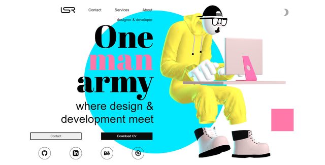
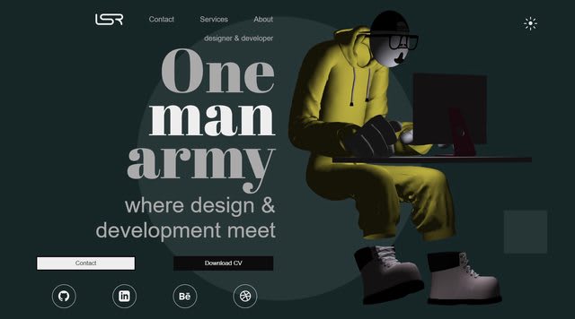
Hi dev.to this is my first post, I would like to introduce myself and share some insights from my website and ask for opinion of this amazing community
I am mix of web developer and designer so my website looks more informal then others programmer portfolios, all the images used in my site are made by me although I think it project more a designer vibe than a programmer site. So I would like to ask:
- what do you guys think ?
- it runs the the model smoothly ?
- it takes to long to load the website ?
- does work well in mobile ?
The model was made with blender and Marvelous Designer, rendered with Three.js and all the site is made with Vue and CSS grid, hosted in Netlify. There is some little details like the backlights that change its color from blue to red to simulate indirect light from the back boxes
And if you enter in dark mode I actually turn of the lights of the scene and turn on a light that simulate the monitor.
I recently move to Europe and I am having a huge Impostor Syndrome, I know its trending but I want to get into the industry I would like to have some feedback of this portfolio Thanks for your time happy weekend


Top comments (8)
Wow! This is a pretty impressive site. In terms of improvements:
Thanks for you reviewing takes to long the switch ? Or it lags or something ? Nice idea about the scroll effect
This is what I see on Firefox:
dev-to-uploads.s3.amazonaws.com/i/...
It seems sort of laggy, or maybe there's not enough shades of colors going from white -> black
Very cool!
The biggest issue with your site is performance, unfortunately. The animations are very laggy/jittery, and my CPU usage immediately shot up:
Unrelated: Don't forget to add a favicon to your site!
Yeah I'm working in the form submission in other branch it's kinda tricky get it work cuz' my site it's not static rendered, so netlify can't read their special forms but is WIP. Which image is slow the first image of the gallery or the 3d model ? Thanks for reviewing the site
I really liked that dark mode light switch.
It looks really neat but finding the dark-mode switch isn't easy. If you hadn't mentioned it I would never have guessed the bizarre grey squiggle thing enabled it.
Runs fine here on Safari!
Yeah it needs UX improvements