There are a lot of features I want to add to my final portfolio project, "MOODetails". The purpose of this app is to take note of prompts to certain moods, and to differentiate between those that are and are not within your control.
Updating Form Layout
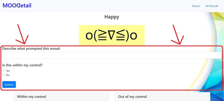
Before working on the additional features, I really wanted to update how the form looked because I found it too bland:
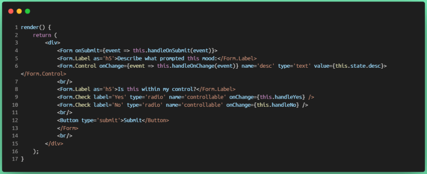
Here is what the original code looked like for the form portion of the above image:
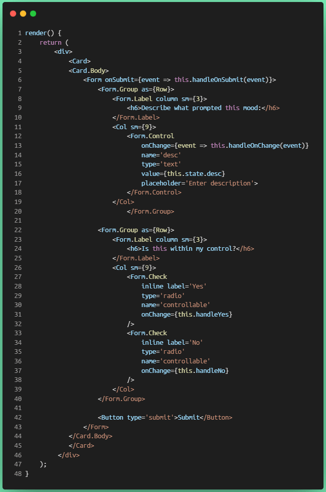
I decided to put the form into React-Bootstrap's Card component, as well as Col (columns). Things were beginning to get jumbled with the additions, so I modified the spacing as well for better readability. Now, the code looks like this:
Though the code looks a bit longer and taking up more lines, I still think this looks much cleaner.
Spacing
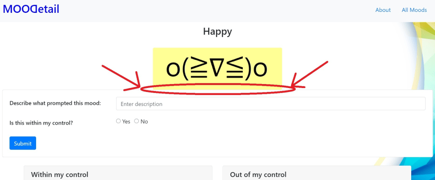
The next thing I want to fix here is the spacing between the mood image and the form:
So originally, I was using break (<br>) tags to deal with the spacing issue, but this definitely made my code look clunky:
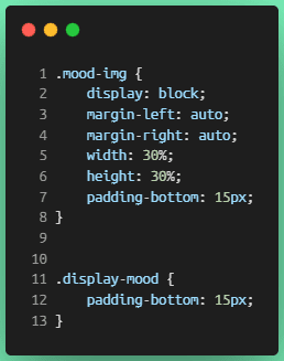
To solve this problem, I simply added class names to the components where I wanted to add a padding to the bottom so that I could manipulate them in the CSS file:
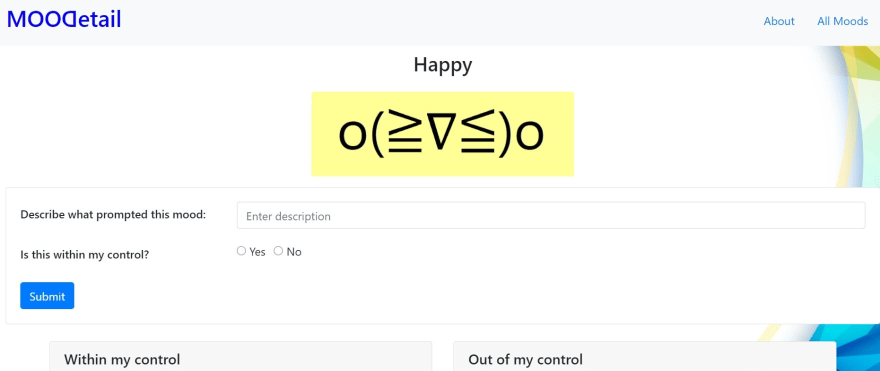
Aaaaaaand voila! I've got the appropriate spacing between mood name, mood image, and form:
Helpful Links
React Bootstrap documentation on forms
Use Carbon to embed code snippets in a blog
There were some inconsistencies in the coloring here, but it still looks pretty nice!





Top comments (0)