Hello. Today's article will be the last one dedicated to custom grid item placement inside the grid. Previously, I focused mainly on describing how to change default grid item positioning using grid-row(column)-start(end) CSS properties (and their shorthands). Now, I want to show you a different approach based on the concept of a grid template.
This article is part of my CSS Grid introduction series. If you want to check out my previous posts, here you can find the whole table of contents.
Naming grid item using the grid-area property.
The discussed method requires that every grid item that needs to be custom positioned should contain its own name. You can name grid item using the same grid-area CSS property which I described in my previous article.
Aside from the arguments I already mentioned, this property takes a single argument of type custom-ident which acts as a name for this grid item.
.grid-item {
  grid-area: myCustomName;
}
Positioning of named grid items using the grid-template-areas property.
After naming each element, you can use those names to define the grid template. This can be done with the grid-template-areas CSS property which is the property of the grid container element.
Keep in mind that all examples presented in this article will share the following common definitions.
.container {
  grid-template-rows: repeat(5, 1fr);
  grid-template-columns: repeat(5, 1fr);
}

.grid-item {
  grid-area: item;
}
A grid template is some kind of representation of a container grid. Its size however does not have to correspond to the size of the container grid — may be larger or smaller. Using previously defined names, you can plan the placement of each grid inside the template which will correspond to placement in a real grid.
The grid-template-areas property takes any number of non-empty string arguments. Every argument represents a single row of the grid, starting from the top. Cells in rows are separated using space and may be one of two values: name or dot. The name refers to the named grid item and the dot represents an empty cell, not occupied by any grid item.
.container {
  grid-template-areas:
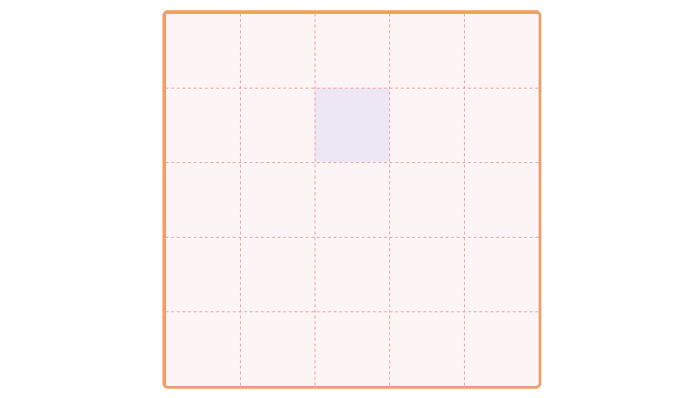
    ". . . . ."
    ". . item . ."
    ". . . . ."
    ". . . . ."
    ". . . . .";
}
.container {
  grid-template-areas:
    ". . . . ."
    ". . item . ."
    ". . . . .";
}
The second example shows that a number of string arguments in grid-template-areas property (3) do not have to match the number of rows defined in the grid (5).
Each row can contain any number of cells, but this number must be equal in all rows.
.container {
  /* invalid: number of cells in rows are different */
  grid-template-areas:
    ". ."
    ". . item . ."
    ". . . . . . . . . . .";
}

.container {
  grid-template-areas:
    ". . ."
    ". item ."
    ". . .";
}
Notice that number of cells in each row does not have to match the number of columns defined in the grid.
If adjacent names in the grid template (both between columns and rows) are the same, the grid item will be assigned to the appropriate grid area.
.container {
  grid-template-areas:
    ". . . . ."
    ". item item . ."
    ". item item . ."
    ". . . . ."
    ". . . . .";
}
A group of adjacent names must form a rectangular shape, otherwise, such a layout will be invalid.
.container {
  /* invalid: adjacent names not form rectangular shape */
  grid-template-areas:
    "item . . . ."
    "item item . . ."
    "item item item . ."
    ". . . . ."
    ". . . . .";
}
Assigning a grid item to a selected grid area (or grid cell) will cause that lines that define the boundaries of this area will automatically receive appropriate names. These names are formed according to the following formula: item name + prefix.
.container {
  grid-template-areas:
    ". . . . ."
    ". . . . ."
    "item item . . ."
    "item item . . ."
    ". . . . .";
  }
}
Thank you for reading this short article. If you want to read more content like this you can follow my dev.to or twitter account. Also, feel free to give me any form of feedback. I'd love to read any comments from you. See you soon in my next article!
PS. If you would like to support my work, I will be grateful for a cup of coffee. Thank you. ❤️


Top comments (0)