Whenever I've taught people about CSS position, I've always warned against using position: sticky;.
Browser support for all position values has been great, except for sticky. So, what's the point in using something that's not going to work a lot of the time?
But, I must say, I've now changed my tune! During the build of Frontend Mentor, I was looking for a simple solution to create a sticky menu on the resources page. The menu allows you to jump between categories on the page and is not part of the main header. All it needed to do was stick to the top of the viewport when the element was scrolled to and leave when the container was scrolled past.
Sure, it would be very easy to install an npm package to achieve that effect, but I wanted to use the simplest approach possible.
As I knew this was the exact behaviour offered by position: sticky; I thought I'd have a look at current browser support:
Not too bad! Over 86% of browsers used around the world support position: sticky; and pretty much all major modern browsers support it.
But what happens if someone comes to the site on a browser that doesn't support it? Simple! The element just doesn't stick to the viewport. No mass chaos or breaking of the internet. Just no sticky element.
The site's main users are web developers (both current and aspiring). So it was entirely reasonable to assume the vast majority of people accessing the site will do so through a modern browser.
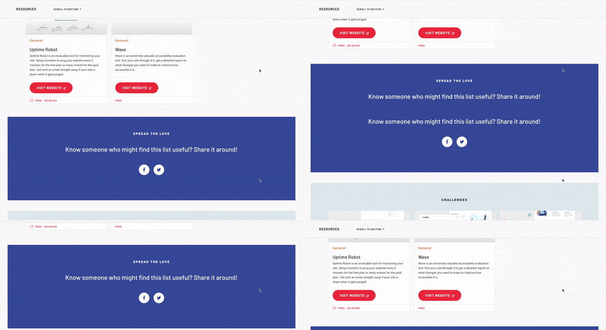
I went ahead and used it, and I must say it put a smile on my face 🙂 Here's the menu bar sticking to the top of the viewport as you scroll down the page:
And here it is un-sticking itself as you scroll past the parent element:
Easy!
If you'd like to check it out properly, head over to the resources page on the site.
Want to have a sticky sidebar on your blog post page? The basic markup could be as follows:
<!-- parent element -->
<section>
    <article>
        ...
    </article>

    <!-- sticky element -->
    <aside>
        ...
    </aside>
</section>
As soon as the section element moves out of the viewport the aside will un-stick itself and move off-screen.
So, next time you're in need of a sticky sidebar or a menu, like me, consider using position: sticky;.
Keep in touch
If you'd like to stay in touch you can follow Frontend Mentor or follow my personal account on Twitter. Feel free to say hi! 🙂


Top comments (19)
Would be nice to have this in the article actions/reactions bar, to stick it at the bottom of the article card/container.
I didn't even know about
position: sticky, I'd only seen this done via JS which I never really liked. This is definitely something I could see us making use of.Yeah, it’s great! Makes sticky elements super easy to implement.
I imagine this is much more performant than JS-driven alternatives?
I couldn’t say for sure, as I haven’t looked into the performance side. But I’d imagine so without any listeners.
I already quickly implemented this in an internal tool for dev.to
PR: github.com/thepracticaldev/dev.to/... 😄
developers.google.com/web/updates/...
There was a little talking about when the reaction bar changed.
dev.to/entrptaher/comment/5fdn
I suggest to use this with a feature query,
@supports (position: sticky). With feature query if you want to offset the sticky point, liketop: 20px, it will only apply the top value to the element if position: sticky is supported.Except it doesn't work well in table headers. I mean check this example:
charliepark.org/css-only-sticky-he...
It works for me only in Firefox Mobile. Not in desktop Chrome or Firefox.
Does it work for anybody?
It seems to work ok for me.
EDIT:
Just looked at the page you linked their elements table is wrong, they need to put
stickyon thethnot thethead.Adding this CSS would fix their problem.
The above css could cause a problem if there was more than one header row. Since top:0 is there it should only be applied to the 1st header row.
thead tr:first-child th {
position: -webkit-sticky;
position: sticky;
top: 0;
background-color: #2eA0ff;
}
Also need webkit for safari.
For multiple header rows you need nth child css or a little javascript where you sum the height of the previous rows.
I am a fan of 'position: sticky'. You have shown how it works great for webpage's headers, but think about how we can use it to improve other UIs.
Sticky headers work great for long tables/lists of information where the column header needs to be referenced continuously.
For sure! There’s plenty of opportunities to improve UIs. Will be thinking how else I could use it. The only problem will be trying to not get too carried away 😂
Used position sticky recently to fix the header row in a table. It worked but when I was done I really didn't understand why I couldn't put position:sticky on the
I love that you can easily give tables sticky headers with no extra work.
github.com/thepracticaldev/dev.to/...
What do you guys think?
It miss only one think... an event. But there’s a workaround.
developers.google.com/web/updates/...
Cool! I had not heard of this one at all.