Welcome to the latest in our series of Tailwind CSS tutorials. In this edition we’ll be styling a responsive pricing table component. These are commonly used to give users a quick overview of plan features and pricing for SAAS products, web hosting, or subscription services.
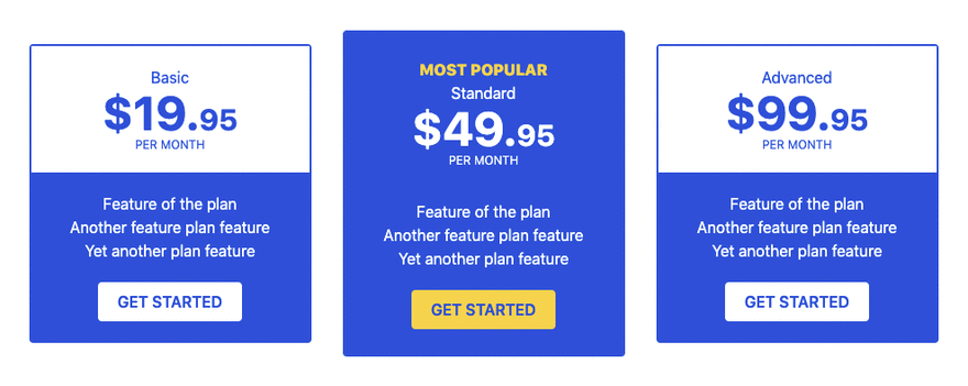
Here’s what the pricing table we’ll be creating will look once completed:
Let’s get started by creating a new blank HTML file and loading Tailwind via CDN:
<!DOCTYPE html>
<html lang="en">
  <head>
    <meta charset="UTF-8" />
    <meta name="viewport" content="width=device-width, initial-scale=1" />
    <title>Responsive Pricing Table - Tailwind CSS</title>
    <link href="https://unpkg.com/tailwindcss@^2/dist/tailwind.min.css" rel="stylesheet" />
  </head>
  <body>
    <!-- responsive pricing table here -->
  </body>
</html>
Note – We’re using the CDN for the purposes of this tutorial as it allows us to get up and running quickly and easily. In the real world it’s recommended to install Tailwind as a PostCSS plugin, you can find more about that and the other installation methods here.
We can now begin to build the pricing table starting with a container to house it all:
<div class="container m-auto">
  <div class="flex flex-wrap items-center justify-center w-full text-center">
    <!-- 3 x pricing plan columns here -->
  </div>
</div>
We’re using container m-auto to restrict the width and center align the pricing table. We’re also use flexbox to achieve the 3 column layout which in Tailwind simply requires the flex class to be added.
Column #1 – Basic Plan
Markup for the 1st column is as follows:
<!-- basic plan -->
<div class="w-full md:w-1/2 lg:w-1/3 p-4">
  <div class="flex flex-col rounded border-2 border-blue-700 bg-blue-700">
    <div class="py-5 text-blue-700 bg-white">
      <h3>Basic</h3>
      <p class="text-5xl font-bold">
        $19.<span class="text-3xl">95</span>
      </p>
      <p class="text-xs uppercase">Per Month</p>
    </div>
    <div class="py-5 bg-blue-700 text-white rounded-b">
      <p>Feature of the plan</p>
      <p>Another feature plan feature</p>
      <p>Yet another plan feature</p>
      <button class="px-5 py-2 mt-5 uppercase rounded bg-white text-blue-700 font-semibold hover:bg-blue-900 hover:text-white">
        Get Started
      </button>
    </div>
  </div>
</div>
Reading this you may be able to figure out what’s going on as most of the classes are pretty self explanatory. Let’s however take a closer look at some of the more important classes are doing.
-
w-full md:w-1/2 lg:w-1/3– This sets the columns as full width on small screens (max-width: 767px), 1/2 the width of the container on medium screens (max-width: 1023px) and 1/3 the width of the container on larger screens (min-width: 1024px). -
hover:bg-blue-900 hover:text-white– Tailwind allows you to apply hover styles by prepending the class with hover. -
border-blue-700 bg-blue-700 text-blue-700– colors in Tailwind can be adjusted on a scale between 50-900 with the darkness increasing the higher you move up the scale.
Column #2 – Standard Plan
Add the markup for the 2nd column as follows:
<!-- standard plan -->
<div class="w-full md:w-1/2 lg:w-1/3 p-4">
   <div class="flex flex-col rounded">
     <div class="py-7 bg-blue-700 text-white rounded-t">
       <h2 class="uppercase text-yellow-300 font-extrabold">
         Most Popular
       </h2>
       <h3>Standard</h3>
       <p class="text-5xl font-bold">
         $49.<span class="text-3xl">95</span>
       </p>
       <p class="text-xs uppercase">Per Month</p>
     </div>
     <div>
       <div class="pt-1 pb-7 bg-blue-700 text-white rounded-b">
         <p>Feature of the plan</p>
         <p>Another feature plan feature</p>
         <p>Yet another plan feature</p>
         <button class="px-5 py-2 mt-5 uppercase rounded bg-yellow-300 text-blue-700 font-semibold hover:bg-blue-900 hover:text-white">
            Get Started
         </button>
      </div>
    </div>
  </div>
</div>
We’ve given this column a dark background so it stands out more along with some additional padding so it appears taller than the other columns. As we are using a flex layout all the columns are centered nicely along the horizontal axis.
Column #3 – Advanced Plan
Add the markup for the 3rd column as follows:
<!-- advanced plan -->
<div class="w-full md:w-1/2 lg:w-1/3 p-4">
  <div class="flex flex-col rounded border-2 border-blue-700 bg-blue-700">
   <div class="py-5 text-blue-700 bg-white">
      <h3>Advanced</h3>
      <p class="text-5xl font-bold">
        $99.<span class="text-3xl">95</span>
      </p>
      <p class="text-xs uppercase">Per Month</p>
    </div>
    <div class="py-5 bg-blue-700 text-white rounded-b">
      <p>Feature of the plan</p>
      <p>Another feature plan feature</p>
      <p>Yet another plan feature</p>
      <button class="px-5 py-2 mt-5 uppercase rounded bg-white text-blue-700 font-semibold hover:bg-blue-900 hover:text-white">
        Get Started
      </button>
   </div>
 </div>
</div>
Markup for this column is identical to the 1st column with only text changes.
Our pricing table is now ready for testing in a browser. If all went to plan the layout should be single columns on mobile devices, staggered layout on tablets and 3 columns on desktop devices.
That concludes this tutorial. If you just want to quickly jump in and have a play around with this code a functioning version of this pricing table can be found on GitHub. If you enjoyed this tutorial be sure to check out some of our other Tailwind CSS tutorials.


Top comments (0)