Linear Gradient
Using BoxDecoration Class you can set different types of gradient for widget. In this example we are going to use LinearGradient widget to set the Liner gradient effect with two colour. colors property accept array of colors and by setting begin and end property you can set the orientation of the gradient.
       Container(
              width: double.infinity,
              height: 200,
              decoration: BoxDecoration(
                gradient: LinearGradient(
                  colors: [Colors.green,Colors.red],
                  begin: Alignment.topLeft,
                  end: Alignment.bottomRight,
                  )
              ),
            )
Radial Gradient
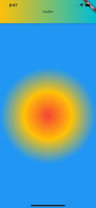
Setting Radial Gradient is not much different than setting up Liner gradient. But it doesn’t contain a property to set begin and end direction. It contain other properties like radius, center etc.
      Expanded(
              child: Container(
                decoration: BoxDecoration(
                    gradient: RadialGradient(
                  colors: [Colors.red, Colors.amber, Colors.blue],
                )),
              ),
            )
You can change the radial start position by setting center position,
       Expanded(
              child: Container(
                decoration: BoxDecoration(
                    gradient: RadialGradient(
                        colors: [Colors.red, Colors.amber, Colors.blue],
                        center: Alignment(0.1, 0.2))),
              ),
            )
Control the space taken for each colour in Gradient
You can use stop property to control the space taken for each colour. stops property accept array of values which say the space taken for each colour. It’s start with 0 and end with 1. For the each color you can specify the fraction between 0 and 1.
As an example if we specify the 0.2 for first colour we need to specify the value greater than 0.2 to show colours properly. If you specify 1 for the first colour it will take all the available space and you will not see other colours. You can thinks this as a ruler which start from 0 and end in 1 and specify end position for each color
        Expanded(
              child: Container(
                decoration: BoxDecoration(
                  gradient: LinearGradient(
                    colors: [Colors.green, Colors.orange, Colors.red],
                    begin: Alignment.bottomCenter,
                    end: Alignment.topCenter,
                    stops: [0.2,0.6,1]
                    )
                ),
              ),
            )
Gradient Appbar
Default Appbar doesn’t support gradient colours. Therefore you have to create a custom appbar to support gradient. PreferredSize widget will allow to create a custom Appbar. Inside the PreferredSize widget you can use container widget with decoration to add gradient to Appbar.
      PreferredSize(
            child: Container(
              height: 100,
              child: Row(
                mainAxisAlignment: MainAxisAlignment.center,
                children: [Text("AppBar")],
                            ),
                          decoration: BoxDecoration(
                              boxShadow: [BoxShadow(color: Colors.black26, blurRadius: 10)],
                              gradient: LinearGradient(
                                colors: [Colors.amber, Colors.cyan],
                                begin: Alignment.centerLeft,
                                end: Alignment.centerRight,)
                            ),
                        ),
                        preferredSize: Size(double.infinity, 56)
                     )
Originally published at mightytechno


Top comments (0)