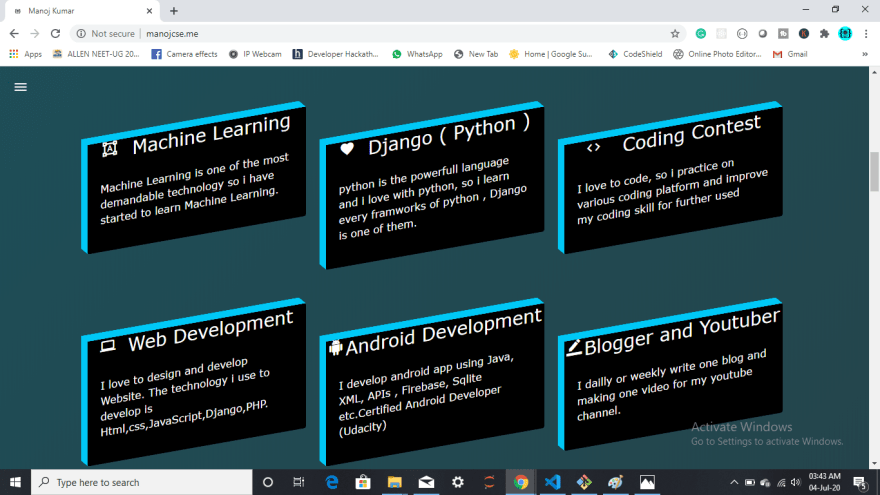
I already had a portfolio but it was created by others. But now have created my portfolio from scratch using HTML, CSS, Bootstrap, and JavaScript.
Tell me, what amazes you? What should I change?
Here is the link to the portfolio:https://mjmaurya.github.io
OR
https://manojcse.netlify.app
Your feedback will be very important to me. It will help to enhance my development skill.


Top comments (44)
Your screenshots are showing a message on bottom right asking you to Activate windows. This may get you into trouble since it shows you are not using licensed windows version and these screenshots are getting public.
then, what should I do
Use macOS / Linux.
Or, properly crop the image.
I can't find a reason for not using Linux as a Developer. Keep windows for gaming and Linux (Elementary OS for example) for work. You'll see in few days that it's much more productive :)
I have used Linux. But due to some specific reason, I'm using Windows
hahaha rollback so, using linux is free after all and you can get Dual Boot easily
Either purchase a Windows license if you don't have one... Or give a Linux distro a try. You could easily try a Linux disro in a virtual machine and use that to creatw your screenshots
First crop the images to remove those portions of the image. Then either properly license the OS or use any free OS distribution to work.
What I like about it is the originality - the design does stand out among the myriad of similar-looking portfolio/professional sites, I think that's more important than the minor flaws you could no doubt come up with.
Like others said, I would also advise sharing a bit less personal info, unless you don't mind risking getting bombarded with spam/unwanted attention.
Oh and finally what I just noticed - no https on your site, just http? Maybe you think it's overkill, but http is pretty uncommon nowadays and I think it's also penalized by Google (SEO).
thanks, I will enable my SSL
Further on this subject - there's a tool called lighthouse.js that you could use to check site metrics that Google finds important when ranking pages
I think you should review the spacing of elements, for example title of the boxes below "What I am Doing" section is too close to borders, and icons don't seem vertically centered.
Also there are a lot of content, and a lot of different colors. I would simplify the overall layout a little bit so the important parts get attention
Can you Visit Now?
very very thanks, I will improve it
I like the site tbh. The only thing i would say is, i never understood the reasoning behind the percentages. 85 percent of what? You have learnt 85 percent of a language?
I think a more concise way of putting it is your main focuses and then your side interests, then maybe the things you are beginning to tinker with.
Thumbs up on the site design though. Quirky but clean.
You have a very large amount of personal info on there, I'd recommend you remove it just for privacy reasons, especially your personal phone number and age
Seconded. Definitely don't put your birth date or phone number anywhere online. That's just an invitation to get doxed.
I accidentally put my personal email on a new site, in few hours I started getting junk mail for the domain 😡
thanks for suggestion
Can you Visit Now?
You've got some serious performance issues here, you locked up my whole PC for a bit when I tried to click on a blog link haha
Lol, who is the one fool to enable add script in their own Portfolio website?,
I encountered a loop of adds, and ended to close the tab;
Not a good habit ;
I need this dowload resume what is you contact
you can contact me on twitter or Facebook.
by the way which code do you need? animation or download?
Can you Visit Now?
I quite like the design, but many employers don't like to download stuff from websites so maybe consider adding the document to your files and linking to it with an anchor tag that way it will open rather than download. Also some of the project images are a little distorted, potentially consider the object-fit property.
Can you Visit Now?
Might I also suggest use of spellchecker? Grammarly is supposed to be a robust tool
Can you Visit Now?