The beginning
A month ago, I was looking for solutions of designing a responsive website using CSS frameworks. I knew that the BootStrap framework is a well-known CSS framework that will get that power to make my website responsive. I was thinking why should I use a framework in 2020 for CSS to give me responsive functionality. These days, all websites should be responsive and responsiveness is not a luxury or fancy feature for websites. I couldn't satisfy myself that I cannot have a fully responsive website with only using pure CSS. I was thinking after many years, doesn't CSS have any builtin feature to make responsive styles? Or are not they enough mature to use them without using any additional library or framework?
I checked the internet and found CSS Grid feature. I had seen several times in the other website codes or even inside Chrome Inspect Element tools while I was debugging my projects something like this:
display: grid;
But I didn't know what is the usage of this kind of display for the element. I started reading more about CSS Grid feature until I found this CSS grid tutorial on youtube. The tutorials were published by Wes Bos and were so good to start with them. I watched every single video of the playlist and tried to check other CSS resources like CSS-Tricks . I learned everything about them and found how useful they are for designing responsive templates.
Browser support?
Whenever you get to know a new CSS feature, you will probably think the same thing. Browser Support! I was worried about how CSS Grid works in different browsers, older versions and my question was, can I rely on it for my next projects or not!
So I found browser support is quite good for it but the only problem is with CSS transitions. If you need to have transitions for changing the number of columns or rows of your grid, it is not supported yet. But in most cases, it is usable and soooooooo powerful.
Why do I think it is a powerful feature for responsiveness?
The first reason is that we will get access to great tools when using Grids:
1- FR unit! A new CSS length unit. Here you can read more about it.
2- Auto-fit and Auto-Fill! for auto-sizing columns which is really useful in terms of responsive template design. Read more about it here.
3- MinMax() feature! You can define your column width using the minmax function to specify the maximum and minimum values.
4- I built this example with only writing 23 lines of css code! You can see how responsive this is and I never used any media query to design this example!
Source code:
    .albums{
      display: grid;
      grid-template-columns: repeat(auto-fit,minmax(400px,1fr));
      align-content: center;
      grid-gap: 30px;
      transition: 2s;
    }
    .album{
      display: grid;
      grid-template-columns: 150px 1fr;
      grid-gap: 10px;
      align-items: center;
      color: white;
      background-color: #ffffff50;
      padding:20px
    }
    .album img{
      width: 100%;
      transition: 2s;
    }
    p{
      font-size: 11px;
      font-weight: normal;
    }
CSS Grid or FlexBox?
As I worked before with FlexBox in both React Native and CSS, I found both the same for some cases. Despite their superficial similarities, they are really different. In some cases, it is better to use FlexBox. For example, if you need to use CSS transitions and animations or need to show items in the opposite direction you have to use FlexBox.
Similar to building the whole page using table tag!
In the era of responsive page design, you must not use table tag to create your page structure. If you remember those days that we used table tag, aligning page structure was a relief for us. But these days we can only use table when need to show a real table. If you need that kind of relief like before, I suggest you use the CSS Grid feature. It is somehow similar to that way of structuring the page but more powerful and better.
Say goodbye to CSS float and shitty clear:both ?
Yes, I guess now it is the best time to stop using the float feature. By the power of new CSS features, we can do exactly what we were doing before with the float feature. Maybe you need to use it in some rare cases.
Tutorial ?
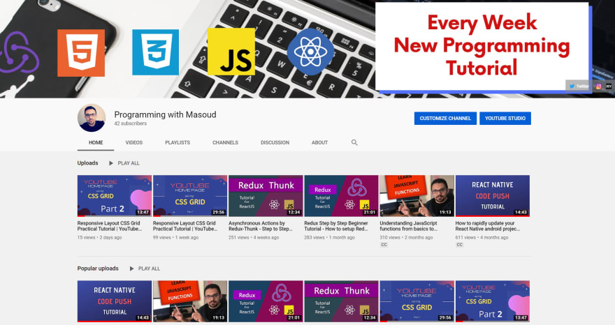
When I learned how to use Grids, in order to master it, I defined a practical challenge for myself. I decided to re-build the main page of the YouTube page and only use CSS Grid. This practice was awesome for me and I learned a lot from it. Then I decided to make several tutorial videos about it to show you how easily you can use CSS Grids to build a responsive layout for your projects.
You can watch two recent episodes of this tutorial and learn all in less than one hour.
The first part: designing the head bar
The second part: designing the left sidebar
Looking for more? Please subscribe to my YouTube channel in order to receive notifications when new episodes are out.


Top comments (0)