[#ux_for_the_rest_of_us ] [#day_2]
Fitts's Law,
A principle from human-computer interaction that predicts the time it takes for a user to point at a target area.
Simply put, Fitts's Law says that
The larger and closer a target, the quicker it is to click on.
This principle, first introduced in the 1950s, is more relevant than ever today. With smartphones playing a central role in our lives, optimizing our apps for touch has become critical. Let's understand how Fitts's Law applies to modern touchscreen phones.
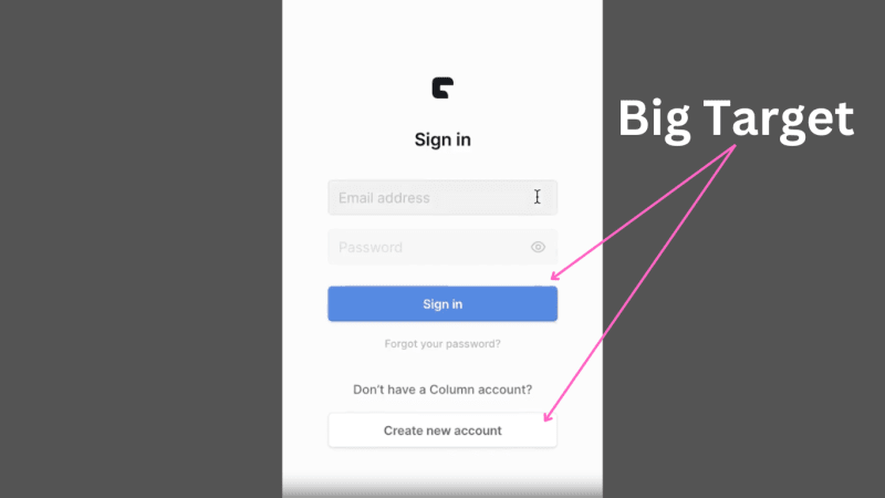
- The target should be large enough for fingers to accurately tap: To start with, our screens are our 'pointing device' and our fingers are the cursors. The touch targets — the buttons, links, and other interactive elements on a screen — should be large enough for fingers to accurately tap. Remember, the "Fat finger" problem is real. Apple's iOS Human Interface Guidelines recommend a minimum target size of 44 pixels wide and 44 pixels tall ( source ).
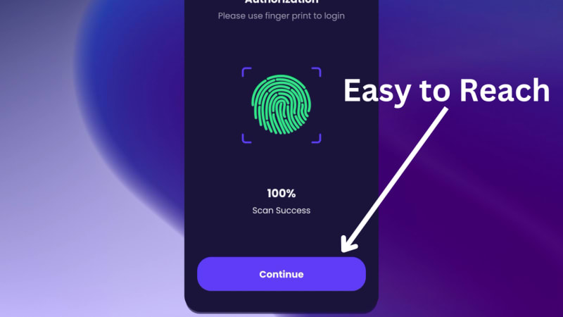
- Frequently used elements within easy reach of the thumb: the positioning of these touch targets is vital. Designing apps with Fitts's Law in mind means placing frequently used elements within easy reach of the thumb. This is often why you'll see key navigation elements at the bottom of mobile apps.
- Be wary of edges and corners: Fitts's law indicates that screen edges and corners are essentially 'infinitely large' targets because the pointer cannot go beyond these boundaries, making them very fast to hit. However, on touchscreen devices, corners especially can be hard to reach, turning a theoretically 'infinite' target into a tricky one.
Final Word: As we create mobile interfaces, let's keep our touch targets big, and within easy reach, and think about the usability of screen edges. Doing so will make our apps more user-friendly.
Cheers to better, more ergonomic designs in our pockets! 🥂📲


Top comments (0)